The raw data that you drag and drop into the data editor placeholders will not be formatted by default; you will need to modify each field you have dragged individually.
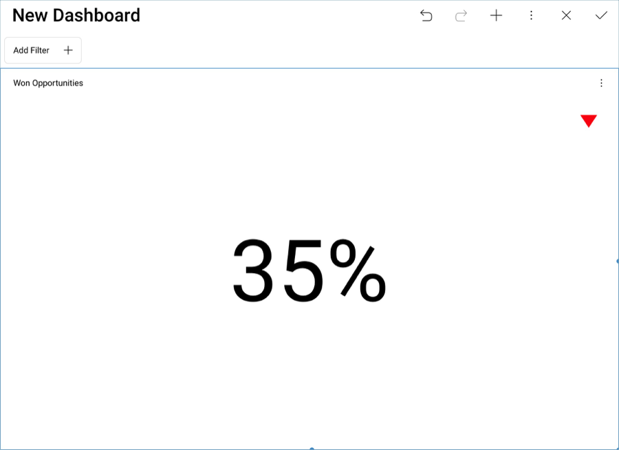
In the sample dashboard, the won opportunity figure is represented as a percentage. In order to apply this formatting:
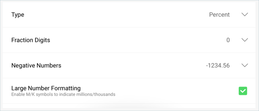
Select Won Opportunities in the Value placeholder of the data editor.
In the Formatting menu:
Change the Type to Percent.
Change the Fraction Digits to 0
Then, select Update Field.
In the sample dashboard, there is a red arrow indicator in the Won Opportunities visualization which is meant to represent that there has been a decrease in the amount of won opportunities. This marker is created through the band configurations in the gauge’s settings.

In order to configure them:
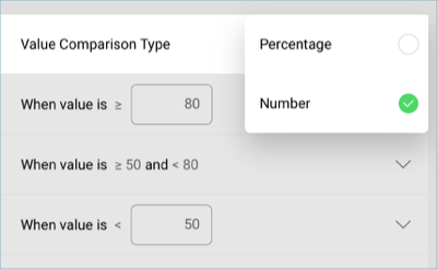
Go to the Settings tab in the Visualizations Editor.

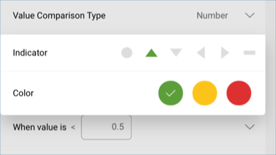
In the "Sales Dashboard" spreadsheet, "Won Opportunities" equals 0.35 as the value, even though the visualization is expressed as a percentage. Therefore, scroll down to Value Comparison Type and set it to "Number".
Set your bounds. In this case, the bounds are within 0.7 and 0.5.
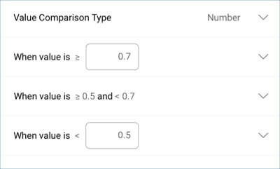
Select each band and select both the color and the indicator. By default, the highest value will be set to green and the lowest to red.
Once you have finished editing the visualization, select the tick button in the top right-hand corner to return to the dashboard editor.