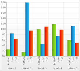

Charting is used in business to plot figures in a visual way, to portray information about trends that would be difficult to describe verbally or in writing. The Chart control provides a set of charts and a framework for creating charting applications, or adding charting capability to existing data or information-driven applications.
Chart allows developers to easily set up common types of charts, such as column, bar, line, and pie charts. 2D and 3D modes are available for the most common chart types. Additionally, specialized charts such as stacked bar, stacked column, scatter, 2D and 3D bubble, 2D and 3D heat map, radar, and candle (doji) chart types are available.
You can quickly create a chart with the most basic settings, simply by changing the ChartType property or using the Chart Wizard.
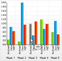
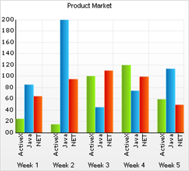
Each chart’s appearance can be customized to suit any particular style, or to add emphasis to the chart and better convey a message. The end result is a graphic that catches the attention of your audience and appears more professional.
In addition to standard coloring models which paint the chart using a set or range of colors, the Chart PaintElements framework allows the developer to customize the appearance down to each data item in the chart, with a great range of capabilities and detail.
Additionally, elements such as chart axes , labels, grid lines, titles, and chart text are fully customizable in their appearance and location.
For more information on customizing the appearance of your chart, see Appearance.
For more advanced and in-depth development, anything is possible in Chart as a result of the " Layers " framework available. Drawing custom shapes on the chart or manipulating existing ones is as simple as implementing an interface ( ILayer ) and using the specialized graphics collection (the SceneGraph) that is used to draw the chart.
Alternatively, you can start from scratch and use the Layers framework to draw a completely new type of chart!
For more information on chart layers, see Layers.