


This topic explains, with code examples, how to use the RangeBarSeries in the UltraDataChart™ control.
The topic is organized as follows:
Range Bar Series belongs to a group of Category Series and it is rendered using a collection of horizontal bars that show the difference between two values of a data point. This type of series emphasizes the amount of change between low values and high values in the same data point or compares multiple items. Range values are represented on the x-axis (NumericXAxis) and categories are displayed on the y-axis (CategoryYAxis). The RangeBarSeries is the vertical counterpart to the RangeColumnSeries in the same way that the BarSeries is the vertical counterpart to the ColumnSeries. For more conceptual information, comprehension with other types of series, and supported types of axes, refer to the Category Series and Chart Axes topics.
Figures 1 and 2 demonstrate how the RangeBarSeries and RangeColumnSeries look when plotted in the UltraDataChart control.
Figure 1: Sample implementation of the RangeBarSeries type.
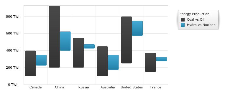
Figure 2: Sample implementation of the RangeColumnSeries type.
Although the UltraDataChart supports plotting unlimited number of various types of series, it is recommended to use the Range Bar Series with similar types of series. Refer to the Multiple Series topic for information on what types of series are recommended with the Range Bar Series and how to plot multiple types of series.
While the UltraDataChart control allows you to easily bind it to your own data model, make sure to supply the appropriate amount and type of data that the series requires. If the data does not meet the minimum requirements based on the type of series that you are using, an error is generated by the control. Refer to the Series Requirements and Category Series topics for more information on data series requirements.
The following is a list of data requirements for the RangeBarSeries type:
The data model must contain at least two numeric data columns for rendering the range between the values.
The data model may contain an optional string or date time field for labels.
The data source should contain at least one data item.
The RangeBarSeries renders data using the following rules:
Each row with two data values specified as the LowMemberPath and HighMemberPath properties of the data mapping is drawn as a separate horizontal bar representing the difference between these data values.
The string or date time column that is mapped to the Label property of data mapping on the y-axis is used as the category labels. If the data mapping for Label is not specified, default labels are used.
Category labels are drawn on the y-axis. Data values are drawn on the x-axis.
When rendering, multiple series of the RangeBarSeries type will get rendered in clusters where each cluster represents a data point. The first series in the Series collection of the UltraDataChart control renders at the bottom of the cluster. Each successive series is rendered above the previous series. For more information, refer to the Multiple Series topic.
The code snippet below shows how to bind the RangeBarSeries object to sample of category data (which is available for download from Sample Energy Data resource). Refer to the data requirements section of this topic for information about data requirements for the RangeBarSeries.
In C#:
var data = new EnergyDataSource();
var xAxis = new NumericXAxis();
var yAxis = new CategoryYAxis();
yAxis.DataSource = data;
yAxis.Label = "{Country}";

var series1 = new RangeBarSeries();
series1.DataSource = data;
series1.HighMemberPath = "Coal";
series1.LowMemberPath = "Oil";
series1.Title = "Coal vs Oil";
series1.XAxis = xAxis;
series1.YAxis = yAxis;
var series2 = new RangeBarSeries();
series2.DataSource = data;
series2.HighMemberPath = "Hydro";
series2.LowMemberPath = "Nuclear";
series2.Title = "Hydro vs Nuclear";
series2.XAxis = xAxis;
series2.YAxis = yAxis;
var chart = new UltraDataChart();
chart.Axes.Add(xAxis);
chart.Axes.Add(yAxis);
chart.Series.Add(series1);
chart.Series.Add(series2);
In Visual Basic:
Dim data As New EnergyDataSource()
Dim xAxis As New NumericXAxis()
Dim yAxis As New CategoryYAxis()
yAxis.DataSource = data
yAxis.Label = "{Country}"

Dim series1 As New RangeBarSeries()
series1.DataSource = data
series1.HighMemberPath = "Coal"
series1.LowMemberPath = "Oil"
series1.Title = "Coal vs Oil"
series1.XAxis = xAxis
series1.YAxis = yAxis
Dim series2 As New RangeBarSeries()
series2.DataSource = data
series2.HighMemberPath = "Hydro"
series2.LowMemberPath = "Nuclear"
series2.Title = "Hydro vs Nuclear"
series2.XAxis = xAxis
series2.YAxis = yAxis
Dim chart As New UltraDataChart()
chart.Axes.Add(xAxis)
chart.Axes.Add(yAxis)
chart.Series.Add(series1)
chart.Series.Add(series2)