
This topic provides information about the category tooltip layer used for interactions. It describes the properties of the category tooltip layer and provides an example of its implementation.
The following topics are prerequisites to understanding this topic:
This topic contains the following sections:
The CategoryToolTipLayer displays grouped tooltips for the series on the UltraDataChart control using a category axis.
You can configure tooltips to target a specific axis. This can be done be setting the TargetAxis property. For more information on this property, see the Properties section below.
By default the grouped tooltips appear at the top of the UltraDataChart control; however this default value can be overridden by setting the ToolTipPosition property. For more information on this property, see the CategoryToolTipLayer properties section below.
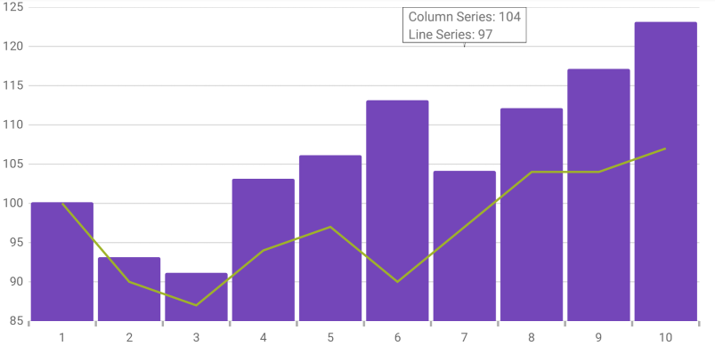
The following image is a preview of the UltraDataChart control renders with the CategoryToolTipLayer added.
The following table summarizes the properties of the CategoryToolTipLayer layer.
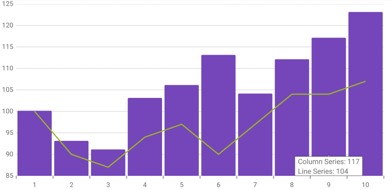
The following screenshot illustrates how the UltraDataChart control renders with the CategoryToolTipLayer object’s ToolTipPosition property configured with the following setting:
Following is the code used in this implementation
First, enable the default tooltip.
In C#
series.ShowDefaultTooltip = true;
Next, set up the CategoryToolTipLayer.
In C#:
var catToolTipLayerSeries = new CategoryToolTipLayer();
catToolTipLayerSeries.ToolTipPosition = CategoryTooltipLayerPosition.InsideStart;
chart.Series.Add(catToolTipLayerSeries);