Version

Touch-enabled WinGanttView

Topic Overview

Purpose

This topic illustrates the Infragistics touch-enabled WinGanttView™ control elements.

Touchable WinGanttView Elements and Gestures

Touchable element

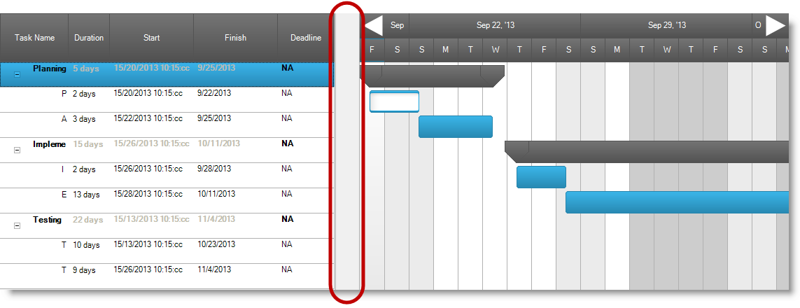
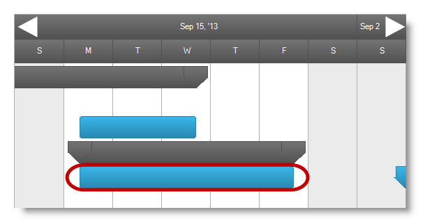
The following screenshot outlines the WinGanttView control’s touchable elements. The touch elements appear slightly larger in touch-enabled mode.

VerticalSplitter Element

The splitter allows dragging if, and only if, both Grid and Timeline sections are visible.

Touch WinGanttView 1.png

Row Element

Touch WinGanttView 2.png

DateNavigationButton Element

Touch WinGanttView 3.png

ColumnHeader Element

Touch WinGanttView 4.png

TaskBar Element

Allows task bar dragging, but not panning, when interacting with the task bar.

Touch WinGanttView 5.png

Task Start and End indicators

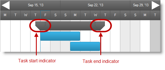
  • Task Start indicator element indicates the task’s begin date.

  • Task End indicator element indicates the task’s end date.

Touch WinGanttView 6.png

Task Milestone and Deadline indicators

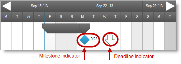
Task Milestone element indicates the task deliverable.

Task Deadline element indicates the date for the task to be completed.

Touch WinGanttView 7.png
Note
Note:

Task information dialog also supports touch. The enlarged rendering of these elements is for easier user interaction.

Touch WinGanttView 9.png

Gesture Support

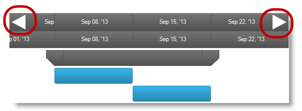
Gesture support for the WinGanttView control consists of vertical and horizontal panning along with flicking (See Touch Gestures for more details).

Topics

The following topics provide additional information related to this topic.

Topic Purpose

This section contains links to specific topics explaining the feature for developing touch-enabled applications using the Infragistics controls and components.

The topics in this group illustrate Infragistics touch-enabled control’s Touch Gestures.