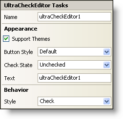
In Visual Studio 2005 (.NET Framework 2.0), each Ultimate UI for Windows Forms control/component is equipped with a Smart Tag. By simply selecting the control/component, a Smart Tag anchor appears. When you click this anchor, a pop-up panel appears, providing you with quick and easy access to the most common properties and settings of the control/component.
The WinCheckEditor™ Smart Tag contains the name of the control, as well as the following sections:
Appearance — Provides common tasks involving the appearance, look, and feel of the control.
Behavior — Provides easy access to properties that govern how the control behaves on the form.
See below for a description of the item (e.g., field, drop-down list, checkbox) in each section, as well as the item’s corresponding property in the properties grid.
