
In 2005 Volume 1 the WinExpandableGroupBox™ control was added to the list of Windows Forms controls Infragistics offers. This control has the ability to take on the style of XP, Office2000, Office2003, VisualStudio2005, and Office2007. It also has the ability to show a caption and an image with the caption, and help you contain your controls on your form.
Create a new C# or VB.NET Windows Application. With the form open in design view locate in your Toolbox the WinExpandableGroupBox control and drag one onto your form. You will notice that adding this control to your project added three references to the reference list:
Infragistics.Shared.v26.1
Infragistics.Win.Misc.v26.1
Infragistics.Win.v26.1
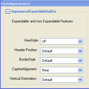
The first property we will look at is the ViewStyle property. Toggling this property will change the look of the control.
The XP style changes the caption text to blue, and also rounds off the corners.
The next property we will look at is the HeaderPosition . This property determines where the header will be displayed at on the UltraExpandableGroupBox. It has several options including:
Default - Header appears in the default location, based on the ViewStyle of the control.
TopOnBorder - Header appears on the upper edge of the control, on the border.
TopInsideBorder - Header appears on the upper edge of the control, within the border.
TopOutsideBorder - Header appears on the upper edge of the control, outside of the border.
RightOnBorder - Header appears on the right edge of the control, on the border.
RightInsideBorder - Header appears on the right edge of the control, within the border.
RightOutsideBorder - Header appears on the right edge of the control, outside of the border.
BottomOnBorder - Header appears on the lower edge of the control, on the border.
BottomInsideBorder - Header appears on the lower edge of the control, within the border.
BottomOutsideBorder - Header appears on the lower edge of the control, outside of the border.
LeftOnBorder - Header appears on the left edge of the control, on the border.
LeftInsideBorder - Header appears on the left edge of the control, within the border.
LeftOutsideBorder - Header appears on the left edge of the control, outside of the border.
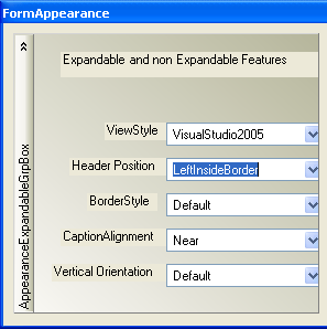
The screenshot below shows the WinExpandableGroupBox control with the HeaderPosition property set to LeftInsideBorder.
You can also change the location of the Caption by changing the CaptionAlignment property. There are the following three options:
Near
Far
Center
The functionality that the UltraExpandableGroupBox has over the standard GroupBox is that it is expandable. There are a couple properties of interest you can set when it comes to how the GroupBox will expand. One of them is the HeaderClick action, this property allows you to set what should happen if they user clicks on just the header. You can set it so that it causes the GroupBox to expand/collapse or you can leave to its Default value which is clicking on just the header has no effect in terms of expand/collapsing the GroupBox.
You can also set the location of the ExpansionIndicator , the options are:
Near
Far
None
You can also set the Expanded property determining if the GroupBox starts expanded or collapsed.