Version

Control the Appearance of Groups and Items

Certain settings that control the appearance of the element, such as the style of interface to use and whether the element accepts input focus, are determined by element-level properties. (For a complete discussion of these features, see Selecting An Appearance Style.) However, much of the element’s appearance is determined by settings at the Group level. Generally speaking, Group-level and element-level settings are complementary, and you will usually need to use both to achieve a particular interface style. Also available are Item-level settings, which you can use to apply custom formatting to individual items on an as-needed basis.

Appearance Overview

To focus on the appearance-related properties of Groups and Items, you must be aware of several levels of indirection that result from a layered approach to Infragistics' element design. First, the Group and Item objects encapsulate many of their properties inside an associated GroupSettings or ItemSettings object. Second, these "settings" objects divide appearance-related properties into two categories, based on the size of the icons being displayed by the Group. So each "settings" object has two "appearances" objects associated with it - one for large icons and one for small icons. Each of these "appearances" object is a container for several "appearance" objects - one for the default appearance, one for the appearance while editing, one for the hot tracking (mouseover) appearance, and so on. It is the properties of these "appearance" objects that determine how the Items in the Group will look in various states.

When working with Group-level appearance settings, the UltraExplorerBarGroupSettings object encapsulates all of the properties of the Group that may be saved into an external file (and therefore persisted across instances of the application.) The Settings property of the UltraExplorerBarGroup object is used to access this object.

The UltraExplorerBarGroupSettings object encapsulates both appearance and behavior settings. Appearance-related settings are stored in one of the UltraExplorerBarGroupAppearances objects associated with the GroupSettings object. The AppearancesLarge property of the GroupSettings object returns the GroupAppearances object that is used by the Group when large icons are being displayed. The AppearancesSmall property of the GroupSettings object returns the GroupAppearances object that is used by the Group when small icons are being displayed.

Accessing Appearances

The UltraExplorerBarGroupAppearances object has several properties that return an Appearance object. The Appearance object (part of the Infragistics.Win assembly has properties that specify formatting attributes, such as foreground color, background color, transparency, etc. The GroupAppearances object access these Appearance objects through properties that indicate what the Appearance is used for. ActiveAppearance returns the appearance applied to the Items in the Group when they become active. EditAppearance supplies the settings for Group Items that are being edited, and the Appearance supplies the default non-active, non-editing appearance settings. There are also Appearance objects used to format the Group itself, such as ActiveHeaderAppearance which controls the look of the Group’s header when the Group is active, and HeaderAppearance , which applies to the Group’s header when the Group is not active.

So to set the backcolor for small icons and large icons in a given group to different colors, but for them both to turn red when the mouse passed over and Item, you would use the following code.

In Visual Basic:

Private Sub Control_the_Appearance_of_Groups_and_Items_Load( _
  ByVal sender As System.Object, _
  ByVal e As System.EventArgs) Handles MyBase.Load
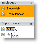
	Me.UltraExplorerBar1.Groups(0).Settings.AppearancesLarge.Appearance.BackColor = _
		Color.Orange
	Me.UltraExplorerBar1.Groups(0).Settings.AppearancesSmall.Appearance.BackColor = _
		Color.Orange
	Me.UltraExplorerBar1.Groups(0).Settings. & _
	  AppearancesLarge.HotTrackAppearance.BackColor = _
	  Color.Red
	Me.UltraExplorerBar1.Groups(0).Settings. & _
	  AppearancesSmall.HotTrackAppearance.BackColor = _
	  Color.Red
End Sub

In C#:

private void Control_the_Appearance_of_Groups_and_Items_Load(object sender, EventArgs e)
{
	this.ultraExplorerBar1.Groups[0].Settings.AppearancesLarge.Appearance.BackColor =
		Color.Orange;
	this.ultraExplorerBar1.Groups[0].Settings.AppearancesSmall.Appearance.BackColor =
		Color.Orange;
	this.ultraExplorerBar1.Groups[0].Settings.
	  AppearancesLarge.HotTrackAppearance.BackColor
	  = Color.Red;
	this.ultraExplorerBar1.Groups[0].Settings.
	  AppearancesSmall.HotTrackAppearance.BackColor
	  = Color.Red;
}
shows ultraexplorerbar with custom appearances applied to groups and items

Also present are Item-level settings for customizing individual Items within a Group. The settings available for the Item object match those of the Group object. By default, each Item in a Group inherits the appearance settings applied to that Group. The settings at the Item level are used only in special cases where the Group’s settings must be overridden.

Like the Group, the appearance of an Item is not controlled by properties of the Item object itself, but of an associated UltraExplorerBarItemSettings object. This object is available through the Item object’s ItemSettings property. Off of this object are two properties: AppearancesLarge and AppearancesSmall. Each of these properties returns an UltraExplorerBarItemAppearances object which encapsulates the Appearance objects applied to the Item in various states.

Essential Properties

The following are some of the important Group and Item appearance properties that you will use to specify a look for the element in your application. For the complete list of properties, see the reference topics for the UltraExplorerBarGroupSettings and UltraExplorerBarItemSettings classes. You may also want to review the UltraExplorerBarGroupAppearances and UltraExplorerBarItemAppearances class topics.

  1. Style — The Group (through its GroupAppearance object) has its own Style property. Distinct from the element’s Style property, this one specifies the overall appearance of the Items in the Group, determining how Items will be sized and arranged, or whether WinForms controls will replace the Items for the Group.

Style has the following settings available to format the group’s Items:

  • SmallImages — Items have small images and no text. Items are arranged in rows and columns from left to right and top to bottom.

  • SmallImagesWithText — Items display text to the right of the small image. Items are arranged in a list from top to bottom. (This is the Visual Studio .NET toolbar style.)

  • LargeImages — Items have large images and no text. Items are arranged in rows and columns from left to right and top to bottom.

  • LargeImagesWithText — Items display text to the right of the large image. Items are arranged in a list from top to bottom.

  • LargeImagesWithTextBelow — Items have large images and display text below the image. Items are arranged in a list from top to bottom. (This is the classic OutlookBar style.)

  • ControlContainer — An UltraExplorerBarContainerControl occupies the entire item area of the UltraExplorerBarGroup. Any .NET WinForms control can be placed inside the container.

  1. MaxLines — if the Items in a Group are displaying text label, the text can be wrapped to more than one line by using the MaxLines property. This property specifies the maximum number of lines text may be wrapped into. A value greater than 1 will cause the Group/Item text to be wrapped onto additional lines when the text cannot fit on a single line. MaxLines applies to the Group’s header text as well as the text of the Items in the Group.

  2. Indent — Individual Items within a Group may be indented by a specific amount using the Indent property of the ItemSettings object. You can use indenting for emphasis or to create a simple hierarchy of Items in a Group.