Imports Infragistics.Win

The WinTab™ and WinTabStrip™ controls provide you with a wide array of options for controlling the appearance and behavior of the control. In addition to the basic capabilities involving colors, fonts and images, you can specify how the tabs will respond to mouse activity and how tabs will be arranged in the tab header area. The element also includes design-time tools to assist with formatting and help you match the control with to look of your application.
How can I apply a particular formatting style to the WinTab or WinTabStrip control
How do I match the look of the control to that of my application?
There are a number of properties of the control itself that directly affect it’s appearance and behavior, including InterRowSpacing , InterTabSpacing , MaxTabWidth , MaxVisibleTabRows , Style , TabButtonStyle , TabLayoutStyle , TabOrientation and TextOrientation . For applications running on Windows XP, the UseOsThemes property is also significant.
While these control-level properties affect the overall look of the control, most of the specific visual settings for the control are handled by Appearance objects. A number of properties of the control provide access to an Appearance object, which encapsulates settings such as font, color, transparency, etc. The element’s Appearance property returns the main Appearance object that applies to much of the element, but there are also ActiveTabAppearance , ClientAreaAppearance , HotTrackAppearance , SelectedTabAppearance and TabHeaderAreaAppearance properties (plus others) that take precedence for different areas or states of the element.
(Appearance objects are part of the Infragistics Presentation Layer Framework (PLF).)
While these properties are primarily visual, there are also behavioral properties that affect how the control will look to the user who is interacting with it. These include properties such as AllowTabMoving , AutoSelect , HotTracking , MaxTabWidth , MaxVisibleTabRows , MinTabWidth and MultiRowSelectionStyle .
This exercise illustrates the appearance-related properties that you are most likely to use. It is not comprehensive, as there are more properties in the control that affect appearance and behavior than are covered here.
Open a new Windows Application project in Visual Studio and add an UltraWinTab element to the form.
Before you start writing any code, you should place using/imports directives in your code-behind so you don’t need to always type out a member’s fully qualified name.
In Visual Basic:
Imports Infragistics.Win
In C#:
using Infragistics.Win;
Add three tabs to the control. (You can add a tab by invoking the element’s context menu or viewing the bottom pane of the Visual Studio Property window and selecting "Add Tab".)
Open the Visual Studio property sheet (F4 on the keyboard) and locate the Style property. Drop down the list of enumerations for the Style property.
Style is the primary property that determines the look of the element. Select several different styles from the drop-down. You will see the changes applied immediately to the element in the design environment.
While most of the styles simply provide a different look for the tabs, it is worth noting that several of the styles change the nature of the tab interface. Generally, tabs provide access to groups of features in a user-driven way that is non-linear; no tab is more important than any other and tabs may be selected in any sequence. The NotePage, NotePageFlat and Wizard styles present the tabs in a definite sequence, and the user must move through the tabs in a linear fashion.
When you select one of these styles, an extra interface element will appear in the tab header area of the element. This element displays the position of the current tab in the tab sequence, i.e. "3 of 5". When the Wizard style is selected, this element also contains navigation buttons for moving through the sequence. This interface element is only displayed at design-time! Its only purpose is to aid the developer in creating linear-style interfaces using the tab control.
On a related note, the Wizard style does not contain any intrinsic navigation interface. (This is why the design-time interface for this style provides navigation. If it didn’t there would be no way to select among the tabs in the element.) When using the Wizard style you must provide a navigation interface using the elements you place on the tab page. For example, to duplicate the common wizard interface found in product installations, you would have Back, Next and Finish buttons that would be shared across all tabs. (The Back button would be excluded from or disabled on the first tab.) You would then attach code to the Back and Next buttons that used the PerformAction method and specified the ActivatePreviousTab or ActivateNextTab actions to navigate through the tabs. The Finish button might jump directly to the last tab (using it’s Index or Key in the VisibleTabs collection) or might simply accept the current values and close the dialog.
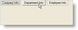
When you are finished looking at the different control styles, set Style to "StateButtons". This will cause the tabs of the element to be presented as a series of buttons in the tab header area.
Select the TabButtonStyle property in the property sheet and drop-down the list. You will see a number of options for the style that will be used to render the buttons. Select several styles to see their effects on the element.
Not all of these styles will have an effect that is immediately evident at design-time. For example, the Popup style creates buttons that respond to the mouse pointer by assuming a 3-D appearance. This behavior will not occur at design-time - the buttons will simply appear flat.
When you are finished looking at the various TabButtonStyle settings, select "Popup".
Run the application and click on the tab headers. Observe how the selected tab’s button remains flat, but the buttons for the other tabs pop up when the mouse passes over them. Select some different tabs to observe how the element changes when tabs are selected. Then stop the project.
The ability of the tabs to respond to the presence of the mouse pointer is hot tracking. The pop-up button style automatically implements hot tracking, but you can apply it to any tab style that you use. There are two pieces to implementing hot tracking. One is to define the appearance of the tab as it will appear when the mouse pointer is over it. The other is to enable the hot tracking feature for the element so the appearance you defined will take effect.
Change the Style of the element to PropertyPage. Then add a button to the form. Add the following code to the button’s Click event:
In Visual Basic:
Private Sub btnChangeStyle_Click(ByVal sender As System.Object, _
  ByVal e As System.EventArgs) Handles btnChangeStyle.Click
	Me.UltraTabControl1.HotTrackAppearance.ForeColor = Color.Red
	Me.UltraTabControl1.UseHotTracking = DefaultableBoolean.True
End Sub
In C#:
private void btnChangeStyle_Click(object sender, EventArgs e)
{
	this.ultraTabControl1.HotTrackAppearance.ForeColor = Color.Red;
	this.ultraTabControl1.UseHotTracking = DefaultableBoolean.True;
}
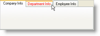
This code sets the foreground color of the hot-tracked tab to red, and enables the hot tracking for the element.
Run the project. Move the mouse over the tabs and see what happens. Then click the button and repeat the process. You will see the text of the tabs turn red as the mouse passes over them. Stop the project when you are through.
Related to the idea of hot tracking is auto select . With auto select enabled, not only does the presence of the mouse pointer over a tab change that tab’s appearance, it actually causes the tab to become selected.
You have already seen how one of the control’s Appearance objects (HotTrackAppearance) is used. Most of the visual look of the element is controlled by Appearance objects.
Enter the following code in the Load event of the form. This code uses several of the element’s Appearance objects to apply a specific formatting theme to the element:
In Visual Basic:
Private Sub Defining_the_Appearance_of_WinTab_and_WinTabStrip_Load( _
  ByVal sender As System.Object, ByVal e As System.EventArgs) _
  Handles MyBase.Load
	Me.UltraTabControl1.UseOsThemes = DefaultableBoolean.False
	Me.UltraTabControl1.Appearance.BackColor = Color.BlanchedAlmond
	Me.UltraTabControl1.Appearance.BackColorAlpha = _
	  Infragistics.Win.Alpha.Opaque
	Me.UltraTabControl1.Appearance.ForeColor = Color.Sienna
	Me.UltraTabControl1.ActiveTabAppearance.BackColor = Color.WhiteSmoke
	Me.UltraTabControl1.ActiveTabAppearance.BackColorAlpha = _
	  Infragistics.Win.Alpha.Opaque
	Me.UltraTabControl1.ActiveTabAppearance.ForeColor = Color.Firebrick
	Me.UltraTabControl1.HotTrackAppearance.BackColor = Color.NavajoWhite
	Me.UltraTabControl1.HotTrackAppearance.BackColorAlpha = _
	  Infragistics.Win.Alpha.Opaque
	Me.UltraTabControl1.HotTrackAppearance.ForeColor = Color.IndianRed
	Me.UltraTabControl1.ClientAreaAppearance.BackColor = _
	Me.UltraTabControl1.ActiveTabAppearance.BackColor
	Me.UltraTabControl1.Tabs(0).Appearance.ForeColor = Color.Black
End Sub
In C#:
private void Defining_the_Appearance_of_WinTab_and_WinTabStrip_Load(object sender,
  EventArgs e)
{
	this.ultraTabControl1.UseOsThemes = DefaultableBoolean.False;
	this.ultraTabControl1.Appearance.BackColor = Color.BlanchedAlmond;
	this.ultraTabControl1.Appearance.BackColorAlpha =
	  Infragistics.Win.Alpha.Opaque;
	this.ultraTabControl1.Appearance.ForeColor = Color.Sienna;
	this.ultraTabControl1.ActiveTabAppearance.BackColor = Color.WhiteSmoke;
	this.ultraTabControl1.ActiveTabAppearance.BackColorAlpha =
	  Infragistics.Win.Alpha.Opaque;
	this.ultraTabControl1.ActiveTabAppearance.ForeColor = Color.Firebrick;
	this.ultraTabControl1.HotTrackAppearance.BackColor = Color.NavajoWhite;
	this.ultraTabControl1.HotTrackAppearance.BackColorAlpha =
	  Infragistics.Win.Alpha.Opaque;
	this.ultraTabControl1.HotTrackAppearance.ForeColor = Color.IndianRed;
	this.ultraTabControl1.ClientAreaAppearance.BackColor =
	  this.ultraTabControl1.ActiveTabAppearance.BackColor;
	this.ultraTabControl1.Tabs[0].Appearance.ForeColor = Color.Black;
}
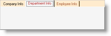
This code first uses the element-level Appearance object (via the Appearance property) to set up the basic color scheme for the element. Then a unique appearance is defined for the active (currently selected) tab, followed by the settings that will be applied to the tab when the mouse pointer is over it and hot tracking is enabled. Next, the client area derives its settings from the element’s Appearance object, but the client area is visually contiguous with the active tab. So the background color of the client area is set to match the setting of the active tab’s Appearance object. Finally, a unique text color is set for the first tab in the element by using the Appearance object of the individual Tab object.
One extra thing to note about element appearance. If you place the element on a form that has a texture or an image as a background, you may want to make the background area of the element in the tab header transparent. In other words, you might want the tabs themselves to be opaque, but the rest of the tab header area (where there are no tabs) to be clear. It is not possible to do this using transparency, because transparency is not supported directly on the element. (The .NET framework does not fully support nested transparent controls, and the Tab element itself must support the containment of transparent controls on its tab pages.)
However, it is possible to achieve the visual effect of a transparent control background using an alternate method. If the Tab element is on a container that has a background image, set the ImageBackground property of the Appearance to the same image, and set its ImageBackgroundOrigin to Container. This will align the element’s background image to the container’s background image, and that portion of the tab header area without tabs will appear transparent.
Tabs can be oriented along any edge of the control, and the text can be displayed in a corresponding rotation, or left to display in the default direction. You can do this by changing the TabOrientation property.
You can permit the user to re-arrange the order of the tabs at run-time. You can also control how the tab arrangement appears, specifying the number of rows that may be created. Sorting the tabs is possible as well.
Select the Tab element on your form and bring up the property sheet.
Locate the TabLayoutStyle property in the list and drop down the list of possible options for this property. These options determine whether tabs will appear on a single row or on multiple rows, and how tabs will be sized to accommodate the space available.
If you select one of the multi-row options, the MaxVisibleTabRows property will determine the number of rows that tabs can occupy in the control and the MultiRowSelectionStyle property will specify how tabs and rows re-arrange themselves as the user interacts with them. The TabsPerRow property can be used to specify how many tabs will appear on any given row.
If you want the user to be able to re-arrange the order of the tabs using simple drag-and-drop, set the AllowTabMoving property to True.
Settings on the individual Tab objects also play a role in the arrangement and capabilities of tabs. For example, even if AllowTabMoving is set to True, you can set the AllowMoving property of a specific tab to False, and that tab will be prevented from moving. Tab-level settings also control tab visibility you can hide a tab by setting its Visible property to False.
This extensive topic covered a number of key concepts related to formatting the control and controlling its visual behavior. You saw how to use control-level properties to enable features such as hot tracking and auto select. You had a brief overview of using Appearance objects to apply formatting to various parts of the control. You saw how to use orientation to change the look of your tabs, and you saw the key properties associated with tab arrangement, moving and sorting.