
The following properties on both the WinTab™ and WinTabStrip™ are used to specify the appearance and layout of the tabs:
Appearance — Determines the default appearance for all tabs. On XP systems where the tab element’s SupportThemes property is set to true, some elements will be drawn themed. In this case certain appearance settings are ignored, such as BackColor, BorderColor etc.
ActiveTabAppearance — Specifies the default appearance of the active tab (the tab with focus).
ClientAreaAppearance — Determines the default appearance of the client area (the entire element excluding the tab header area).
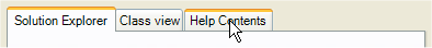
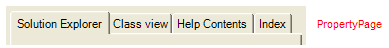
HotTrack — if set to true will modify the appearance of the tab that the mouse is over at run-time. By default only the ForeColor of the tab changes, except on XP systems where the tab element’s SupportThemes property is set to true and the Style property is set to PropertyPage or PropertyPageSelected. In this case, the hot tracked tab is rendered the same as a selected, themed tab as depicted in the image below.
HotTrackAppearance — Determines the appearance of the hot tracked tab. Some settings are ignored when drawing the themed tabs as in the above image.
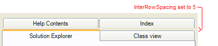
InterRowSpacing — In multi-row TabLayoutStyles this specifies how large a gap, in pixels, there will be between each row of tabs. Negative values are allowed. The following image shows the effect of setting InterRowSpacing to 5.
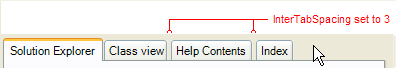
InterTabSpacing — Specifies how large a gap, in pixels, there will be between each tab in the same row. Negative values are allowed. The following image shows the effect of setting InterTabSpacing to 3.
MaxTabWidth and MinTabWidth — When calculating the size of a tab based on its image and text size, these properties limit how big or small the tab will be.
SelectedTabAppearance — Specifies the default appearance of the selected tab (the tab whose tab page is currently visible).
ShowButtonSeparators — This property only has meaning when the Style property is set to StateButtons. The following image shows an UltraTabControl with Style set to StateButtons, TabButtonStyle set to PopupSoftBorderless and ShowButtonSeparators set to true.
Style — Specifies the style of the tabs. If Style is set to StateButtons, then the TabButtonStyle property determines the look of the buttons. Also, themed support is only available on Windows XP and is specified with the UseOsThemes property.
SupportThemes — If this property is set to true on XP systems and if the Style property is set to PropertyPage or PropertyPageSelected then scroll buttons and tabs will display as themed.
TabButtonStyle — This property has meaning only if the Style property is set to StateButtons.
TabHeaderAreaAppearance — Determines the background appearance of the tab header area.
TabLayoutStyle — Determines how tabs are laid out. There are various single row and multi-row styles available.
TabOrientation — Determines how tabs are positioned relative to the tab page area, top-left, bottom-right, left-top, etc.
TabsPerRow — This property has meaning only if the TabLayoutStyle property is set to SingleRowTabsPerRow or MultiRowTabsPerRow. It determines how many tabs will be placed on every tab row and the size of each tab.
TextOrientation — Determines if and how the text is rotated with respect to the horizontal.
In addition, the following properties on both the UltraTabControl and UltraTabStripControl are used to specify the appearance of scroll buttons:
ScrollArrowStyle — Determines how the arrows are rendered in the scroll buttons, e.g. as filled triangles, hollow triangles or chevrons.
ScrollButtonAppearance — Determines the appearance of the scroll buttons.
ScrollButtons — Determines if scroll buttons are shown always, only when needed or never.
ScrollButtonStyle — Determines the style of the scroll buttons. This property is ignored on XP systems if SupportThemes is true and Style is PropertyPage or PropertyPageSelected.
ScrollButtonTypes — Determines which scroll buttons are show, next/previous, next page/previous page, first/last and thumb.
ScrollTrackAppearance — This has meaning only if the 'Thumb' bit in ScrollButtonTypes is set on and the buttons aren’t rendered as themed. It determines the look of the track that the thumb sits in.
ScrollTrackExtent — Determines the length of the thumb track. If set to 0 then an appropriate size will we calculated.
The following properties on the UltraTab object are used to specify the appearance of specific tabs:
Appearance — Determines the normal appearance of the tab.
ActiveAppearance — Determines the appearance of the tab when it is the active tab (the tab has input focus.)
ClientAreaAppearance — Determines the appearance of the client area (the entire element excluding the tab header area) when the tab is the selected tab (its tab page is visible.)
FixedWidth — Determines the width of the tab in pixels. If set to 0 will cause an appropriate width to be calculated.
HotTrackAppearance — Determines the appearance of the tab when it is the hot tracked tab. The HotTrack property must be true for this property to have meaning.
SelectedAppearance — Determines the appearance of the tab when it is the selected tab (its tab page is visible.)
Text — Specifies the text that will be shown in the tab. When determining the size required for a tab the text metrics calculations are based on the largest font specified by the Font, Appearance, ActiveTabAppearance, HotTrackAppearance and SelectedTabAppearance properties on the tab element. It will ignore any font settings on specific tab appearance properties.