
The UltraToolTipManager class adds an extender property called "UltraToolTip" to any control. The UltraToolTip property allows for a control to be managed by the WinToolTipManager™. This allows a tooltip to automatically display when the mouse hovers over the control.
Start by placing some controls on a form.
These can be any controls, but for the purposes of this example, a TextBox will be used.
Place an UltraToolTipManager component on the Form.
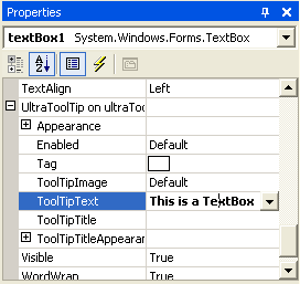
Set the ToolTipText property on the TextBox.
By default, the WinToolTipManager will show a tooltip when the mouse hovers over a control only when that control has it’s ToolTipText set to a valid string.
Set optional properties.
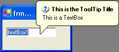
Once the ToolTipText is set, a tooltip will be displayed for the TextBox when the mouse hovers over it at run-time.
If you want the tooltip to display a title as well, set the ToolTipTitle property.
If you want the tooltip to display an Image in the title, set the ToolTipImage . ToolTipImage gives you some options for some common images. To display a custom Image, set the ToolTipImage property to Custom and set the Appearance.Image or ToolTipTitleAppearance.Image property.
At this point, you can also set other Appearance properties such as BackColor, ForeColor, etc.
Run the application.
Run the application and hover the mouse over the TextBox. The WinToolTip will display after a delay specified by the InitialDelay property of the WinToolTipManager (half a second by default).