Imports Infragistics.Win
Imports Infragistics.Win.UltraWinToolTip

WinToolTipManager™ adds an extender property called "UltraToolTip" to any control. The UltraToolTip property allows for a control to be managed by the WinToolTipManager. This allows a tooltip to automatically display when the mouse hovers over the control.
Before you start writing any code, you should place using/imports directives in your code-behind so you don’t need to always type out a member’s fully qualified name.
In Visual Basic:
Imports Infragistics.Win Imports Infragistics.Win.UltraWinToolTip
In C#:
using Infragistics.Win;
using Infragistics.Win.UltraWinToolTip;
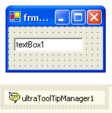
Place controls on the form
These can be any controls, but for the purposes of this example, a TextBox will be used.
Place an UltraToolTipManager component on the Form.
Get the ToolTipInfo for the control.
In order to set up WinToolTip properties, you must first get the ToolTipInfo for the control. Do this using the GetUltraToolTip method of the WinToolTipManager. Place the following code in the Form_Load event.
In Visual Basic:
' Get the ToolTipInfo for TextBox1
Dim toolTipInfo As UltraToolTipInfo = _
  Me.ultraToolTipManager1.GetUltraToolTip(Me.textBox1)
In C#:
// Get the ToolTipInfo for TextBox1
UltraToolTipInfo toolTipInfo =
  this.ultraToolTipManager1.GetUltraToolTip(this.textBox1);
Set the ToolTipText.
In order to display a tooltip, the ToolTipText property must be set to some text. Add the following code.
In Visual Basic:
' Set the ToolTipText
toolTipInfo.ToolTipText = "Enter some text here."
In C#:
// Set the ToolTipText.
toolTipInfo.ToolTipText = "Enter some text here.";
Set optional properties
Once the ToolTipText is set, a tooltip will be displayed for the TextBox when the mouse hovers over it at run-time. If you want the tooltip to display a title, set the ToolTipTitle property. If you want the tooltip to display an Image in the title, set the ToolTipImage . ToolTipImage gives you some options for some common images. To display a custom Image, set the ToolTipImage property to Custom and set the Appearance.Image or TitleAppearance.Image property. At this point, you can also set other Appearance properties such as BackColor, ForeColor, etc.
In Visual Basic:
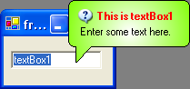
' Set the ToolTipTitle
toolTipInfo.ToolTipTitle = "This is textBox1"
' Apply an image
toolTipInfo.ToolTipImage = ToolTipImage.Info
' Apply an appearance
toolTipInfo.Appearance.BackColor = Color.White
toolTipInfo.Appearance.BackColor2 = Color.Chartreuse
toolTipInfo.Appearance.BackGradientStyle = GradientStyle.Circular
toolTipInfo.Appearance.ForeColor = Color.Black
' Apply an appearance to the Title.
toolTipInfo.ToolTipTitleAppearance.ForeColor = Color.Red
In C#:
// Set the ToolTipTitle
toolTipInfo.ToolTipTitle = "This is textBox1";
// Apply an image
toolTipInfo.ToolTipImage = ToolTipImage.Info;
// Apply an appearance
toolTipInfo.Appearance.BackColor = Color.White;
toolTipInfo.Appearance.BackColor2 = Color.Chartreuse;
toolTipInfo.Appearance.BackGradientStyle = GradientStyle.Circular;
toolTipInfo.Appearance.ForeColor = Color.Black;
// Apply an appearance to the Title.
toolTipInfo.ToolTipTitleAppearance.ForeColor = Color.Red;
Run the application
Run the application and hover the mouse over the TextBox. The WinToolTip will display after a delay specified by the InitialDelay property of the WinToolTipManager (half a second by default).