
This topic provides information about the callout layer used for hover interactions. It describes the properties of the callout layer and provides an example of its implementation.
The following topics are prerequisites to understanding this topic:
This topic contains the following sections:
The CalloutLayer displays annotations from existing or new data on the XamDataChart control. The annotations appear next to the given data values in the datasource.
The callout layer supports being used with all series types in the XamDataChart.
Use the callout annotations to display additional information, such as notes or specific details about datapoints, that you would like to point out to your users.
You can configure the callouts to target a specific series if you want to have multiple callouts layers present with different configurations. This can be done be setting the TargetSeries property.
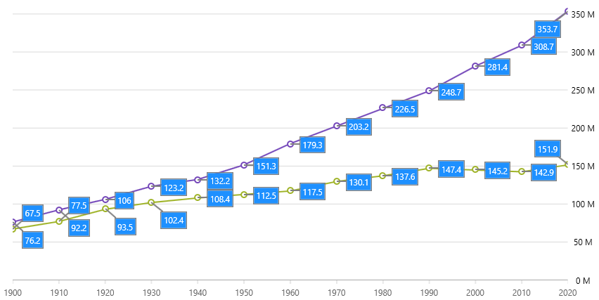
The following image is a preview of the XamDataChart control with the CalloutLayer added.
Following is the code used in the screenshot above.
In XAML:
<ig:XamDataChart x:Name="DataChart" Grid.Column="1"
                 HorizontalZoomable="True"
                 VerticalZoomable="True"
                 DataContext="{StaticResource VM}" >
    <ig:XamDataChart.Axes>
        <ig:CategoryXAxis x:Name="XAxis" ItemsSource="{Binding USA}"
                          Label="{}{Year}"  Interval="1"/>
        <ig:NumericYAxis x:Name="YAxis" MinimumValue="0" Label="{}{} M"
                         Title="{Binding XWDC_WorldData_Types_Population, Source={StaticResource Strings}}">
            <ig:NumericYAxis.LabelSettings>
                <ig:AxisLabelSettings Location="OutsideRight" Margin="5 0 5 0" />
            </ig:NumericYAxis.LabelSettings>
        </ig:NumericYAxis>
    </ig:XamDataChart.Axes>
    <ig:XamDataChart.Series>
        <ig:LineSeries ValueMemberPath="ValueInMln"
                       DataContext="{Binding USA}"
                       ItemsSource="{Binding}"
                       Title="{Binding Country}"
                       XAxis="{Binding ElementName=XAxis}"
                       YAxis="{Binding ElementName=YAxis}" >
        </ig:LineSeries>
        <ig:LineSeries ValueMemberPath="ValueInMln"
                       DataContext="{Binding RUS}"
                       ItemsSource="{Binding}"
                       Title="{Binding Country}"
                       XAxis="{Binding ElementName=XAxis}"
                       YAxis="{Binding ElementName=YAxis}" >
        </ig:LineSeries>
        <!-- this single callout layer is targeting ItemsSource of multiple series: -->
        <ig:CalloutLayer x:Name="AutoCallout"
                         IsAutoCalloutBehaviorEnabled="True"
                         UseValueForAutoCalloutLabels="True"
                         AutoCalloutLabelPrecision="1"
                         XMemberPath="Index"
                         YMemberPath="ValueInMln"
                         LabelMemberPath="ChangePercentage"
                         CalloutLeaderBrush="Gray"
                         CalloutOutline="Gray"
                         CalloutBackground="DodgerBlue"
                         CalloutTextColor="White"
                         CalloutStrokeThickness="1.5">
        </ig:CalloutLayer>
    </ig:XamDataChart.Series>
</ig:XamDataChart>
In C#:
var callout = new CalloutLayer();
callout.IsAutoCalloutBehaviorEnabled = true;
callout.UseValueForAutoCalloutLabels = true;
callout.AutoCalloutLabelPrecision = 1;
callout.XMemberPath = "Index";
callout.YMemberPath = "ValueInMln";
callout.LabelMemberPath = "ChangePercentage";
callout.CalloutLeaderBrush = new SolidColorBrush(Colors.Gray);
callout.CalloutOutline = new SolidColorBrush(Colors.Gray);
callout.CalloutBackground = new SolidColorBrush(Colors.DodgerBlue);
callout.CalloutTextColor = new SolidColorBrush(Colors.White);
callout.CalloutStrokeThickness = 1.5;
DataChart.Series.Add(callout);