Version

Category Highlight Layer

Topic Overview

Purpose

This topic provides information about the category highlight layer which is used for hover interactions. It describes the properties of the category highlight layer and provides an example of its implementation.

Required background

The following topics are prerequisites to understanding this topic:

Topic Purpose

The XamDataChart control requires a data object model to be mapped to control’s DataContext property. This article will provide a simple data object model but you can create your own and use it with this sample code instead.

This topic explains various types of Category Series in the XamDataChart control.

In this topic

This topic contains the following sections:

Overview

Category highlight layer overview

The CategoryHighlightLayer targets a category axis, or all category axes in the XamDataChart control. If the axis contains any series that are aligned between major gridlines of the axis, for example, ColumnSeries series, this will render a shape that fills the current category.

For other series, such as LineSeries series, it will render a band with an adjustable thickness at the closest gridline to the pointer position. In this situation if the UseInterpolation property is enabled this will cause the x position to become affixed to the x position of the pointer.

You can change the color of the highlighting area by setting the Brush property. For more information on this property see the Common Properties topic.

Preview

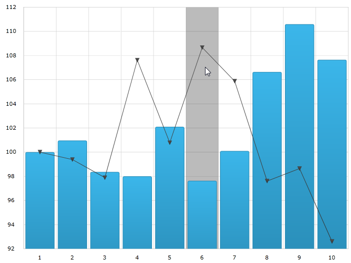
The following image is a preview of the XamDataChart control rendered with the CategoryHighlightLayer added.

Category Highlight Layer 1.png

Properties

Category highlight layer summary

The following table summarizes the properties of the CategoryHighlightLayer layer.

Property Name Property Type Description

double

This property specifies the width of the highlight area for series that are aligned on gridlines. For example, LineSeries, AreaSeries and SplineSeries.

This property has no effect if there are series present aligned between gridlines. For example ColumnSeries and WaterfallSeries.

When this property is set, it highlights a banded shape of the specified size around the gridline.

CategoryAxisBase

This property specifies which axis should have the enabled category highlight layer.

bool

This property specifies if the highlight band should snap-to-cursor, instead of snap-to-gridlines.

This property has no effect if there are series present aligned between gridlines. For example, ColumnSeries and WaterfallSeries.

Example

Example

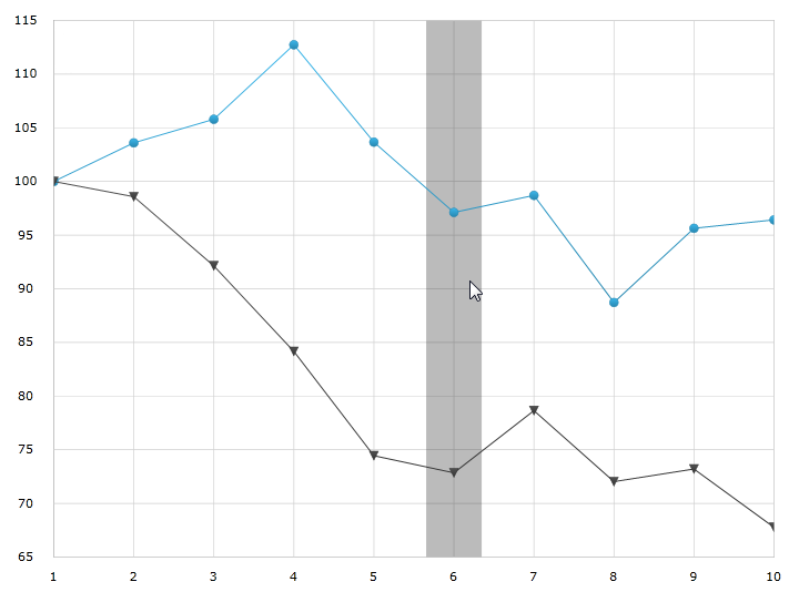
The following screenshot illustrates how the XamDataChart control with the BandHighlightWidth property of the CategoryHighlightLayer object looks as a result of the following setting:

Property Value

50

Category Highlight Layer 2.png

Following is the code used to implement this example

In XAML:

<ig:XamDataChart x:Name="theChart" Margin="5,0,5,0" >
    <ig:XamDataChart.Axes>
        <ig:CategoryXAxis x:Name="xmCategoryXAxis"
                          ItemsSource="{StaticResource CategoryData1}"
                          Label="{}{Category}">
            <ig:CategoryXAxis.LabelSettings>
                <ig:AxisLabelSettings x:Name="xmCategoryXAxisLabel"
                                      Extent="25"
                                      VerticalAlignment="Bottom"
                                      FontSize="11" />
            </ig:CategoryXAxis.LabelSettings>
        </ig:CategoryXAxis>
        <ig:NumericYAxis x:Name="xmNumericYAxis1">
            <ig:NumericYAxis.LabelSettings>
                <ig:AxisLabelSettings x:Name="xmNumericYAxisLabel"
                                      Extent="50"
                                      Location="OutsideLeft" />
            </ig:NumericYAxis.LabelSettings>
        </ig:NumericYAxis>
    </ig:XamDataChart.Axes>
    <ig:XamDataChart.Series>
        <ig:CategoryHighlightLayer BandHighlightWidth="50" />

        <ig:LineSeries ItemsSource="{StaticResource CategoryData1}"
                       ValueMemberPath="Value"
                       XAxis="{Binding ElementName=xmCategoryXAxis}"
                       YAxis="{Binding ElementName=xmNumericYAxis1}">
        </ig:LineSeries>
        <ig:LineSeries ItemsSource="{StaticResource CategoryData2}"
                       ValueMemberPath="Value"
                       XAxis="{Binding ElementName=xmCategoryXAxis}"
                       YAxis="{Binding ElementName=xmNumericYAxis1}">
        </ig:LineSeries>
    </ig:XamDataChart.Series>
</ig:XamDataChart>

In C#:

var catHighlightLayerSeries = new CategoryHighlightLayer();
catHighlightLayerSeries.BandHighlightWidth = 50;
theChart.Series.Add(catHighlightLayerSeries);

In VB:

Dim catHighlightLayerSeries As New CategoryHighlightLayer()
catHighlightLayerSeries.BandHighlightWidth = 50
theChart.Series.Add(catHighlightLayerSeries)

Related Content

Topic Purpose

This topic provides information about the properties and methods that the hover interaction feature uses for highlighting, hovering and interacting with the tooltip interactions inherited from the Series class.

This topic provides information about the crosshair layer used for hover interactions. It describes the properties of the crosshair layer and provides an implementation example.

This topic provides information about the category item highlight layer used for hover interactions. It describes the properties of the category item highlight layer and provides an example of its implementation.

This topic provides information about the category tooltip layer used for hover interactions. It describes the properties of the category tooltip layer and provides an example of its implementation.

This topic provides information about the item tooltip layer which is used for hover interactions. It describes the properties of the item tooltip layer and also provides an example of its implementation.