Version

Category Item Highlight Layer

Topic Overview

Purpose

This topic provides information about the category item highlight layer used for hover interactions. It describes the properties of the category item highlight layer and provides an example of its implementation.

Required background

The following topics are prerequisites to understanding this topic:

Topic Purpose

The XamDataChart control requires a data object model to be mapped to control’s DataContext property. This article will provide a simple data object model but you can create your own and use it with this sample code instead.

This topic explains various types of Category Series in the XamDataChart control.

In this topic

This topic contains the following sections:

Overview

Category item highlight layer overview

The CategoryItemHighlightLayer highlights items in series using category axis by either drawing a banded shape or rendering a marker at that position.

The default highlight depends on the type of series. For example, the highlight for a ColumnSeries and a LineSeries is different; for ColumnSeries it is a banded shape, for LineSeries it is a marker. You can override the default highlight by setting the HighlightType property. For more information on this property, see the Properties section below.

Preview

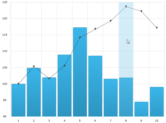
The following image is a preview of the XamDataChart control rendered with the CategoryItemHighlightLayer added.

Category Item Highlight Layer 1.png

Properties

Category item highlight layer summary

The following table summarizes the properties of the CategoryItemHighlightLayer.

Property Name Property Type Description

double

This property specifies the width of the highlight area for the items in a series that are aligned on gridlines. For example LineSeries, AreaSeries and SplineSeries.

This property has no effect if there are series present aligned between gridlines. For example ColumnSeries and WaterfallSeries.

When this property has a value set for it, a banded shape is highlighted around the gridline.

This property specifies what the highlight should look like.

The default uses a marker for series such as LineSeries, and a highlight band series such as ColumnSeries.

bool

This property specifies if the highlight band should snap-to-cursor, instead of snap-to-gridlines.

This property has no effect if there are series present aligned between gridlines. For example, ColumnSeries and WaterfallSeries series.

DataTemplate

This property specifies which template to use for the marker highlight type instead of using available marker types.

Example

Example

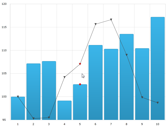
The following screenshot illustrates how the XamDataChart control with the CategoryItemHighlightLayer object’s

BandHighlightWidth and Brush properties looks as a result of the following setting:

Property Value

Red

Marker

Category Item Highlight Layer 2.png

Following is the code used to implement this example

In XAML:

<ig:XamDataChart x:Name="theChart" Margin="5,0,5,0" >
    <ig:XamDataChart.Axes>
        <ig:CategoryXAxis x:Name="xmCategoryXAxis"
                          ItemsSource="{StaticResource CategoryData1}"
                          Label="{}{Category}">
            <ig:CategoryXAxis.LabelSettings>
                <ig:AxisLabelSettings x:Name="xmCategoryXAxisLabel"
                                      Extent="25"
                                      VerticalAlignment="Bottom"
                                      FontSize="11" />
            </ig:CategoryXAxis.LabelSettings>
        </ig:CategoryXAxis>
        <ig:NumericYAxis x:Name="xmNumericYAxis1">
            <ig:NumericYAxis.LabelSettings>
                <ig:AxisLabelSettings x:Name="xmNumericYAxisLabel"
                                      Extent="50"
                                      Location="OutsideLeft" />
            </ig:NumericYAxis.LabelSettings>
        </ig:NumericYAxis>
    </ig:XamDataChart.Axes>
    <ig:XamDataChart.Series>
        <ig:ColumnSeries ItemsSource="{StaticResource CategoryData1}"
                         ValueMemberPath="Value"
                         XAxis="{Binding ElementName=xmCategoryXAxis}"
                         YAxis="{Binding ElementName=xmNumericYAxis1}">
        </ig:ColumnSeries>
        <ig:LineSeries ItemsSource="{StaticResource CategoryData2}"
                       ValueMemberPath="Value"
                       XAxis="{Binding ElementName=xmCategoryXAxis}"
                       YAxis="{Binding ElementName=xmNumericYAxis1}">
        </ig:LineSeries>

        <ig:CategoryItemHighlightLayer HighlightType="Marker" Brush="Red" />
   </ig:XamDataChart.Series>
</ig:XamDataChart>

In C#:

var catItemHighlightLayerSeries = new CategoryItemHighlightLayer();
catItemHighlightLayerSeries.HighlightType = CategoryItemHighlightType.Marker;
catItemHighlightLayerSeries.Brush = new SolidColorBrush(Colors.Red);
theChart.Series.Add(catItemHighlightLayerSeries);

In VB:

Dim catItemHighlightLayerSeries As New CategoryItemHighlightLayer()
catItemHighlightLayerSeries.HighlightType = CategoryItemHighlightType.Marker;
catItemHighlightLayerSeries.Brush = New SolidColorBrush(Colors.Red)
theChart.Series.Add(catItemHighlightLayerSeries)

Related Content

Topic Purpose

This topic provides information about the properties and methods that the hover interaction feature uses for highlighting, hovering and interacting with the tooltip interactions inherited from the Series class.

This topic provides information about the crosshair layer used for hover interactions. It describes the properties of the crosshair layer and provides an implementation example.

This topic provides information about the category highlight layer which is used for hover interactions. It describes the properties of the category highlight layer and provides an example of its implementation.

This topic provides information about the category tooltip layer used for hover interactions. It describes the properties of the category tooltip layer and provides an example of its implementation.

This topic provides information about the item tooltip layer which is used for hover interactions. It describes the properties of the item tooltip layer and also provides an example of its implementation.