<UserControl.Resources>
   <!-- TODO: Create style here -->
</UserControl.Resources>

Every aspect of the Ultimate UI for WPF controls can be styled and customized to maintain consistency throughout your applications. Each and every control contains styling properties and target types. Styling the controls follows the same pattern. As an example, this topic will describe how to style the text foreground of the XamLinearGauge™ control by setting the Style property.
After completing the steps in this walkthrough, you will have created a Style resource used to style the XamLinearGauge control’s label foreground.
Add tags for the user control’s resource dictionary.
In XAML:
<UserControl.Resources> <!-- TODO: Create style here --> </UserControl.Resources>
Add a Style object to the resource dictionary with the following properties
In XAML:
<Style x:Key="DisplayCustomStyle" TargetType="ig:XamLinearGauge">
   <!-- Add setter -->
</Style>
Add a Setter element to the Style. Set the following properties
Property: Foreground
Value: DodgerBlue
In XAML:
<Setter Property="Foreground" Value="DodgerBlue" />
Within the XamLinearGauge control, set the Style property to the Style you created
In XAML:
<Grid x:Name="layoutRoot">
        <ig:XamLinearGauge x:Name="xamLinearGauge1"
                           Margin="5"
                           FontSize="16"
                           Style="{StaticResource DisplayCustomStyle}"
                           Height="150"/>
</Grid>
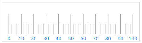
Save and run your application. The following image shows how the XamLinearGauge control might look with this custom style.