
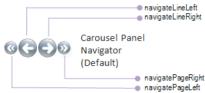
End users can navigate through carousel items using the CarouselPanelNavigator panel shown below. By default, it contains four buttons to move to the beginning of the items list, the preceding item in the list, the next item in the list, or the end of the item list.
You can customize the appearance of the CarouselPanelNavigator by binding your own style resource to the CarouselPanelNavigatorStyle property on ViewSettings. Alongside the buttons appearing in the illustration above are their standard Names. If you only want to re-style the button, you can Key your style resource to the name of the button for which you want to redefine the styling. You can also associate your own control template to change the content of the CarouselPanelNavigator altogether, including the number and positioning of the buttons, as shown in the following image.

Notice that the buttons are placed in an Adorner layer to ensure they always appear in front of the carousel items. If you wanted to hide the CarouselPanelNavigator from sight, you would set the IsNavigatorVisible property on ViewSettings.