<igDP:XamDataGrid
  ...
  Theme="Office2k7Black"/>

The xamDataCarousel™, xamDataGrid™, and xamDataPresenter™ controls can be styled with built-in themes stored in the assembly. Setting the control’s Theme property to the name of the desired theme is all that is necessary to use built-in themes. The available built-in themes include:
Aero
Generic
IGTheme
LunaNormal
LunaOlive
LunaSilver
Metro
Metro Dark
Office2010Blue
Office2013
Office2k7Black
Office2k7Blue
Office2k7Silver
Onyx
Print Basic
Royal Dark
Royal Light
Royale
RoyaleStrong
The following procedure assumes you already have a control setup for which you want to set the Theme property. The procedure has been written in the context of xamDataGrid, but works the same way for xamDataCarousel and xamDataPresenter.
To set the Theme property on the xamDataGrid control:
The following XAML shows you where to set the Theme property in relationship to the control. It also sets the Theme property to the Office2k7Black built-in style.
In XAML:
<igDP:XamDataGrid ... Theme="Office2k7Black"/>
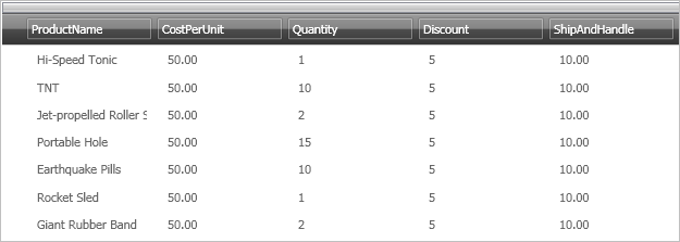
When you apply the Office2k7Black theme to xamDataGrid, the control would look similar to the image below.