
This topic describes how to programmatically perform selection in the xamDataTree™ control.
The following topics are prerequisites to understanding this topic:
This topic contains the following sections:
The xamDataTree control provides functionality for enabling single or multiple selection using either mouse or keyboard. The control also provides easy way to configure all the aspects of the selection feature.
The following table explains briefly the configurable aspects of the selection in the xamDataTree control and maps them to the properties that configure them. Further details are available after the table.
Use the TreeSelectionSettings object’s NodeSelection property to configure the desired node selection type in the xamDataTree control.
You can enable single or multiple node selection or disable the selection completely.
The following table maps the desired configuration to the property settings that manage it.
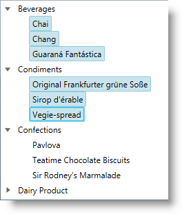
The screenshot below demonstrates how the xamDataTree would behave as a result of the following settings:
Following is the code that implements this example.
In XAML:
<ig:XamDataTree x:Name="DataTree" ItemsSource="{Binding CategoriesAndProducts}">
    <ig:XamDataTree.SelectionSettings>
        <ig:TreeSelectionSettings NodeSelection="Multiple"/>
    </ig:XamDataTree.SelectionSettings>
</ig:XamDataTree>
In Visual Basic:
DataTree.SelectionSettings.NodeSelection = TreeSelectionType.MultipleIn C#:
DataTree.SelectionSettings.NodeSelection = TreeSelectionType.Multiple;Use the XamDataTreeNode object’s IsSelected property to select a particular node or to determine which node is currently selected.
The following table maps the desired configuration to the property settings that manage it.
The example code below demonstrates how to select the root node in the xamDataTree control:
In Visual Basic:
DataTree.Nodes(0).IsSelected = trueIn C#:
DataTree.Nodes[0].IsSelected = true;Use the TreeSelectionSettings object’s SelectedNodes collection property to programmatically set selected XamDataTreeNode objects in the xamDataTree control.
You can also use this property to identify the user’s selected XamDataTreeNode objects.
The following table maps the desired configuration to the property settings that manage it.
The example code below demonstrates how to add the root node to the collection of selected nodes in the xamDataTree control:
In Visual Basic:
DataTree.SelectionSettings.SelectedNodes.Add(DataTree.Nodes(0))In C#:
DataTree.SelectionSettings.SelectedNodes.Add(DataTree.Nodes[0]);Use the XamDataTree SelectedDataItems property to set or get the selected data items in the xamDataTree control.
When an item is selected/unselected, this change reflects the SelectedDataItems collection as well as the SelectionSettings SelectedNodes collection.
The SelectedDataItems collection accepts items of different types and different levels in the data source hierarchy.
The following table maps the desired behavior to the property settings that manage it.
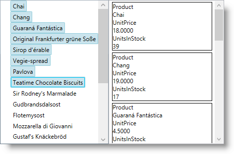
The screenshot below demonstrates how the XamDataTree SelectedDataItems property is used as an ItemsSource of the ListView control:
Following is the code that implements this example.
In XAML:
<ig:XamDataTree x:Name="DataTree" ItemsSource="{Binding Path=Products}">
    <ig:XamDataTree.SelectionSettings>
        <ig:TreeSelectionSettings NodeSelection="Multiple" />
    </ig:XamDataTree.SelectionSettings>
    <ig:XamDataTree.GlobalNodeLayouts>
        <ig:NodeLayout Key="ProductLayout"
                       TargetTypeName="Product"
                       DisplayMemberPath="ProductName">
        </ig:NodeLayout>
    </ig:XamDataTree.GlobalNodeLayouts>
</ig:XamDataTree>
<ListView ItemsSource="{Binding ElementName=DataTree, Path=SelectedDataItems}" >
    <ListView.ItemTemplate>
        <DataTemplate>
            <Border BorderBrush="Black" BorderThickness="1">
                <StackPanel Width="200">
                    <TextBlock Text="Product" />
                    <TextBlock Text="{Binding ProductName}" />
                    <TextBlock Text="UnitPrice" />
                    <TextBlock Text="{Binding UnitPrice}" />
                    <TextBlock Text="UnitsInStock" />
                    <TextBlock Text="{Binding UnitsInStock}" />
                </StackPanel>
            </Border>
        </DataTemplate>
    </ListView.ItemTemplate>
</ListView>Configure the Selected/Unselected data items using an underlying data model’s boolean property value to determine the items’ current state in the xamDataTree control. The name of this data model property is set through the IsSelectedMemberPath property.
Once the IsSelectedMemberPath is set to a data model property path, the SelectedDataItems collection is populated with the tree data items that have the specified property value set to True. If the underlying data model supports the INotifyPropertyChanged interface, modifications over the specified property values reflect over the xamDataTree items’ selection state, as well as changes over the nodes selection reflect over the specified member path property values.
The IsSelectedMemberPath property can be set to the XamDataTree itself or to a NodeLayout object. If it is set to the XamDataTree, it is the default value for every NodeLayout.
The following table maps the desired configuration to the property settings that manage it.
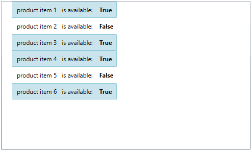
The screenshot below demonstrates how the xamDataTree looks as a result of the following settings:
Following is the code that implements this example.
In XAML:
<Grid>
    <Grid.DataContext>
        <local:DataProvider />
    </Grid.DataContext>
    <ig:XamDataTree x:Name="DataTree" Margin="10"
                    ItemsSource="{Binding Path=ProductItems}"
                    IsSelectedMemberPath="IsAvailable">
        <ig:XamDataTree.GlobalNodeLayouts>
            <ig:NodeLayout Key="ProductItems"
                           DisplayMemberPath="ProductNames"
                           TargetTypeName="ProductItem" >
                <ig:NodeLayout.ItemTemplate>
                    <DataTemplate>
                        <Grid Margin="5">
                            <Grid.ColumnDefinitions>
                                <ColumnDefinition/>
                                <ColumnDefinition/>
                            </Grid.ColumnDefinitions>
                            <TextBlock Text="{Binding Data.ProductName}" />
                            <StackPanel Orientation="Horizontal"
                                        Margin="10,0,0,0"
                                        Grid.Column="1">
                                <TextBlock Text="is available: "/>
                                <TextBlock Text="{Binding Data.IsAvailable}"
                                           Margin="10,0,0,0"
                                           FontWeight="Bold"/>
                            </StackPanel>
                        </Grid>
                    </DataTemplate>
                </ig:NodeLayout.ItemTemplate>
            </ig:NodeLayout>
        </ig:XamDataTree.GlobalNodeLayouts>
    </ig:XamDataTree>
</Grid>
The following class is the data model used in the example:
In C#:
public class ProductItem : INotifyPropertyChanged
{
    public ProductItem(string name, bool isAvailable)
    {
        _productName = name;
        _isAvailable = isAvailable;
    }
    private string _productName;
    public string ProductName
    {
        get { return this._productName; }
        set
        {
            if (this._productName != value)
            {
                this._productName = value;
                this.OnPropertyChanged("ProductName");
            }
        }
    }
    private bool _isAvailable;
    public bool IsAvailable
    {
        get { return this._isAvailable; }
        set
        {
            if (this._isAvailable != value)
            {
                this._isAvailable = value;
                this.OnPropertyChanged("IsAvailable");
            }
        }
    }
    public event PropertyChangedEventHandler PropertyChanged;
    protected void OnPropertyChanged(object sender, PropertyChangedEventArgs e)
    {
        PropertyChangedEventHandler handler = this.PropertyChanged;
        if (handler != null)
            handler(sender, e);
    }
    protected void OnPropertyChanged(string propertyName)
    {
        OnPropertyChanged(this, new PropertyChangedEventArgs(propertyName));
    }
}
In C#:
public class DataProvider : INotifyPropertyChanged
{
    public DataProvider()
    {
        DownloadDataSource();
    }
    private ObservableCollection<ProductItem> _productItems = null;
    public ObservableCollection<ProductItem> ProductItems
    {
        get { return this._productItems; }
        set
        {
            if (this._productItems != value)
            {
                this._productItems = value;
                this.OnPropertyChanged("ProductItems");
            }
        }
    }
    private void DownloadDataSource()
    {
        var data = new ObservableCollection<ProductItem>();
        data.Add(new ProductItem("product item 1", true));
        data.Add(new ProductItem("product item 2", false));
        data.Add(new ProductItem("product item 3", true));
        data.Add(new ProductItem("product item 4", true));
        data.Add(new ProductItem("product item 5", false));
        data.Add(new ProductItem("product item 6", true));
        this._productItems = data;
    }
    public event PropertyChangedEventHandler PropertyChanged;
    protected void OnPropertyChanged(object sender, PropertyChangedEventArgs e)
    {
        PropertyChangedEventHandler handler = this.PropertyChanged;
        if (handler != null)
            handler(sender, e);
    }
    protected void OnPropertyChanged(string propertyName)
    {
        OnPropertyChanged(this, new PropertyChangedEventArgs(propertyName));
    }
}The following topics provide additional information related to this topic.