
This topic provides an overview of the visual elements of the xamDiagram™ control.
The following topics are prerequisites to understanding this topic:
This topic contains the following sections:
The xamDiagram control exposes the following basic visual elements:
A diagram surface
Diagram nodes
Diagram nodes’ connections
The nodes and the connections, collectively known as “diagram items” are rendered within the diagram surface.
Additional visual elements are the:
Navigation pane – a reduced-size overview of its full content in a separate pane positioned inside the diagram space, by default at its bottom-right corner. The Navigation pane is implemented through an internal control ( xamOverviewPlusDetailPane™)
Toolbox – a control that allows adding items to the diagram via drag-and-drop. The Toolbox is implemented through the xamDiagramToolbox™ control.
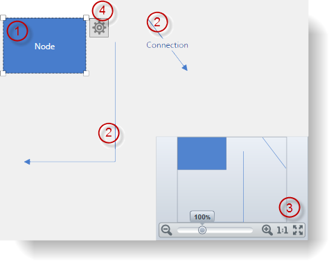
The following screenshot shows the visual elements of the diagram. The configurable elements are listed after the image.
The following table maps the visual elements of the XamDiagram control and the properties that configure them.
The following screenshot depicts the visual elements of diagram nodes. The configurable elements are listed after the image.
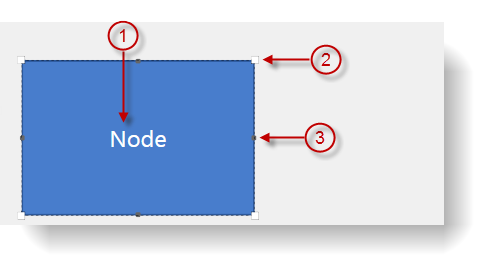
The following table maps the visual elements of DiagramNodes and the properties that configure them.
The following table summarizes the default node sizes in pixels. The default sizes vary depending on the node’s shape. (The default sizes are in effect if no explicit overriding has been applied to a node.)
The following screenshot depicts the visual elements of the diagram connections. The configurable elements are listed after the image.
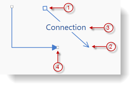
The following table maps the visual elements of the DiagramConnections and the properties that configure them.
The xamDiagramToolbox provides functionality for adding items to the xamDiagram via drag-drop. This control consists of a header and several categories (2 by default). Each of the categories has its own header is capable of containing any number of items representing a diagram item and a caption. The following screenshot shows the visual elements of the XamDiagramToolbox control. The configurable elements are listed after the image.
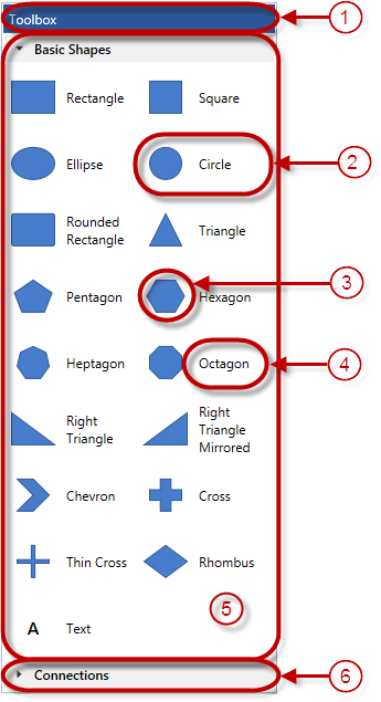
The following table maps the visual elements of the XamDiagramToolbox control and the properties that configure them.
The following topics provide additional information related to this topic.