
You can use xamTimeline™ control’s EventTitleTopStyle and EventTitleBottomStyle properties to style all event titles above and below the timeline respectively. In addition, you can change event title style per series or per entry using the NumericTimeSeries and DateTimeSeries objects' EventTitleStyle property or the NumericTimeEntry and DateTimeEntry objects' TitleStyle property.
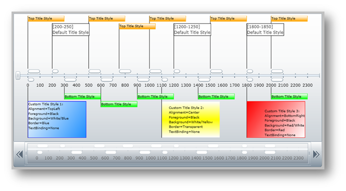
You will create a user control that will style all event titles above and below a numeric timeline using the EventTitleTopStyle, EventTitleBottomStyle and EventTitleStyle properties, and you will style specific event titles using the TitleStyle property. When you run the finished project, you should see custom styles for all event titles in the xamTimeline control that looks similar to the screen shot below.
Add the following NuGet package reference to your application:
Infragistics.WPF.Timeline
For more information on setting up the NuGet feed and adding NuGet packages, you can take a look at the following documentation: NuGet Feeds.
In the Main Page, add the following namespace declaration.
In XAML:
xmlns:ig="http://schemas.infragistics.com/xaml"
Add the following styles for event titles in the control resources.
In XAML:
<UserControl.Resources>
    <!--TODO: Add default style of Event Title -->
    <!--TODO: Add first custom style for a single Event Title -->
    <!--TODO: Add second custom style for a single Event Title -->
    <!--TODO: Add third custom style for a single Event Title -->
    <!--TODO: Add style for all Top Event Titles -->
    <!--TODO: Add style for all Bottom Event Titles -->
</UserControl.Resources>
Add the default style of Event Title.
In XAML:
<Style x:Key="rscDefaultTitleStyle" TargetType="ig:EventTitle">
    <Setter Property="MaxWidth" Value="180" />
    <Setter Property="IsTabStop" Value="/>
    <Setter Property="Background" Value="White" />
    <Setter Property="Foreground" Value="#FF333333"/>
    <Setter Property="BorderThickness" Value="1" />
    <Setter Property="BorderBrush" Value="Black" />
    <Setter Property="PointStringFormat" Value="{}[{0}]" />
    <Setter Property="SpanStringFormat" Value="{}[{0}-{1}]" />
    <Setter Property="LineStyle">
        <Setter.Value>
            <Style TargetType="Line">
                <Setter Property="StrokeThickness" Value="1" />
                <Setter Property="Stroke" Value="Black" />
                <Setter Property="Canvas.ZIndex" Value="-1" />
            </Style>
        </Setter.Value>
    </Setter>
    <Setter Property="Template">
        <Setter.Value>
            <ControlTemplate TargetType="ig:EventTitle">
                <Border HorizontalAlignment="Left"
                        BorderThickness="{TemplateBinding BorderThickness}"
                        Background="{TemplateBinding Background}"
                        BorderBrush="{TemplateBinding BorderBrush}">
                    <Grid>
                        <Grid.RowDefinitions>
                            <RowDefinition Height="*" />
                            <RowDefinition Height="Auto" />
                        </Grid.RowDefinitions>
                        <TextBlock Text="{TemplateBinding FormattedText}"
                                   TextWrapping="Wrap" />
                        <TextBlock Text="{TemplateBinding Title}"
                                   TextWrapping="Wrap" Grid.Row="1"/>
                    </Grid>
                </Border>
            </ControlTemplate>
        </Setter.Value>
    </Setter>
</Style>
Add the first custom style.
In XAML:
<Style x:Key="rscCustomTitleStyle1" TargetType="ig:EventTitle">
    <Setter Property="Width" Value="160" />
    <Setter Property="Height" Value="100" />
    <Setter Property="HorizontalAlignment" Value="Center" />
    <Setter Property="Template">
        <Setter.Value>
            <ControlTemplate TargetType="ig:EventTitle">
                <Border BorderBrush="Blue" BorderThickness="1">
                    <Border.Background >
                        <LinearGradientBrush EndPoint="0,0" StartPoint="1,1">
                            <GradientStop Color="White" Offset="1"/>
                            <GradientStop Color="DodgerBlue"/>
                        </LinearGradientBrush>
                    </Border.Background>
                    <TextBlock HorizontalAlignment="Left" VerticalAlignment="Top"
                               FontSize="9" Foreground="Black" TextWrapping="Wrap"
                               Text="Custom Title Style 1:
                                     Alignment=TopLeft
                                     Foreground=Black
                                     Background=White/Blue
                                     Border=Blue
                                     TextBinding=None"/>
                </Border>
            </ControlTemplate>
        </Setter.Value>
    </Setter>
</Style>
Add the second custom style.
In XAML:
<Style x:Key="rscCustomTitleStyle2" TargetType="ig:EventTitle">
    <Setter Property="Width" Value="160" />
    <Setter Property="Height" Value="100" />
    <Setter Property="HorizontalAlignment" Value="Center" />
    <Setter Property="Margin" Value="0,0,0,0" />
    <Setter Property="Template">
        <Setter.Value>
            <ControlTemplate TargetType="ig:EventTitle">
                <Border BorderBrush="Transparent"  BorderThickness="1">
                    <Border.Background >
                        <LinearGradientBrush EndPoint="0.5,1" StartPoint="0.5,0">
                            <GradientStop Color="White" Offset="1"/>
                            <GradientStop Color="Yellow" Offset="0.5"/>
                            <GradientStop Color="White"/>
                        </LinearGradientBrush>
                    </Border.Background>
                    <TextBlock HorizontalAlignment="Center" VerticalAlignment="Center"
                               FontSize="9" Foreground="Black" TextWrapping="Wrap"
                               Text="Custom Title Style 2:
                                     Alignment=Center
                                     Foreground=Black
                                     Background=White/Yellow
                                     Border=Transparent
                                     TextBinding=None"/>
                </Border>
            </ControlTemplate>
        </Setter.Value>
    </Setter>
</Style>
Add the third custom style.
In XAML:
<Style x:Key="rscCustomTitleStyle3" TargetType="ig:EventTitle">
    <Setter Property="Width" Value="160" />
    <Setter Property="Height" Value="100" />
    <Setter Property="HorizontalAlignment" Value="Center" />
    <Setter Property="Margin" Value="0,0,0,0" />
    <Setter Property="Template">
        <Setter.Value>
            <ControlTemplate TargetType="ig:EventTitle">
                <Border BorderBrush="Red" BorderThickness="1">
                    <Border.Background >
                        <LinearGradientBrush EndPoint="0,0" StartPoint="1,1">
                            <GradientStop Color="Red" Offset="1"/>
                            <GradientStop Color="White" />
                        </LinearGradientBrush>
                    </Border.Background>
                    <TextBlock HorizontalAlignment="Right" VerticalAlignment="Bottom"
                               FontSize="9" Foreground="Black" TextWrapping="Wrap"
                               Text="Custom Title Style 3:
                                     Alignment=BottomRight
                                     Foreground=Black
                                     Background=Red/White
                                     Border=Red
                                     TextBinding=None"/>
                </Border>
            </ControlTemplate>
        </Setter.Value>
    </Setter>
</Style>
Add a Style resource for all top event titles.
In XAML:
<Style x:Key="rscTopTitleStyle" TargetType="ig:EventTitle">
    <Setter Property="Width" Value="100" />
    <Setter Property="HorizontalAlignment" Value="Center" />
    <Setter Property="Margin" Value="0,0,0,0" />
    <Setter Property="Template">
        <Setter.Value>
            <ControlTemplate TargetType="ig:EventTitle">
                <Border BorderBrush="Orange" BorderThickness="1">
                    <Border.Background >
                        <LinearGradientBrush EndPoint="0.5,1" StartPoint="0.5,0">
                            <GradientStop Color="Orange" Offset="1"/>
                            <GradientStop Color="White"/>
                        </LinearGradientBrush>
                    </Border.Background>
                    <TextBlock HorizontalAlignment="Left" VerticalAlignment="Top"
                               FontSize="9" Foreground="Black" TextWrapping="Wrap"
                               Text="{TemplateBinding Title}"  />
                </Border>
            </ControlTemplate>
        </Setter.Value>
    </Setter>
</Style>
Add a Style resource for all bottom event titles.
In XAML:
<Style x:Key="rscBottomTitleStyle" TargetType="ig:EventTitle">
    <Setter Property="Width" Value="100" />
    <Setter Property="HorizontalAlignment" Value="Center" />
    <Setter Property="Margin" Value="0,0,0,0" />
    <Setter Property="Template">
        <Setter.Value>
            <ControlTemplate TargetType="ig:EventTitle">
                <Border BorderBrush="Lime" BorderThickness="1">
                    <Border.Background >
                        <LinearGradientBrush EndPoint="0.5,1" StartPoint="0.5,0">
                            <GradientStop Color="Lime" Offset="1"/>
                            <GradientStop Color="White"/>
                        </LinearGradientBrush>
                    </Border.Background>
                    <TextBlock HorizontalAlignment="Left" VerticalAlignment="Top"
                               FontSize="9" Foreground="Black" TextWrapping="Wrap"
                               Text="{TemplateBinding Title}"  />
                </Border>
            </ControlTemplate>
        </Setter.Value>
    </Setter>
</Style>
Add a xamTimeline control with styles for the top and bottom event titles.
In XAML:
<ig:XamTimeline x:Name="xamTimeline" Width="1000" Height="430" Margin="20"
                     EventTitleBottomStyle="{StaticResource Style_EventTitleBottom}"
                     EventTitleTopStyle="{StaticResource Style_EventTitleTop}">
    <!-- TODO: Add Event Title Layout Settings -->
    <!-- TODO: Add Axis -->
    <!-- TODO: Add Series -->
</ig:XamTimeline>
Add an EventTitleLayoutSettings object to the xamTimeline control.
In XAML:
<ig:XamTimeline.EventTitleLayoutSettings>
    <ig:EventTitleLayoutSettings HorizontalOffset="5"
                                   VerticalOffset="5" Enabled="True" />
</ig:XamTimeline.EventTitleLayoutSettings>
Add a NumericTimeAxis object to the xamTimeline control.
In XAML:
<ig:XamTimeline.Axis>
    <ig:NumericTimeAxis Minimum="-100" Maximum="2400" AutoRange=" Unit="100"
                          ShowLabels="True" ShowThumb="True" />
</ig:XamTimeline.Axis>
Add the following three NumericTimeSeries collections to the xamTimeline control’s Series property.
In XAML:
<ig:XamTimeline.Series>
    <!--TODO: Add Series with Default Event Title Styles -->
    <!--TODO: Add Series with Top Event Title Style -->
    <!--TODO: Add Series with Bottom Event Title Style -->
    <!--TODO: Add Series with Custom Event Title Styles -->
</ig:XamTimeline.Series>
Add a NumericTimeSeries collection with a default event title style.
In XAML:
<ig:NumericTimeSeries Title="Default Title Styles" Fill="White"
                        Position="TopOrLeft"
                        EventTitleStyle="{StaticResource rscDefaultTitleStyle}" >
    <ig:NumericTimeSeries.Entries>
        <ig:NumericTimeEntry Time="200" Duration="50"
                               Title="Default Title Style" Details=""/>
        <ig:NumericTimeEntry Time="1200" Duration="50"
                               Title="Default Title Style" Details=""/>
        <ig:NumericTimeEntry Time="1800" Duration="50"
                               Title="Default Title Style" Details=""/>
    </ig:NumericTimeSeries.Entries>
</ig:NumericTimeSeries>
Add a NumericTimeSeries collection with a top event title style.
In XAML:
<ig:NumericTimeSeries Title="Top Title Styles" Fill="White" >
    <ig:NumericTimeSeries.Entries>
        <ig:NumericTimeEntry Time="0" Duration="200"
                               Title="Top Title Style" Details="" />
        <ig:NumericTimeEntry Time="250" Duration="200"
                               Title="Top Title Style" Details="" />
        <ig:NumericTimeEntry Time="500" Duration="200"
                               Title="Top Title Style" Details="" />
        <ig:NumericTimeEntry Time="750" Duration="200"
                               Title="Top Title Style" Details="" />
        <ig:NumericTimeEntry Time="1000" Duration="200"
                               Title="Top Title Style" Details="" />
        <ig:NumericTimeEntry Time="1250" Duration="200"
                               Title="Top Title Style" Details="" />
        <ig:NumericTimeEntry Time="1500" Duration="200"
                               Title="Top Title Style" Details="" />
        <ig:NumericTimeEntry Time="1750" Duration="200"
                               Title="Top Title Style" Details="" />
        <ig:NumericTimeEntry Time="2000" Duration="200"
                               Title="Top Title Style" Details="" />
    </ig:NumericTimeSeries.Entries>
</ig:NumericTimeSeries>
Add a NumericTimeSeries collection with a bottom event title style.
In XAML:
<ig:NumericTimeSeries Title="Bottom Title Styles"
Fill="White" Position="BottomOrRight">
    <ig:NumericTimeSeries.Entries>
        <ig:NumericTimeEntry Time="300" Duration="100"
                               Title="Bottom Title Style" Details=""/>
        <ig:NumericTimeEntry Time="600" Duration="100"
                               Title="Bottom Title Style" Details=""/>
        <ig:NumericTimeEntry Time="900" Duration="100"
                               Title="Bottom Title Style" Details=""/>
        <ig:NumericTimeEntry Time="1200" Duration="100"
                               Title="Bottom Title Style" Details=""/>
        <ig:NumericTimeEntry Time="2000" Duration="100"
                               Title="Bottom Title Style" Details=""/>
    </ig:NumericTimeSeries.Entries>
</ig:NumericTimeSeries>
Add a NumericTimeSeries collection with custom title styles
In XAML:
<ig:NumericTimeSeries Title="Custom Title Styles"
Fill="White" Position="BottomOrRight">
    <ig:NumericTimeSeries.Entries>
        <ig:NumericTimeEntry Time="0" Duration="50"
                               TitleStyle="{StaticResource rscCustomTitleStyle1}"
                               Title="Custom Title Style 1" Details=""/>
        <ig:NumericTimeEntry Time="1100" Duration="50"
                               TitleStyle="{StaticResource rscCustomTitleStyle2}"
                               Title="Custom Title Style 2" Details=""/>
        <ig:NumericTimeEntry Time="1800" Duration="50"
                               TitleStyle="{StaticResource rscCustomTitleStyle3}"
                               Title="Custom Title Style 3" Details=""/>
    </ig:NumericTimeSeries.Entries>
</ig:NumericTimeSeries>
Run the application. The xamTimeline control will display all event titles in different styles.