Microsoft Analysis Services as a data source shows some specifics in regard to:
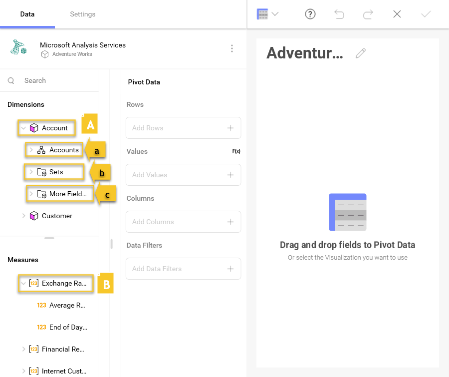
When you create a dashboard with information coming from Microsoft Analysis Services, you will see fields organized differently as seen in the screenshot below.
As you can see, there is no "Fields" heading. In its place, there are two sections in their own query field:
Dimensions (depicted by a cube icon with a pink side): Dimensions are structures used to categorize data that can be measured. Elements in a dimension can be organized by:
Hierarchy - when elements in a dimension are organized by hierarchy, you can use the whole hierarchy or part of it, starting from an element at any lower level. For example, if you have a "Geography" dimension organized in "Country → State → City" hierarchy, you can drag and use only the "State → City" part of this hierarchy.
Named Sets (depicted by a folder icon and named "Sets") - an arbitrary collection of elements with a name (e.g. "Top 50 Customers").
Attributes - elements are organized in single level hierarchies (e.g. a "Demographic" attribute, containing groups of elements like "Gender", "Marital Status", etc.)
Measures (depicted by [123] icon): Measures consist of numeric data.
The default visualization type for the Microsoft Analysis Services data source is a Pivot table. For Rows and Columns you must use Dimensions data and for Values - Measures data, when you build a Pivot table visualization:

For more information on dimensions and measures, please visit this Technet article.
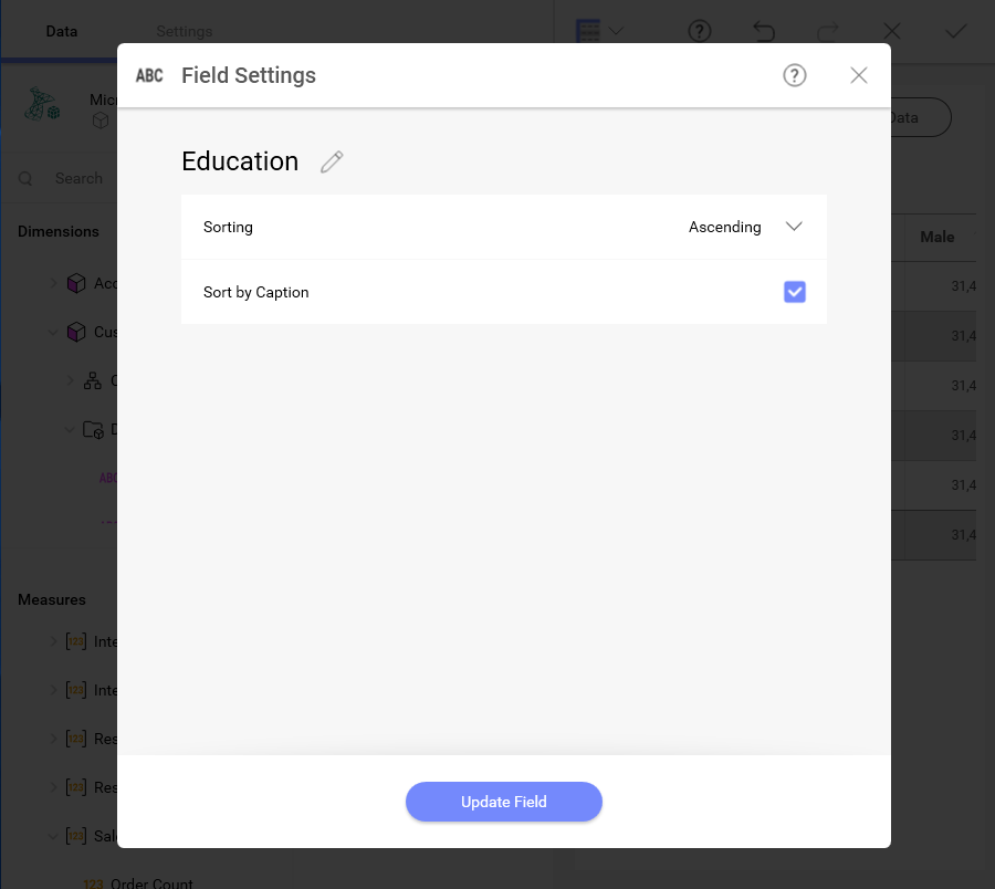
There is also a Sort by Caption option which defines whether the filter will be applied to the dimension’s labels or to the corresponding values. When enabled, Sort by Caption sorts the dimensions alphabetically by their label
To enable it, select a dimension in Rows or Columns. Enable Sorting for the field by choosing Ascending or Descending to have the Sort by Caption option show up:
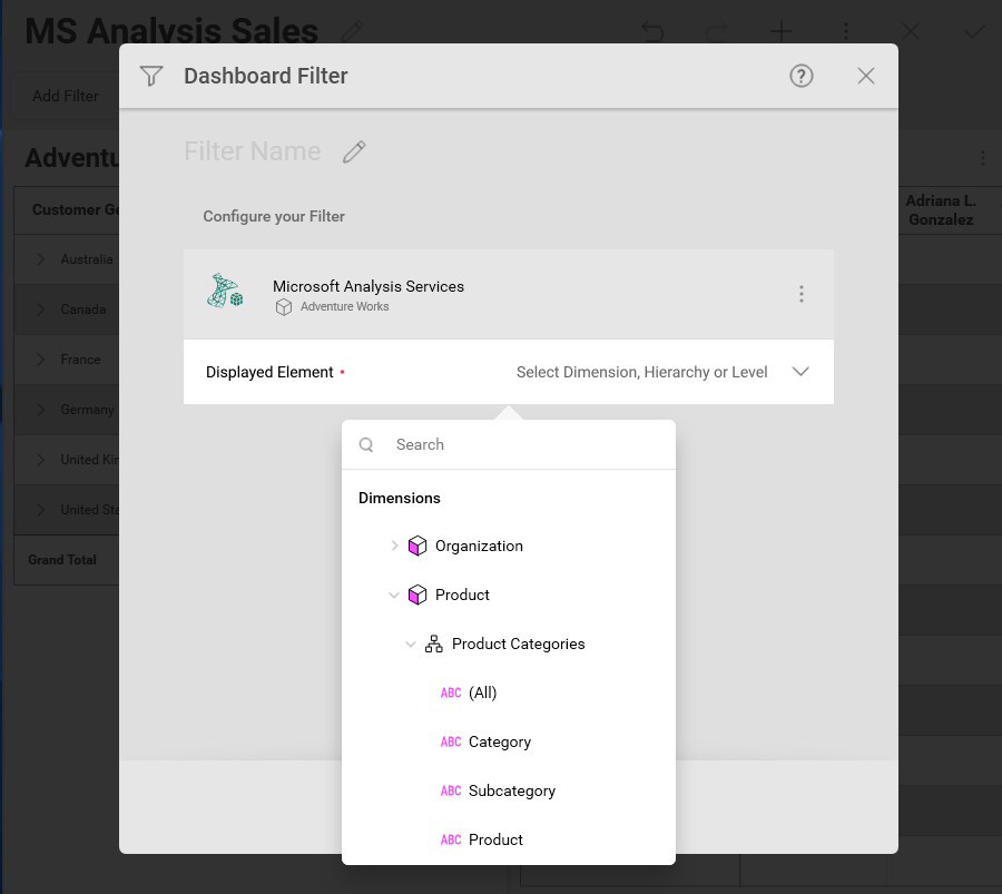
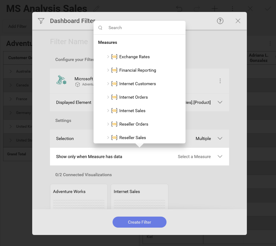
When configuring a SSAS-based dashboard filter, there are two data fields for you to set up:
Displayed Element - select a Dimension, Hierarchy or Level data field to display dashboard filter values
(Optional) Show only when Measure has data - select a Measure to limit the dashboard filter values to ones that contain data for a certain Measure
For example, if you use the Product Dimension as a Displayed element to filter sales data in a visualization, your dashboard filter will contain a list of products (e.g. bikes, clothes, etc). When you select a value from the list, the connected visualizations will be refreshed to show data only for the selected product.
If you select additionally the Internet orders Measure for Show only when Measure has data field, dashboard filter values that do not contain information about this measure will not be an option (i.e. if there are no internet orders of bikes, you will not be able to select this product as a filter value).
For more information on how to work with filters, please refer to: