Chip
igxChip is a compact visual component that displays information in an obround. Chip can be templated, deleted, and selected. Multiple chips can be reordered and visually connected to each other. Chips reside in a container called chips area which is responsible for managing the interactions between the chips.
Demo
Initializing Chips
The IgxChipComponent is the main class for a chip elemenent and the IgxChipsAreaComponent is the main class for a chip area. The chip area is used when handling more complex scenarios that require interaction between chips (dragging, selection, navigation etc.). The IgxChipComponent has an id input so that the different chips can be easily distinguished. If id is not provided it will be automatically generated.
Example of using igxChip with igxChipArea:
<igx-chips-area>
    <igx-chip *ngFor="let chip of chipList" [id]="chip.id">
        <span>{{chip.text}}</span>
    </igx-chip>
</igx-chips-area>
Chip states:

Features
Selection

Selection can be enabled by setting an input called selectable. The selecting is done either by clicking on the chip itself or by using the Tab key to focus the chip and then pressing the Space key. If a chip is already selected it can be deselected by pressing the Space key again while the chip is focused or by clicking on it.
An event selectedChanging is fired when the selection state of the igxChip changes. It provides the new selected value so you can get the new state and the original event in originalEvent that triggered this selection change. If this is not done through user interaction but instead is done by setting the selected property programmatically the originalEvent argument has value null.
Also by default an icon is shown indicating that the chip is being selected. It is fully customizable and can be done through the selectIcon input. It accepts values of type TemplateRef and overrides the default icon while retaining the same functionality.
Example of customizing the select icon:

<igx-chips-area #chipsArea>
    <igx-chip *ngFor="let chip of chipList" [selectable]="'true'" [selectIcon]="mySelectIcon">
        <igx-icon igxPrefix>{{chip.icon}}</igx-icon>
        <span>{{chip.text}}</span>
    </igx-chip>
</igx-chips-area>
<ng-template #mySelectIcon>
    <igx-icon fontSet="fa-solid" name="fa-check-circle"></igx-icon>
</ng-template>
Removing

Removing can be enabled by setting the removable input to true. When enabled a remove button is rendered at the end of the chip. When the end-users performs any interaction like clicking on the remove button or pressing the Delete key while the chip is focused the remove event is emitted.
By default the chip does not remove itself from the template when the user wants to delete a chip. This needs to be handled manually using the remove event.
If you need to customize the remove icon you can use the removeIcon input. It takes a value of type TemplateRef and renders it instead of the default remove icon. This means that you can customize the remove button in any way while all the handling of it is still handled by the chip itself.
Example of handling chip removing and custom remove icon:
<igx-chips-area #chipsArea>
    <igx-chip *ngFor="let chip of chipList" [id]="chip.id" [removable]="true" [removeIcon]="myRemoveIcon" (remove)="chipRemoved($event)">
        <igx-icon igxPrefix>{{chip.icon}}</igx-icon>
        <span>{{chip.text}}</span>
    </igx-chip>
</igx-chips-area>
<ng-template #myRemoveIcon>
    <igx-icon fontSet="fa-solid" name="fa-trash-alt"></igx-icon>
</ng-template>
public chipRemoved(event: IBaseChipEventArgs) {
    this.chipList = this.chipList.filter((item) => {
        return item.id !== event.owner.id;
    });
    this.changeDetectionRef.detectChanges();
}
Moving/Dragging

The chip can be dragged by the end-user in order to change it's position. The moving/dragging is disabled by default, but can be enabled with an option called draggable. You need to handle the actual moving of the chip in the template manually. This is where the chip area comes in handy since it provides reorder event that returns the new order if a chip is dragged over another chip to take its place.
<igx-chips-area (reorder)="chipsOrderChanged($event)">
    <igx-chip *ngFor="let chip of chipList" [draggable]="'true'">
        <igx-icon igxPrefix>{{chipElem.icon}}</igx-icon>
        {{chip.text}}
    </igx-chip>
</igx-chips-area>
public chipsOrderChanged(event: IChipsAreaReorderEventArgs) {
    const newChipList = [];
    for (const chip of event.chipsArray) {
        const chipItem = this.chipList.filter((item) => {
            return item.id === chip.id;
        })[0];
        newChipList.push(chipItem);
    }
    this.chipList = newChipList;
}
Chip Templates
The IgxChipComponent's main structure consists of select icon, prefix, chip content, suffix and remove button. All of those elements are templatable.
The content of the chip is taken by the content defined inside the chip template except elements that define the prefix and suffix of the chip. You can define any type of content you need.
The prefix and suffix are also elements inside the actual chip area where they can be templated by your preference. The way they can be specified is by respectively using the IgxPrefix and IxgSuffix directives:

Example of using an icon for both prefix and suffix and a text for content:
<igx-chip>
    <igx-icon igxPrefix>insert_emoticon</igx-icon>
    <igx-icon igxSuffix style="transform: rotate(180deg)">insert_emoticon</igx-icon>
    <span>Why not both?</span>
</igx-chip>
Chip rendering can be customized so its dimensions can be different using the displayDensity input. By default it is set to comfortable. It can also be set to cosy or compact while everything inside the chip retains its relative positioning:

<igx-chip>Hi! My name is Chip!</igx-chip>

<igx-chip displayDensity="cosy">
    I can be smaller!
</igx-chip>

<igx-chip displayDensity="compact">
    <igx-icon igxPrefix>child_care</igx-icon>
    Even tiny!
</igx-chip>
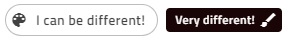
A few examples of how the chip can be even further customized:
Keyboard Navigation
The chip can be focused using the Tab key or by clicking on it. When in chip area chips can be reordered using keyboard navigation:
Keyboard controls when the chip is focused:
LEFT - Moves the focus to the chip on the left.

RIGHT - Moves the focus to the chip on the right.

SPACE - Toggles chip selection if it is selectable.

DELETE - Triggers the
removeevent for theigxChipso the chip deletion can be handled manually.SHIFT + LEFT - Triggers
reorderevent for theigxChipAreawhen the currently focused chip should move position to the left.SHIFT + RIGHT - Triggers
reorderevent for theigxChipAreawhen the currently focused chip should move one position to the right.
Keyboard controls when the remove button is focused:
- SPACE or ENTER Fires the
removeoutput so the chip deletion can be handled manually.
- SPACE or ENTER Fires the
Styling
The igxChip allows styling through the Ignite UI for Angular Theme Library. The chip's theme exposes a wide variety of properties, which allow the customization of many of the aspects of the chip.
Importing global theme
To begin styling of the predefined chip layout, you need to import the index file, where all styling functions and mixins are located.
@import '~igniteui-angular/lib/core/styles/themes/index'
Defining custom theme
Next, create a new theme, that extends the chip-theme and accepts the parameters, required to customize the chip as desired.
$custom-theme: chip-theme(
    $background: #494949,
    $text-color: #e2e2e2,
    $remove-icon-color: #e2e2e2,
    $remove-icon-color-focus: #ffcd0f,
    $hover-text-color: #f2f2f2,
    $selected-background: #ffcd0f,
    $selected-border-color: #ffcd0f,
    $hover-selected-background: #ebbf11,
    $focus-selected-background: #ffcd0f,
    $border-radius: 5px
);
Defining a custom color palette
In the approach, that was described above, the color values were hardcoded. Alternatively, you can achieve greater flexibility, using the palette and color functions.
igx-palette generates a color palette, based on provided primary and secondary colors.
$black-color: #494949;
$yellow-color: #ffcd0f;

$custom-palette: palette(
    $primary: $black-color,
    $secondary: $yellow-color
);
After the custom palette has been generated, the igx-color function can be used to obtain different varieties of the primary and the secondary colors.
$custom-theme: chip-theme(
    $background: color($custom-palette, "primary", 500),
    $text-color:contrast-color($custom-palette, "primary", 500),
    $remove-icon-color:contrast-color($custom-palette, "primary", 500),
    $remove-icon-color-focus: color($custom-palette, "secondary", 500),
    $hover-text-color:contrast-color($custom-palette, "primary", 500),
    $selected-background: color($custom-palette, "secondary", 500),
    $selected-border-color: color($custom-palette, "secondary", 500),
    $hover-selected-background: color($custom-palette, "secondary", 600),
    $focus-selected-background: color($custom-palette, "secondary", 500),
    $border-radius: 5px
);
Defining custom schemas
You can go even further and build flexible structure that has all the benefits of a schema. The schema is the recipe of a theme.
Extend one of the two predefined schemas, that are provided for every component. In our case, we would use $_light_chip.
$custom-chip-schema: extend($_light-chip, (
    background: (igx-color("primary", 500)),
    text-color: (igx-contrast-color("primary", 500)),
    hover-text-color: (igx-contrast-color("primary", 500)),
    remove-icon-color: (igx-contrast-color("primary", 500)),
    remove-icon-color-focus: (igx-contrast-color("secondary", 500)),
    selected-background: (igx-color("secondary", 500)),
    selected-border-color: (igx-color("secondary", 500)),
    hover-selected-background: (igx-color("secondary", 600)),
    focus-selected-background: (igx-color("secondary", 500)),
    border-radius: 5px
));
In order for the custom schema to be applied, either light, or dark globals has to be extended. The whole process is actually supplying a component with a custom schema and adding it to the respective component theme afterwards.
$my-custom-schema: extend($light-schema, (
    igx-chip: $custom-chip-schema
));

$custom-theme: chip-theme(
    $palette: $custom-palette,
    $schema: $my-custom-schema
);
Applying the custom theme
The easiest way to apply your theme is with a sass @include statement in the global styles file:
@include chip($custom-theme);
Scoped component theme
In order for the custom theme to affect only specific component, you can move all of the styles you just defined from the global styles file to the custom component's style file (including the import of the index file).
This way, due to Angular's ViewEncapsulation, your styles will be applied only to your custom component.
Note
If the component is using an Emulated ViewEncapsulation, it is necessary to penetrate this encapsulation using ::ng-deep in order to style the grid.
Note
Wrap the statement inside of a :host selector to prevent your styles from affecting elements outside of our component:
:host {
    ::ng-deep {
        @include chip($custom-theme);
    }
}
Demo
API
References
Our community is active and always welcoming to new ideas. GitHub