Version

Creating Gauge Visualizations

Key Concepts

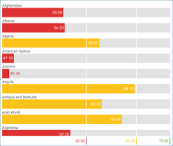
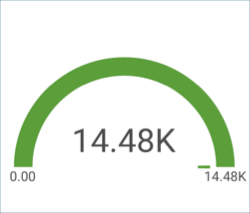
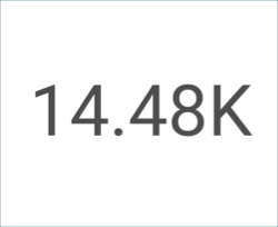
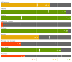
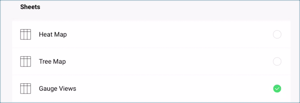
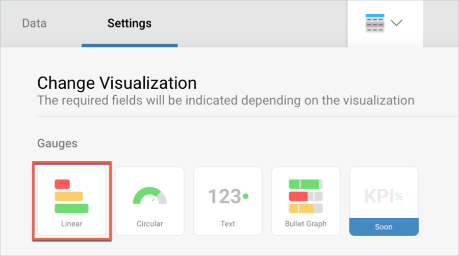
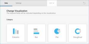
There are three different layouts to choose from when using gauge views:

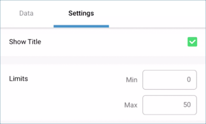
  • Bounds Configuration. The bounds configuration for gauges covers the lowest and highest possible values in your gauges. It is usually set to the lowest value in your data source by default, but you can change it to exclude specific data.

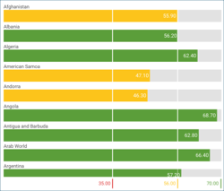
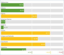
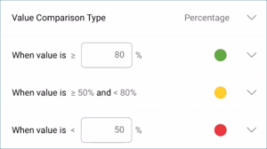
  • Bands Configuration. The bands configuration allows you to establish three different ranges for your information (Higher than, between, and Less than). You can override the default values with ranges tailored to your data source.


Sample Data Source

For this tutorial, you will use the "Gauge Views" sheet in the Reveal Tutorials Spreadsheet.

Note
NOTE

Excel files as local files are not supported in this release. In order to follow these tutorials, make sure you upload the file to one of the supported cloud services or add it as a Web Resource.


Creating a Linear Gauge

1. Create a Dashboard

Tutorials-Create-New-Dashboard

In the dashboard viewer, select the + button in the top right-hand corner of the "My Dashboards" screen. Then, select "Dashboard" from the dropdown.

2. Configure your Data Source

Tutorials-Select-Data-Source

In the New Visualization window, select the + button in the bottom right corner and select your data source.

3. Select the Tutorials Spreadsheet

Tutorials-Select-Gauge-Views

Once the data source is configured, select the Reveal Tutorials Spreadsheet. Then, choose the "Gauge Views" sheet and select Load Data.

4. Open the Visualizations Menu

Tutorials-Select-Change-Visualization

Select the grid icon in the top bar of the Visualizations Editor.

5. Select your Visualization

Tutorials-Select-Linear-Gauge

By default, the visualization type will be set to "Grid". Select the "Linear" gauge.

6. Organize your Data

Tutorials-LinearGauge-Data

This linear gauge, for example, will display life expectancy per Country. Drag and drop the "Country Name" field to "Label" and one of the year fields into "Values".

Creating a Circular Gauge

1. Create a Dashboard

Tutorials-Create-New-Dashboard

In the dashboard viewer, select the + button in the top right-hand corner of the "My Dashboards" screen. Then, select "Dashboard" from the dropdown.

2. Configure your Data Source

Tutorials-Select-Data-Source

In the New Visualization window, select the + button in the bottom right corner and select your data source.

3. Select the Tutorials Spreadsheet

Tutorials-Select-Gauge-Views

Once the data source is configured, select the Reveal Tutorials Spreadsheet. Then, choose the "Gauge Views" sheet and select Load Data.

4. Open the Visualizations Menu

Tutorials-Select-Change-Visualization

Select the grid icon in the top bar of the Visualizations Editor.

5. Select your Visualization

Tutorials-Select-Linear-Gauge

By default, the visualization type will be set to "Grid". Select the "Circular" gauge.

6. Organize your Data

Tutorials-CircularGauge-Data

This radial gauge, for example, will display life expectancy per Country. Drag and drop the "Country Name" field to "Label" and one of the year fields into "Values".

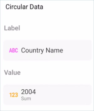
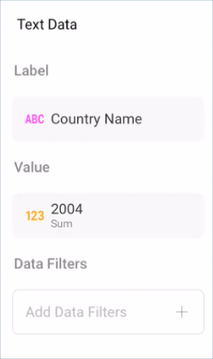
Circular Gauges are particularly useful to show average values as well as sum of values. In order to change the aggregation for the field displayed in Values:

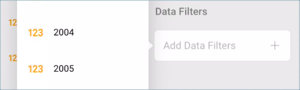
1. Access Field Settings for your Value

Add-Data-Filter-CircularGauge

Select the field in Values to access

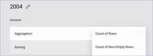
2. Choose a different Aggregation

CircularGauge-Aggregation

Expand the Aggregation dropdown and select a different option (for example, Average).

Creating a Text Gauge

1. Create a Dashboard

Tutorials-Create-New-Dashboard

In the dashboard viewer, select the + button in the top right-hand corner of the "My Dashboards" screen. Then, select "Dashboard" from the dropdown.

2. Configure your Data Source

Tutorials-Select-Data-Source

In the New Visualization window, select the + button in the bottom right corner and select your data source.

3. Select the Tutorials Spreadsheet

Tutorials-Select-Simple-Series-Charts-Spreadshee

Once the data source is configured, select the Reveal Tutorials Spreadsheet. Then, choose the "Gauge Views" sheet.

4. Open the Visualizations Menu

Tutorials-Select-Change-Visualization

Select the grid icon in the top bar of the Visualizations Editor.

5. Select your Visualization

Tutorials-Select-Linear-Gauge

By default, the visualization type will be set to "Grid". Select the "Text" gauge.

6. Organize your Data

Tutorials-TextGauge-Organizing-Data

This text gauge, for example, will display life expectancy per Country. Drag and drop one of the year fields into "Values", and then the "Country Name" field into "Data Filters". Then, select the specific country you want by selecting the field.

The text gauge sample above utilizes the average aggregation. In order to learn how to change your field’s aggregation, review these instructions.

Creating a Bullet Graph

1. Create a Dashboard

Tutorials-Create-New-Dashboard

In the dashboard viewer, select the + button in the top right-hand corner of the "My Dashboards" screen. Then, select "Dashboard" from the dropdown.

2. Configure your Data Source

Tutorials-Select-Data-Source

In the New Visualization window, select the + button in the bottom right corner and select your data source.

3. Select the Tutorials Spreadsheet

Tutorials-Select-Simple-Series-Charts-Spreadshee

Once the data source is configured, select the Reveal Tutorials Spreadsheet. Then, choose the "Gauge Views" sheet.

4. Open the Visualizations Menu

Tutorials-Select-Change-Visualization

Select the grid icon in the top bar of the Visualizations Editor.

5. Select your Visualization

Tutorials-Charts-Select-Visualization

By default, the visualization type will be set to "Grid". Select the "Bullet Graph" visualization.

6. Organize your Data

Tutorials-Charts-Organizing-Data

This bullet graph, for example, will display life expectancy per Country. Drag and drop the "Country Name" field to "Label", one of the years into "Values", and another year into "Target".

Adding Bounds to your Gauge

Bounds allow you to set the lowest and highest values in your gauges; as mentioned in Key Concepts, you can change it to exclude specific data. In order to do this:

1. Change Settings

Tutorials-Navigate-Settings

Go to the Settings section of the Visualization Editor.

2. Change the Default selection in Limits

Tutorials-Limits-Bounds

Depending on whether you want to set the minimum or maximum value (or both), enter the value you want the chart to start or end with.

Changing Band Colors

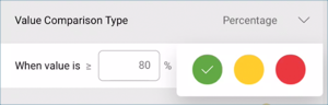
The colors for the three different ranges (Higher than, Lower than and Between) can be changed between the predefined colors. In order to do so:

1. Change Settings

Tutorials-Navigate-Settings

Go to the Settings section of the Visualization Editor.

2. Access the Colors dropdown

Tutorials-Colors-Dropdown

Expand the dropdown of the range for which you want to change the color.

3. Select your Color

Tutorials-Changing-Color

Select one of Reveal’s three predefined colors for your band color.