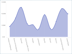
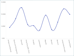
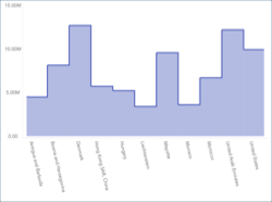
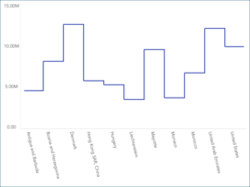
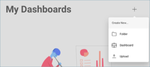
In this tutorial, you will learn how to create a simple-series chart visualization using a sample spreadsheet.
Access the links below for the Simple chart view walkthroughs:
When working with charts, you can add extra information on top of the data you want to display. This comes in the form of:
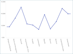
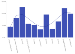
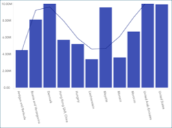
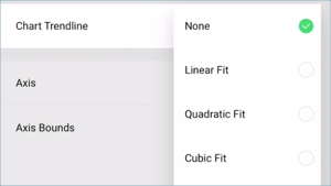
Chart Trendlines, which will display as lines across your chart. These are particularly useful when you want to display the relationship between your variables or the overall direction your information is taking. There are several algorithms, also known as regressions, which you can apply to your charts; you can select them within the Chart Trendline dropdown.
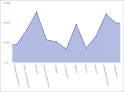
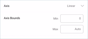
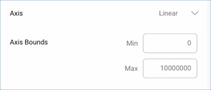
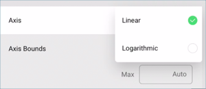
Axis Configuration: the axis configuration lets you configure the minimum and maximum values for your charts. The minimum value is set to 0 by default and the maximum calculated automatically depending on your values.
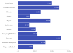
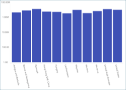
Logarithmic Axis Configuration: if you check the "Logarithmic" checkbox, the scale for your values will be calculated with a non-linear scale which takes magnitude into account instead of the usual linear scale.
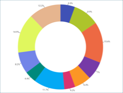
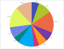
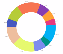
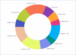
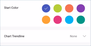
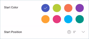
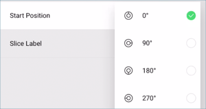
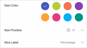
Start Position: for Doughnut and Pie charts, you can configure the start position for the chart to rotate the slices and change the order in which your data is presented.
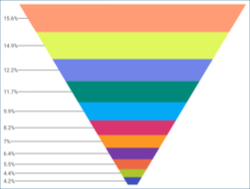
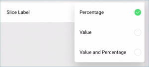
Slice Labels: for Doughnut, Funnel, and Pie Charts, you can change the slice labels to display values, percentages, or both at the same time.
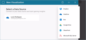
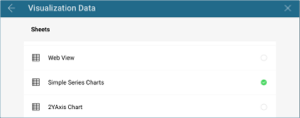
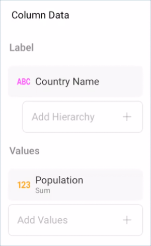
For this tutorial, you will use the "Simple Series Charts" sheet in the Reveal Tutorials Spreadsheet.
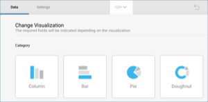
The tutorial above outlines how to create any chart. If you need to choose a different type, more fitted to your needs, go through the following procedure:
You can add a chart trendline to display the relationship between your chart variables, or to display the overall direction of your information. In order to do this:
Similarly to the Gauge bands, the chart axis configuration allows you to set the lowest and highest values in your chart. You can use this feature to include or exclude specific data.