
This topic demonstrates how to add and configure the UltraCarousel items using the control’s design-time interface.
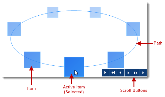
In this topic, you will learn how to add the UltraCarousel control and configure it through the control’s design-time interface. The main components of the carousel control are the Path, Items, and Scroll buttons.
Install the Infragistics WinForms 2014 Volume 2 or later version of the product.
Start with a new Windows Forms application using Visual Studio 2010 or later version.
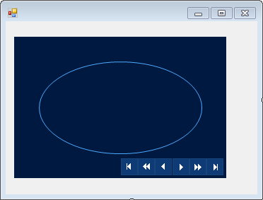
Drag and drop the UltraCarousel control from the Visual Studio toolbox area on to the form. As you can see the control displays the default item path and navigation buttons by default.
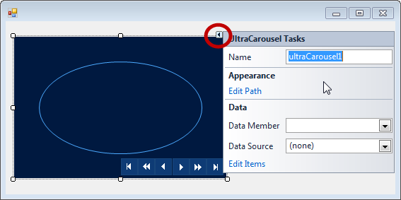
The UltraCarousel control contains a smart tag for optional, initial property settings.
Click on the surface of the control to enable the smart tag indicator (arrow) located in the control’s upper-right corner. The smart tag consists of a drop-down task list containing Name and two sections for Appearance and Data properties for design-time customization.
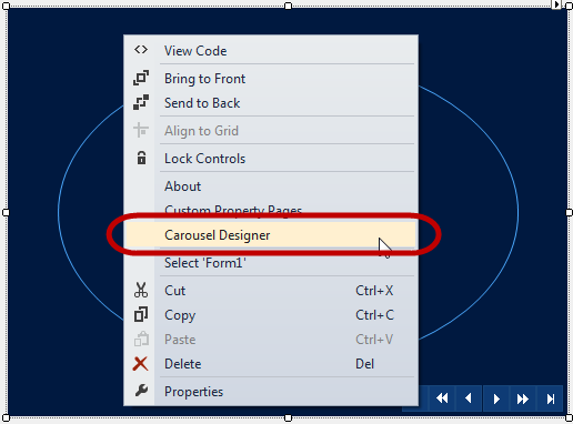
To open the carousel designer simply Right-click on the control’s surface and select “ Carousel Designer ”. Another way to open the carousel designer is through “ Edit Path ” link on the smart tag drop-down, explained in the next section.
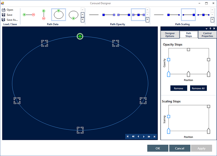
The Path is the continuous track on the control on which the carousel items are rendered. There are various predefined Path types for configuration. The UltraCarousel design-time interface provides a convenient way to interact with those Path properties.
Click the “ Edit Path ” in the Appearance section of the “UltraCarousel Tasks” dialog to open the designer.
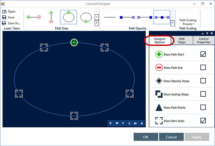
On top of the designer window you may notice three sections (In the screenshot below). Those sections contain predefined templates: Path Data , Path Opacity and Path Scaling for item path configuration.
You can preview the predefined path templates on the control by simply moving the mouse over Path Data icons, and when the icon is clicked that template will be selected.
Similarly, you can preview the opacity and scaling stop positions in the Opacity Stops and Scaling Stops window below it.
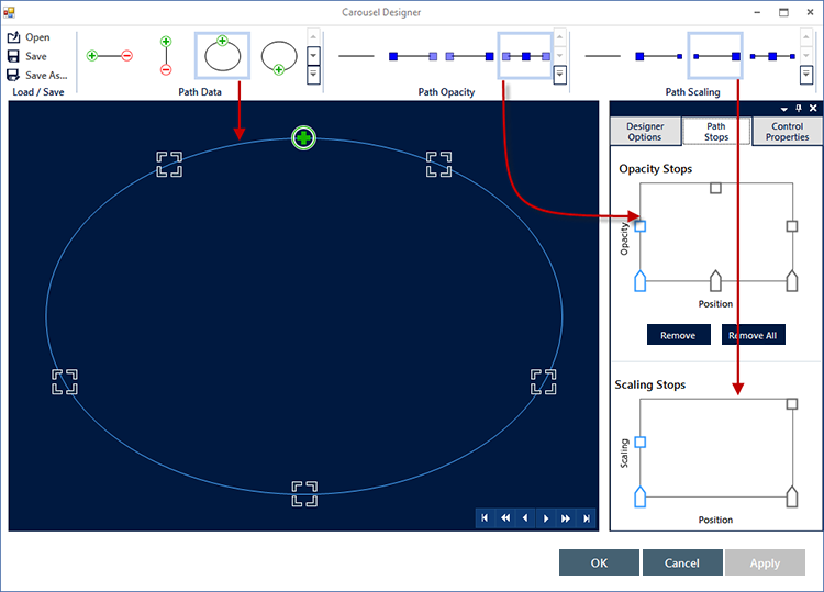
Continue with the following selections illustrated in the screenshot below:
For “ Path Data ” select “ EllipsTop ” by clicking on the icon or use the drop-down.
For “ Path Opacity ” select “ FadeFromMiddle ”.
For “ Path Scaling ” select “ Growing ”.
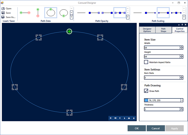
Optionally, you can apply additional configurations, while in designer view, using the “ Control Properties ” tab. You may notice the default Item size is 64x64 (In pixels), item slots (5 slots allocated for five items), and the color of the path.
If the actual items are less than the item slots, blank slots will appear on the path
If the actual items are more than the item slots, the additional items will not render, because there would be no slots allocated for them.
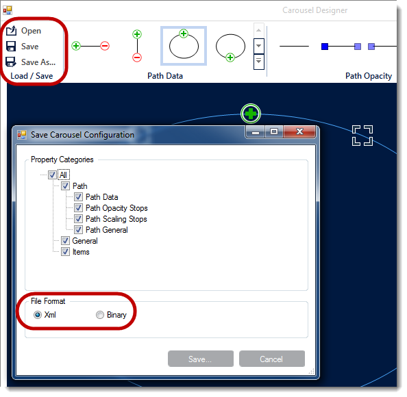
Optionally, configurations can be saved as XML or Binary files and loaded in an application. You can open an existing (previously saved) configuration file in the designer and reuse it for a new project.
The “Designer Options” tab (outlined below) allows to display the path glyphs, which are the ornamental symbols on the path and stop points.
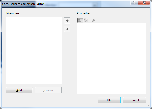
An Item in the UltraCarousel control is the visual representations of the data object. Items can be added using the designer or in code, and also can be bound to a data source. The next screenshot illustrates adding items through the design-time interface.
Click the smart tag on the control and select “Edit Items”. Start adding your first item in the items editor.
After adding your first item, you will notice the Text property, which displays the name on the item. The Settings object exposes more properties for configuration including the Appearance property, which is illustrated in the next screenshot.
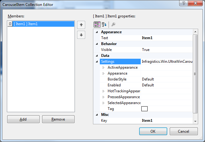
Expand the Settings object, followed by the Appearance object and navigate to the Image property.
Click the ellipses (…) to open a dialog window and import an existing image for the Image property. Click OK to apply the setting, and repeat this step to add four more items.

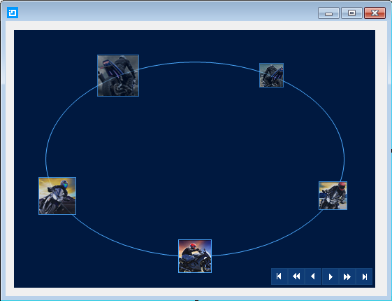
After adding five items, the carousel should look similar to the following screenshot in the designer. Run the application to verify the result.
Adding Carousel Items in Code — This topic demonstrates how to add UltraCarousel items using the Code-Behind.
Binding Data to Carousel in Code |This topic demonstrates binding data to the UltraCarousel in code-behind.
Binding Data to Carousel Using the Designer — This topic will demonstrate with steps, how to set up a data source at design-time, and bind it to the UltraCarousel control.
Save/Load Carousel Layout — This topic demonstrates how to Save/Load the UltraCarousel layout including carousel items, unless the control is bound to data. In that case the control has to be re-bound after loading the saved layout.