
This topic explains how to show/hide the default tooltip and how apply a custom tooltip using DataTemplate in the XamScatterSurface3D™ control.
The following topics are prerequisites to understanding this topic:
This topic contains the following sections:
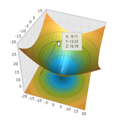
A 2D tooltip is displayed as long as you mouse hover over the xamScatterSurface3D series surface to provide information about X, Y and Z data points coordinates.
Use the XamScatterSurface3D ToolTipVisibility property to show/hide the default tooltip in the xamScatterSurface3D control.
By default, the initial value of the ToolTipVisibility is Visible.
The following table maps the desired configuration to the property settings that manage it.
The screenshot below demonstrates how the xamScatterSurface3D control behaves as a result of the following settings:
Following is the code that implements this example.
In XAML:
<ig:XamScatterSurface3D Name="SurfaceChart"
 ItemsSource="{Binding Path=DataCollection}"
 XMemberPath="X" YMemberPath="Y" ZMemberPath="Z"
 ToolTipVisibility="Visible"/>
In C#:
…
SurfaceChart.ToolTipVisibility = Visibility.Visible;
In Visual Basic:
…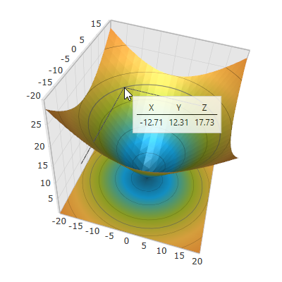
SurfaceChart.ToolTipVisibility = Visibility.VisibleUse the XamScatterSurface3D ToolTipTemplate property to apply a custom tooltip DataTemplate to the xamScatterSurface3D control in order to change its visual appearance.
The runtime DataContext of the created DataTemplate is a SurfaceChartToolTipDataContext object.
The SurfaceChartToolTipDataContext provides a property Location of type Point3D corresponding to the mouse location in 3D space.
Use negative container margins to arrange the tooltip above or left of the mouse location.
The following table maps the desired configuration to the property settings that manage it.
The screenshot below demonstrates how the xamScatterSurface3D control looks as a result of the following settings:
Following is the code that implements this example.
In XAML:
<Grid>
    <Grid.Resources>
        <Style x:Key="TextBlockStyle" TargetType="TextBlock">
            <Setter Property="Margin" Value="4,2"/>
        </Style>
        <Style x:Key="HeaderTextBlockStyle" TargetType="TextBlock" BasedOn="{StaticResource TextBlockStyle}">
            <Setter Property="HorizontalAlignment" Value="Center"/>
        </Style>
        <DataTemplate x:Key="ToolTipTemplate">
            <Border BorderBrush="LightGray" BorderThickness="1" Margin="12" Padding="5" Background="White" Opacity="0.8" >
                <Grid>
                    <Grid.ColumnDefinitions>
                        <ColumnDefinition/>
                        <ColumnDefinition/>
                        <ColumnDefinition/>
                    </Grid.ColumnDefinitions>
                    <Grid.RowDefinitions>
                        <RowDefinition/>
                        <RowDefinition/>
                        <RowDefinition/>
                    </Grid.RowDefinitions>
                    <TextBlock Text="X" Grid.Column="0" Grid.Row="0" Style="{StaticResource HeaderTextBlockStyle}"/>
                    <TextBlock Text="Y" Grid.Column="1" Grid.Row="0" Style="{StaticResource HeaderTextBlockStyle}"/>
                    <TextBlock Text="Z" Grid.Column="2" Grid.Row="0" Style="{StaticResource HeaderTextBlockStyle}"/>
                    <Border BorderBrush="Black" BorderThickness="0.5" HorizontalAlignment="Stretch" Grid.Row="1" Grid.ColumnSpan="3"/>
                    <TextBlock Text="{Binding Location.X, StringFormat=N2}" Grid.Column="0" Grid.Row="2" Style="{StaticResource TextBlockStyle}" />
                    <TextBlock Text="{Binding Location.Y, StringFormat=N2}" Grid.Column="1" Grid.Row="2" Style="{StaticResource TextBlockStyle}"/>
                    <TextBlock Text="{Binding Location.Z, StringFormat=N2}" Grid.Column="2" Grid.Row="2" Style="{StaticResource TextBlockStyle}"/>
                </Grid>
            </Border>
        </DataTemplate>
    </Grid.Resources>
    <ig:XamScatterSurface3D Name="SurfaceChart"
 ItemsSource="{Binding Path=DataCollection}"
 XMemberPath="X" YMemberPath="Y" ZMemberPath="Z"
 ToolTipTemplate="{StaticResource ToolTipTemplate}"/>
</Grid>The following topics provide additional information related to this topic.