
Microsoft® Windows® Presentation Foundation introduced enhanced support for shapes and geometries, built around the Path XAML element. It was only natural that this should lead to a very innovative set of controls from Infragistics that deliver the Carousel View experience. The ItemPath property is fundamental to working with xamCarouselPanel™ and every other control built upon this View (for an overview, see Architecture.
It is easy to see how setting an effective Path can put a smile on your end users' faces. In XAML, you start with the Path element, which will have a Name property set on it that you will use later to reference it from your Carousel-enabled control.In XAML:
<Path Name="smilePath"
  Width="Auto"
  Height="Auto"
  Stretch="Fill"
  Margin="0,0,0,0"
  VerticalAlignment="Top"
  HorizontalAlignment="Left"
  Data="M 12,192 C12,192 61,444 239,444 417,444 487,198 487,198"
  Opacity="1" />
Then, you would assign this Path element to the ItemPath property on the CarouselViewSettings exposed through your control’s ViewSettings property. The example XAML below associates the Path defined above with a xamCarouselPanel control.In XAML:
<igWindows:XamCarouselPanel.ViewSettings>
        <igWindows:CarouselViewSettings
          ItemPath="{StaticResource smilePath}" />
</igWindows:XamCarouselPanel.ViewSettings>
For a step-by-step walkthrough of creating a Path using the Microsoft® Expression® Blend ArtBoard, see Creating a Named Path on the Artboard.
If you are, instead, going to be specifying your Path directly in XAML, then you should consult the .NET Framework 3.0 SDK documentation for the Framework class, System.Windows.Shapes.Path, and its Data property. The documentation for the Data property will connect you to the "PathGeometry Markup Syntax" help topic, also in the .NET Framework 3.0 SDK documentation. At first glance, the syntax for path geometries may look intimidating if you have never used it before, but after gaining more familiarity with its syntax you will be able to edit Paths directly in XAML, if necessary.
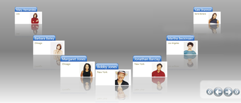
Every Path is defined with a starting and ending point, even if it follows a circular or elliptical course. These starting and ending points are based on the first and last coordinate specified to the Path element’s Data property. Carousel items emerge at one end, move sequentially in front of your end user’s eyes as your end user navigates through the list, and then depart at the opposite end. When the list of items becomes exhausted, the carousel empties. You can avoid this by setting the IsListContinuous on your control’s ViewSettings.
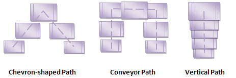
You never have to deal with the smooth, animated movement of the carousel items because the control infrastructure orchestrates this for you. The flexibility of Path definitions frees you to lay out carousel list items in the most optimal way to showcase your data. The image below illustrates a few Path layouts to spark your imagination.
The Path is not merely abstract, it’s styleable. Use the ItemPathRenderPen property to draw the Path, and the ItemPathRenderBrush property to fill the Path. Both of these properties are on your control’s ViewSettings property. These properties allow you to stylize the space beneath the carousel items. The properties can also be used for Path troubleshooting purposes because they enable you to see the actual Path used by the control at run time.
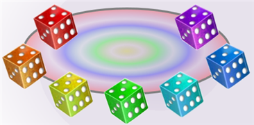
You can specify how many items are shown on the Path at one time using the ItemsPerPage property. As you increase the number of items displayed, they will appear packed more closely together. A decrease in the number of items displayed will space them more widely apart. The following image shows a xamCarouselPanel control displaying five items.
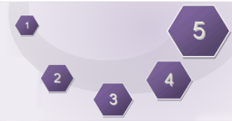
Another alternative for tuning the density of your items' arrangement in the Carousel-enabled controls is by using the ItemPathPrefixPercent and ItemPathSuffixPercent properties. These properties allow you to condense or spread out carousel items along your prescribed Path. You would specify the offset from the starting and ending points of your Path where the carousel items emerge into view. This will effectively shorten the Path length available to carousel items for their layout. In the following image, both of these properties have been increased to their maximum value of 0.4 (40%), and you can see the impact that has on the spacing between carousel items.

ItemPath is one of the most powerful properties in any Carousel-enabled control. The Path you choose significantly impacts your end users' experience with your application.
The next concept you will want to learn is Path Effects, which will allow you to bring your Path to life with transition effects and a real-world workspace feel.