Version

Architecture

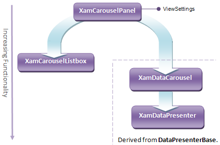
All controls that support the Carousel View build upon a common architectural foundation that you should understand to select the right control for the right task.

Conceptual Carousel Control Diagram

While these controls display items using a Carousel layout by default, they are designed to enable flexible layout of items based on any Path you define. This Path is one of the most fundamental principles of working with these controls because the controls used the Path as a guide along which items move, arrange themselves, and Path Effects take place.

The most basic of the four controls is xamCarouselPanel™, a container that enables its contents to follow the Path. It is the engine for the other controls, as it provides them with all of the properties, methods, and events necessary to support the layout of items along a Path. Each of the other controls use xamCarouselPanel internally to handle item presentation in the Carousel View. The relationship between controls is one of delegation, not inheritance.

This frees the controls to inherit from the most appropriate base class that can give them the greatest benefit in terms of functionality. The xamDataCarousel™ and xamDataPresenter™ controls both derive from the DataPresenterBase class, which enables them to perform more powerful data management based on Records and Fields.

Property Categorization on CarouselViewSettings

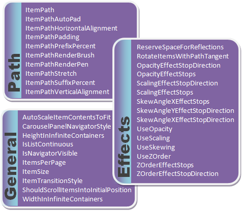
The CarouselViewSettings class is one of the most important properties that the xamCarouselPanel control exposes. Its properties fall into three categories shown in the diagram above. They allow you to exercise fine-grained control over item arrangement and presentation. Every control capable of displaying in Carousel View exposes an object of this type through a property named ViewSettings on the control.

Note
Note

Because of its pluggable view architecture, the xamDataPresenter control exposes this property off of its View, only when the View is a CarouselView.

The following table summarizes the functionality of the controls that support the Carousel View, and describes the usage scenarios to which they apply.

Control Basic Capabilities When Should You Use This Control?

xamCarouselPanel

  • Performs layout of items along a specified path

  • Exposes properties and methods to control the layout

  • Exposes properties for applying various visual effects to individual items to enhance the impact and/or realism of the presentation

  • Supports animated scrolling of items

  • Provides a UI for scrolling one item at a time or one page of items at a time

  • When all you need to do is lay out elements (i.e., when you would normally use any Panel-derived class), but you need to arrange items along a custom path

xamCarouselListBox™

  • Includes all xamCarouselPanel functionality

  • Support for binding to a data source

  • Single selection of items

  • Virtualization of UI elements that represent items to improve performance with large lists of items

  • When you need to bind to a list of data but don’t need the automatic field layout generation capability of xamDataCarousel or xamDataPresenter

  • When you are displaying a large number of items and you want to ensure optimal performance

  • When you need support single selection of items

xamDataCarousel

  • Includes all xamCarouselListBox functionality

  • Support for generating records and fields from the underlying data source

  • Support for automatically generating UI elements for cells and cell labels based on the data structure

  • Support for the display of hierarchical data

  • Support for WPF automation

  • When you need to bind to a list of data and want to avoid manually creating data templates that reflect the structure of your data

  • When you need to bind to and display hierarchical data

xamDataPresenter

  • Includes all xamDataCarousel functionality

  • Support for multiple Views (i.e., UI layouts) including CarouselView (same user experience as xamDataCarousel) and GridView (classic Grid View)

  • Support for dynamically switching between Views at runtime

  • When you need to switch between different Views (i.e., UI layouts) at run time

  • When you need to create your own custom View based on the xamDataPresenter’s custom pluggable View architecture