Version

Configuring Specific Editor Fields (xamDataGrid)

Topic Overview

Purpose

This topic describes an easy and straightforward way of configuring specific editor fields for different data types in the xamDataPresenter™ controls.

Required background

The following topics are prerequisites to understanding this topic:

Topic Purpose

This section defines the major elements that constitute the controls that make up The Data Presenter Family.

This topic describes how to add a xamDataGrid control to your page.

This topic describes how to specify manually FieldLayouts and Fields in the xamDataGrid control.

Specific Editor Fields Summary

Specific editor fields summary

The xamDataPresenter controls provide two ways of defining fields – automatic and manual. In many cases, the preferred way is to specify a particular editor manually.

The different editor fields offer an easy and straightforward way to specify a particular editor to handle the specific data type.

Specific editor fields summary chart

The following table briefly lists the configurable editor fields in the xamDataPresenter controls and maps them to the related class. Further details are available after the table.

Configurable aspect Details Class

Use the CheckBoxField to edit Boolean data type through the xamCheckEditor control.

Use the ComboBoxField to edit items collections through the xamComboEditor control.

Use the CurrencyField to edit currency data through the xamCurrencyEditor control.

Use the DateTimeField to edit DateTime data type through the xamDateTimeEditor control.

Use the MaskedTextField to edit data through the xamMaskedEditor control.

Use the NumericField to edit numeric data through the xamNumericEditor control.

Use the TextField to edit data through the xamTextEditor control.

Configuring CheckBox Field

Overview

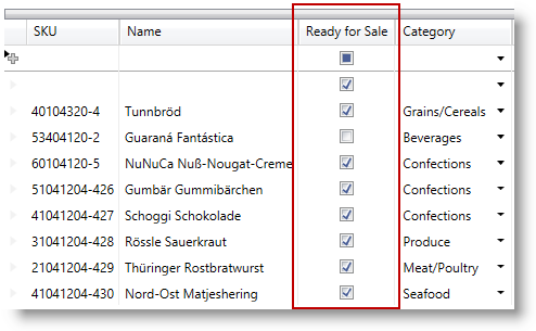
Use a CheckBoxField to represent boolean data in the xamDataPresenter controls.

In this case, the embedded editor is the xamCheckEditor control. For more information about this control, read the xamCheckEditor topic.

For more information about the base Field's properties, read the Fields topic. Some of the specific editor field properties are described in the Property settings section below.

Property settings

The following table maps the desired configuration to the property settings that manage it.

In order to: Use this property: And set it to:

Specify if the check box editor allows three or two checked states.

bool?

By default, the two determined states – checked/unchecked are allowed.

Example

The screenshot below demonstrates the CheckBoxField defined in the xamDataGrid control.

Configuring Editor Specific Fields 1.png

Following is the code that implements this example.

In XAML:

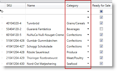
<igDP:CheckBoxField  Name="ReadyForSale" Label="Ready For Sale" />

Configuring ComboBox Field

Overview

Use a ComboBoxField to represent items collections in the xamDataPresenter controls.

In this case, the embedded editor is the xamComboEditor control. For more information about this control, read the xamComboEditor topic.

For more information about the base Field's properties, read the Fields topic. Some of the specific editor field properties are described in the Property settings section below.

Property settings

The following table maps the desired configuration to the property settings that manage it.

In order to: Use this property: And set it to:

Specify the path to the data item property which value will be displayed in the xamComboEditor.

string

Specify whether to display the display text or the value in the edit portion of the xamComboEditor.

By default, the DisplayText is displayed.

Specify when the xamComboEditor dropdown button is displayed.

By default, the dropdown button is Always visible. The other options are Focused, MouseOver and OnlyInEditMode.

Specify whether the user is allowed to resize the xamComboEditor dropdown.

By default, the user can resize the drop down in Both directions – horizontally and vertically.

Specify if the text in the xamComboEditor is editable.

bool?

Specify the xamComboEditor items collection.

IEnumerable

Note
Note

A ComboBoxItemsProvider is internally created to wrap the ItemsSource so that lookups are optimized.

Specify whether to restrict the user input to the items in the items source.

bool?

By default, if the xamComboEditor is editable, user can enter items that are not available in the items collection. If the typed item is found in the items collection, it will be selected.

If you want to restrict the user input, set the LimitToList to true. Use the InvalidValueBehavior property to specify the editor behavior when the user attempts to leave it with an invalid value.

Specify the text to display when the value is null.

string

Specify the maximum drop-down height.

double?

Specify the maximum drop-down width.

double?

Specify the minimum drop-down width.

double?

Specify the path to the data item property which value will be returned when an item is selected.

string

Specify the converter to use for converting between display text and value

IValueConverter

Example

The screenshot below demonstrates the ComboBoxField defined in the xamDataGrid control.

Configuring Editor Specific Fields 2.png

Following is the code that implements this example.

In XAML:

<igDP:ComboBoxField Name="Category" Label="Category"
                    ItemsSource="{Binding Source={StaticResource categories}}"
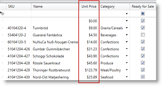
                    DisplayMemberPath="Name" />

Configuring Currency Field

Overview

Use a CurrencyField to represent currency data in the xamDataPresenter controls.

In this case, the embedded editor is the xamCurrencyEditor control. For more information about this control, read the xamCurrencyEditor topic.

For more information about the base Field's properties, read the Fields topic.

Note
Note

The CurrencyField derives from MaskedTextField and therefore inherits all of its properties.

Example

The screenshot below demonstrates the CurrencyField defined in the xamDataGrid control.

Configuring Editor Specific Fields 3.png

Following is the code that implements this example.

In XAML:

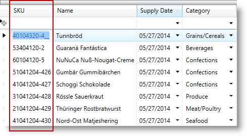
<igDP:CurrencyField Name="UnitPrice" Label="Unit Price" />

Configuring DateTime Field

Overview

Use a DateTimeField to represent DateTime data in the xamDataPresenter controls.

In this case, the embedded editor is the xamDateTimeEditor control. For more information about this control, read the xamDateTimeEditor topic.

For more information about the base Field's properties, read the Fields topic. Some of the specific editor field properties are described in the Property settings section below.

Note
Note

The DateTimeField derives from MaskedTextField and therefore inherits all of its properties.

Property settings

The following table maps the desired configuration to the property settings that manage it.

In order to: Use this property: And set it to:

Specify if the drop down calendar appears to select a date

bool?

Specify when the xamDateTimeEditor dropdown button is displayed.

By default, the dropdown button is Always visible. The other options are Focused, MouseOver and OnlyInEditMode.

Example

The screenshot below demonstrates the DateTimeField defined in the xamDataGrid control.

Configuring Editor Specific Fields 4.png

Following is the code that implements this example.

In XAML:

<igDP:DateTimeField Name="SupplyDate" Label="Supply Date"  />

Configuring Masked Text Field

Overview

Use a MaskedTextField to represent masked data in the xamDataPresenter controls.

In this case, the embedded editor is the xamMaskedEditor control. For more information about this control, read the xamMaskedEditor topic.

For more information about the base Field's properties, read the Fields topic. Some of the specific editor field properties are described in the Property settings section below.

Property settings

The following table maps the desired configuration to the property settings that manage it.

In order to: Use this property: And set it to:

Specify whether to shift characters across section boundaries when deleting characters.

bool?

Default value is true.

Specify whether to auto-fill empty date when the user attempts to leave the editor.

Default value is None.

Specify how the editor content will be copied to the clipboard when data masking is enabled.

Specify how the editor content is stored by the data source when data masking is enabled.

Specify how the editor content is displayed when the control is not in edit mode and data masking is enabled.

Specify the text to display when the value is null.

string

Specify the mask to be applied on the control data

string

Specify the character used as the pad character.

char?

The default pad character is the space character (' ').

Specify the prompt character.

char?

The default prompt character is the underscore (_).

Specify whether to select only the entered characters or all the characters (including prompt characters) when all text selection is performed.

The default value SelectAllCharacters.

Specify when the editor spin buttons are displayed.

By default, the spin buttons are Never visible. The other options are Always, MouseOver, Focused and OnlyInEditMode.

Specify the value to increment/decrement the value of the editor when the up or down spin buttons are clicked.

object

The type of the increment/decrement depends on the data type that is edited in the control.

Specify if the spin buttons should wrap the editor’s value.

bool?

The default value is False.

Specifies whether to trim the insignificant zero’s in fraction part of numeric masks.

bool?

The default value is False.

Specify the converter to use for converting between display text and value

IValueConverter

Example

The screenshot below demonstrates the MaskedTextField defined in the xamDataGrid control.

Configuring Editor Specific Fields 5.png

Following is the code that implements this example.

In XAML:

<igDP:MaskedTextField Name="SKU" Label="SKU" Mask="########-###"/>

Configuring Numeric Field

Overview

Use a NumericField to represent numeric data in the xamDataPresenter controls.

In this case, the embedded editor is the xamNumericEditor control. For more information about this control, read the xamNumericEditor topic.

For more information about the base Field's properties, read the Fields topic. Some of the specific editor field properties are described in the Property settings section below.

Note
Note

The NumericField derives from MaskedTextField and therefore inherits all of its properties.

Example

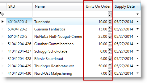
The screenshot below demonstrates the NumericField defined in the xamDataGrid control.

Configuring Editor Specific Fields 6.png

Following is the code that implements this example.

In XAML:

<igDP:NumericField Name="UnitsOnOrder" Label="Units On Order"
                   SpinButtonDisplayMode="Always"
                   SpinIncrement="5"/>

Configuring Text Field

Overview

Use a TextField to represent data in the xamDataPresenter controls.

In this case, the embedded editor is the xamTextEditor control. For more information about this control, read the xamTextEditor topic.

For more information about the base Field's properties, read the Fields topic. Some of the specific editor field properties are described in the Property settings section below.

Property settings

The following table maps the desired configuration to the property settings that manage it.

In order to: Use this property: And set it to:

Specify if pressing the RETURN key creates a new line

bool?

Specify if pressing the TAB key creates a tab character or moves the focus

bool?

Specify the visibility of the horizontal scroll bar

ScrollBarVisibility?

Specify the text to display when the value is null.

string

Specify the horizontal text alignment

TextAlignment?

Specify text wrapping

TextWrapping?

Specify the visibility of the vertical scroll bar

ScrollBarVisibility

Specify the converter to use for converting between display text and value

IValueConverter

Example

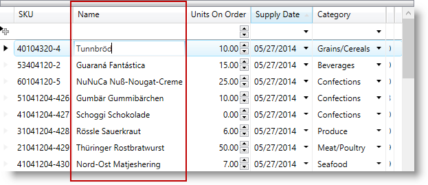
The screenshot below demonstrates the TextField defined in the xamDataGrid control.

Configuring Editor Specific Fields 7.png

Following is the code that implements this example.

In XAML:

<igDP:TextField Name="Name" Label="Name"/>

Related Topics

The following topics provide additional information related to this topic.

Topic Purpose

This topic describes how to define field layouts to specify which fields to display and to set properties related to those fields in the xamDataPresenter controls.

This topic describes how to create a field with a custom display and edit template using a TemplateField in the xamDataPresenter controls.

This topic describes the difference between automatic and manual Fields generation in the xamDataPresenter controls.

This topic describes how you can create multiple FieldLayouts for the xamDataPresenter controls.

This topic describes how to add a Field to display an image overriding the CellValuePresenter’s template in the xamDataPresenter controls.

This topic describes how to load field customizations for the xamDataPresenter controls.

This topic describes how to save field customizations for the xamDataPresenter controls.

This topic describes how to change the layout customizing the Row, Column, ColumnSpan, or RowSpan on each Field to further control the layout of the Record.

This topic describes how to change the Record orientation.

This topic describes how to change the content flow direction.

This topic explains how to configure the controls on the data presenter field editor.