
This topic provides an overview of the visual elements of the xamRadialMenu ™ control.
The following topic is a prerequisite to understanding this topic:
This topic contains the following sections:
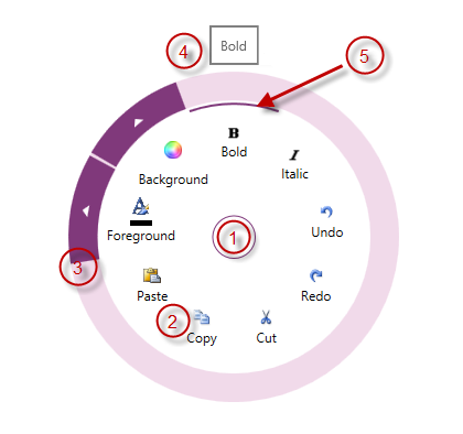
The following screenshot depicts the visual elements of the xamRadialMenu control. Configurable elements are listed after the image.
Configurable Visual Elements:
Center Button – either opens and closes the xamRadialMenu, or allows access to menu items on the previous level.
Items Area – displays the current level menu items in this area.
Outer Ring – the outer most part of the xamRadialMenu, may contain arrows for accessing sub-items
Tooltip – indicates the currently hovered menu item.
Selection Arc – highlights the currently selected menu item and its checked state.
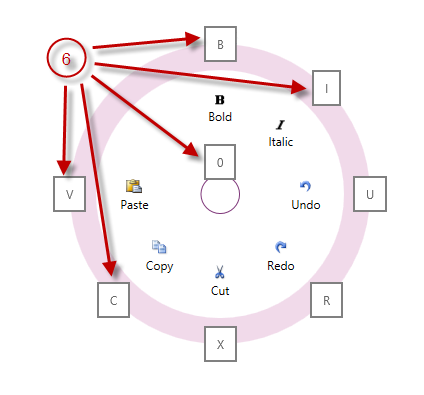
Key Tips – shows the keyboard shortcut for activating each menu item.
The following table maps the visual elements of the xamRadialMenu control and the properties that configure them.
The following topic provides additional information related to this topic.