
This topic explains the features supported by the xamRadialMenu ™ control from developer perspective.
This topic contains the following sections:
The xamRadialMenu™ control is essentially a context menu presenting its items in a circular arrangement around a center button. The circular arrangement of the items speeds up items selection, because each item is equally positioned in relation to the center. The xamRadialMenu supports different item types for choosing numerical values, color values or performs actions. Sub-Items are also supported.
By default the only visible part of the xamRadialMenu is the center button. When the user clicks on the center button, the xamRadialMenu opens and shows the root level menu items. Clicking on the center button when the root level items are shown closes the xamRadialMenu . To navigate Sub-Items the user should click the arrows in the outer ring and the corresponding sub-items group will be displayed. Clicking on the center button when a sub-items group is shown will display the items on the previous level.
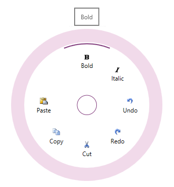
The screenshot below shows an opened xamRadialMenu with 7 items while the mouse hovers above the “Bold” item:
The following table summarizes the main features of the xamRadialMenu control. Additional details are available following the summary table.
Button items can be clicked to perform an action. In addition, button items can be configured to operate as checkbox items (in which case they will have a checked/unchecked state represented by an arc in the outer most part of the items area) or radio button items (in which case their checked state is mutually exclusive with respect to the other items in the radio button group).
There are two types of color items:
Color item – Similar to button items but contains text, an image and a rectangle displaying the selected color
Color well – Displays the selected color in the whole item’s area
There are two types of numeric items:
Numeric item – similar to button items it contains text, images and a dedicated numeric area showing the current value
Numeric Gauge – presents the user with a scale showing the allowed numerical values and needles showing the current value and the pending value
The xamRadialMenu’s list item is similar to the button items; however, when the user navigates to its sub-items, they are rendered in a vertical list.
Because the xamRadialMenu shows its items in a circular way, their number is generally limited (typically 8 slices/wedges) are shown. To provide more options to be available for user selection you can organize items into groups.
All xamRadialMenu’s items support tooltips shown when hovering above the items.
Each xamRadialMenu item supports key tip definitions, thus allowing users to activate items quickly using their keyboard.
By default, the order in which all xamRadialMenu items are displayed is specified in the code; however, you can explicitly order them differently.
The following topics provide additional information related to this topic.