Version

Configuring Tooltips (xamRadialMenu)

Topic Overview

Purpose

This topic explains how to configure the xamRadialMenu ™ items’ tooltips.

Required background

The following topics are prerequisites to understanding this topic:

Topic Purpose

This topic explains the features supported by the control from developer perspective.

This topic provides an overview of the visual elements of the control.

In this topic

This topic contains the following sections:

Introduction

Tooltips summary

XamRadialMenu tooltip is a small visual element shown outside of the menu when a user hovers over a menu item. The tooltip usually contains helpful user information that you can specify using the Tooltip property. If tooltip’s message is not specified it is resolved based on the menu item type as shown in the table below:

Menu item type Default tooltip content

Button item

The content of the Header property (assuming it is not an element).

Numeric item

Color item

List item

Gauge item

The pending value

Color well

The calculated color name

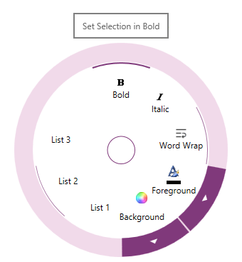
The following is a screenshot showing the xamRadialMenu tooltip:

xamRadialMenu 12.png

Tooltips Configuration Summary

Tooltips configuration summary chart

The following table briefly explains the main configurable aspects of the xamRadialMenu’s tooltips.

Configurable aspect Details Properties

Tooltip

Enable/Disable the item tooltip

Item Tooltip’s content

Set/Obtain the item tooltip content

Tooltip

Item Tooltip’s template

A template you can set to be used for the xamRadialMenu tooltip

Note
Note

The DataContext for this object will be a RadialMenuTooltipContext instance providing the menu item.

Related Content

Topics

The following topics provide additional information related to this topic.

Topic Purpose

This topic explains how to configure the xamRadialMenu control.

This topic explains how to configure the Center Button.

This topic explains how to configure the items’ key tips.