public partial class App : Application
{
    static public int ScreenWidth;
    static public int ScreenHeight;
    static public float ScreenDensity = 1;
    ...
}
This topic is designed to help you understand the concept of responsive layout when a neighboring layout of the XamDataGrid control is resizing.
This topic contains the following sections:
The following topics are prerequisites to understanding this topic:
It may be necessary to modify the width of the XamDataGrid control in your application, due to changes in the dimensions of neighboring layout(s); in such a scenario, you should ensure that the data in your application is presented in such a way that allows for legibility as well as maintaining aesthetics. This example will walk you through the process of implementing a responsive layout behavior with the XamDataGrid control to respond to the conditions in this scenario. The sample will use a Button to change the width of the XamDataGrid control, (by modifying the width of a neighboring view); in response, you will apply the ResponsiveState objects to hide low priority columns from view, (Territory and Sales columns) for maintaining readability for critical data, (Name column).
Before implementing responsive layout behavior, you need to prepare your application projects and save parameters of device’s screen because they will be later used to define ResponsiveState objects of the XamDataGrid control.
In the Portable application project, add this code to define parameters of device’s screen:
In C#:
public partial class App : Application
{
static public int ScreenWidth;
static public int ScreenHeight;
static public float ScreenDensity = 1;
...
}In the .Droid application project, add this code to save parameters of device’s screen:
In C#:
public class MainActivity : FormsAppCompatActivity
{
    protected override void OnCreate(Bundle bundle)
    {
        App.ScreenDensity = Resources.DisplayMetrics.Density;
        App.ScreenWidth   = Resources.DisplayMetrics.WidthPixels;
        App.ScreenHeight  = Resources.DisplayMetrics.HeightPixels;
        ...
    }
}
In the .iOS application project, add this code to save parameters of device’s screen:
In C#:
public partial class AppDelegate : FormsApplicationDelegate
{
    public override bool FinishedLaunching(UIApplication app, NSDictionary options)
    {
        App.ScreenWidth  = (int)UIScreen.MainScreen.Bounds.Width;
        App.ScreenHeight = (int)UIScreen.MainScreen.Bounds.Height;
        ...
    }
}You will need to set up the layouts for the application; this sample uses several nested layouts for controlling and illustrating the XamDataGrid control’s reaction to various width densities by modifying the width of neighbour layouts.
The following diagram illustrates the arrangement of these layouts for clarification:
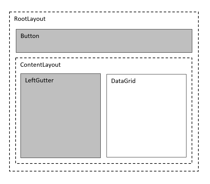
Add the following code to your main view to create above layouts with one XamDataGrid control that will resize in response to changing size of the LeftGutter when a Button is clicked.
In XAML:
<Grid x:Name="RootLayout" Margin="10"  >
    <Grid.RowDefinitions>
        <RowDefinition Height="Auto" />
        <RowDefinition Height="*" />
    </Grid.RowDefinitions>

    <Button x:Name="Button" Text="Change Grid Size"/>

    <Grid x:Name="ContentLayout" Grid.Row="1">
        <Grid.ColumnDefinitions>
            <ColumnDefinition Width="Auto" />
            <ColumnDefinition Width="*" />
        </Grid.ColumnDefinitions>

        <Grid x:Name="LeftGutter" Grid.Column="0"
               MinimumWidthRequest="0"
               MinimumHeightRequest="100"
               BackgroundColor="#FFCBCBCB" />

        <ig:XamDataGrid x:Name="DataGrid" Grid.Column="1"
                        AutoGenerateColumns="False">
            <ig:XamDataGrid.ItemsSource>
                <local:SampleSalesTeam />
            </ig:XamDataGrid.ItemsSource>
            <ig:XamDataGrid.Columns>
                <ig:TextColumn PropertyPath="FirstName" />
                <ig:TextColumn PropertyPath="Territory" />
                <ig:NumericColumn PropertyPath="Sales"  />
            </ig:XamDataGrid.Columns>
        </ig:XamDataGrid>
    </Grid>
</Grid>
Create five variables of type int for storing width dimensions of LeftGutter and the DataGrid:
The XamDataGrid control will be responding to changes in its width; these changes in width are the result of the changing width of a neighboring layout. This scenario will toggle between three discrete widths for this neighboring layout as a percentage of the total width of the screen, for this example they will include 0%, 25% and 50%; the XamDataGrid control in response will have its width reduced to the remaining screen widths of 100%, 75% and 40%, respectively for these three states.
The LeftGutterWidth25 and LeftGutterWidth50 variables will be used to calculate and store the value in pixels of 25% and 50% of the maximum width of the screen which is stored using the ContentMaxWidth variable.
The DataGridWidth1 and DataGridWidth2 variables will be used to calculate and store the remaining available screen width that the XamDataGrid control will assume after it is resized, these values are necessary for setting the range values for the ResponsiveStates.
static int ContentMaxWidth = (int)(App.ScreenWidth / App.ScreenDensity);
static int LeftGutterWidth25 = (int)(ContentMaxWidth * .25);
static int LeftGutterWidth50 = (int)(ContentMaxWidth * .50);
static int DataGridWidth1 = ContentMaxWidth - LeftGutterWidth25;
static int DataGridWidth2 = ContentMaxWidth - LeftGutterWidth50;
Add the following code to handle Click event for the button that will toggle through three width values of the XamDataGrid control, (in incremental widths of 100%, 50% and 25%) which are relatively proportional to the total width available on the screen.
In C#:
Button.Clicked += Button_Clicked;
...
private void Button_Clicked(object sender, EventArgs e)
{
    // Condition 1: if LeftGutter has its default width
    // then set its width to LeftGutterStop: 25% of screen width
    if (LeftGutter.Width <= 0)
    {
        LeftGutter.WidthRequest = LeftGutterWidth25;
    }
    // Condition 2: if LeftGutter's width is equal to LeftGutterWidth25
    // then set its width to LeftGutterWidth50: 50% of screen width
    else if (LeftGutter.Width == LeftGutterWidth25)
    {
        LeftGutter.WidthRequest = LeftGutterWidth50;
    }
    // Condition 3: if LeftGutter's width is equal to LeftGutterWidth50
    // then set its width to  default state of 0
    else if (LeftGutter.Width == LeftGutterWidth50)
    {
        LeftGutter.WidthRequest = 0;
    }
}
Add a helper method for creating ResponsivePhase objects as is demonstrated in code below:
In C#:
private ResponsivePhase CreatePhase(string columnName, string propertyName, object value)
{
    var setter = new ColumnPropertySetter()
    {
        ColumnName = columnName,
        PropertyName = propertyName,
        Value = value,
    };
    return new ResponsivePhase().AddColumnPropertySetter(setter);
}
Create the first ResponsiveState which will be used as the default state of the XamDataGrid control, prior to any adjustments to its width.
This responsive state will activate when the XamDataGrid control’s width is within the range of DataGridWidth1 to ContentMaxWidth values and display the Territory and Sales columns.
In C#:
var state1 = new ResponsiveState();
state1.MaximumWidth = ContentMaxWidth;
state1.MinimumWidth = DataGridWidth1 + 1;
state1.AddResponsivePhase(CreatePhase("Territory", "IsHidden", false));
state1.AddResponsivePhase(CreatePhase("Sales", "IsHidden", false));
Create the second ResponsiveState which will be used when the XamDataGrid control is resized to a width range between DataGridWidth1 and DataGridWidth2 and hide the Sales column.
In C#:
var state2 = new ResponsiveState();
state2.MaximumWidth = DataGridWidth1;
state2.MinimumWidth = DataGridWidth2 + 1;
state2.AddResponsivePhase(CreatePhase("Territory", "IsHidden", false));
state2.AddResponsivePhase(CreatePhase("Sales", "IsHidden", true));
Create the third ResponsiveState which will be used when the XamDataGrid control is resized to a width less than DataGridWidth2 and hide both Territory and Sales columns.
In C#:
var state3 = new ResponsiveState();
state3.MaximumWidth = DataGridWidth2;
state3.MinimumWidth = 0;
state3.AddResponsivePhase(CreatePhase("Territory", "IsHidden", true));
state3.AddResponsivePhase(CreatePhase("Sales", "IsHidden", true));
Add all three ResponsiveState objects to the XamDataGrid control as shown in this code snippet:
In C#:
DataGrid.ResponsiveStates.Add(state1);
DataGrid.ResponsiveStates.Add(state2);
DataGrid.ResponsiveStates.Add(state3);
Save and run your application to verify the responsive layout behavior of the XamDataGrid control.
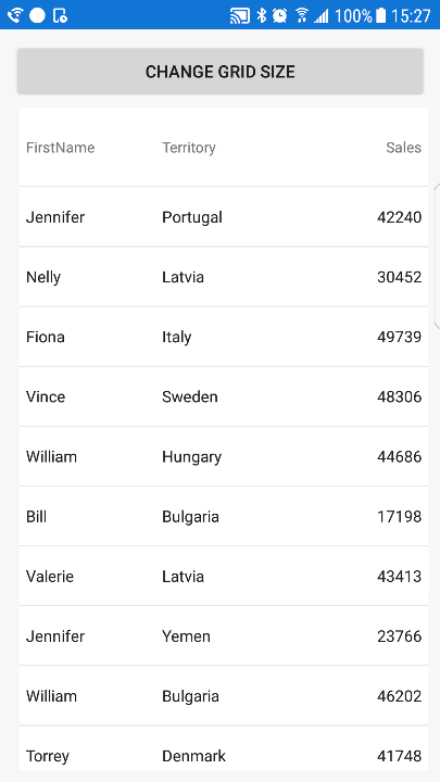
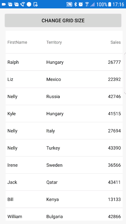
The following animated graphic demonstrates how the XamDataGrid control’s layout responses when width of a neighboring layout (LeftGutter) changes three times.
Initially, the LeftGutter has zero width and the DataGrid shows all three columns, (Name, Territory, Sales) which represents the first responsive state.
Then width of LeftGutter increases to 25% of the screen’s width; this triggers the second responsive state which hides the Sales column.
After another width increase, the LeftGutter occupies 50% of the screen’s width and the third responsive state triggers hiding of the Territory column.
Finally, width of LeftGutter resets back to zero and the first responsive state triggers to show again both Territory and Sales columns.
You can also apply animations to the grid to show smooth transitions between responsive states. For example, applying fade out animation for column hiding operation in the data grid:
In XAML:
<ig:XamDataGrid x:Name="DataGrid" ColumnHidingAnimationMode="FadeOut">
...
</ig:XamDataGrid>
In C#:
DataGrid.ColumnHidingAnimationMode = ColumnHidingAnimationMode.FadeOut;This animated graphic shows how the XamDataGrid control’s layout responses with addition of animating column hide operation.
The following table lists topics that are related to this topic: