
This topic contains the following sections:
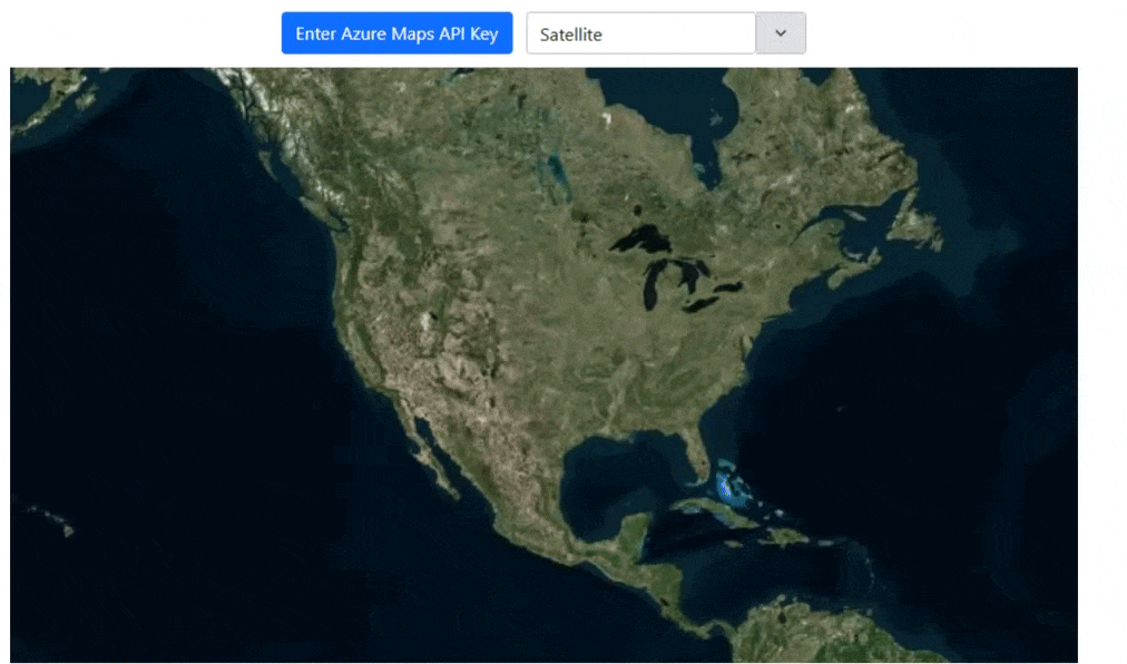
The XamGeographicMap now supports Azure-based map imagery, allowing developers to display detailed, dynamic maps across multiple application types. You can combine multiple map layers, visualize geographic data, and create interactive mapping experiences with ease.
Note: Support for Bing Maps imagery is being phased out. Existing enterprise keys can still be used to access Bing Maps, ensuring your current applications continue to function while you transition to Azure maps.
Explore some of the publicly available Azure maps here: Azure Maps.
The following events have been added to the XamDataChart to allow you to detect different operations on the axis labels:
LabelMouseDown
LabelMouseUp
LabelMouseEnter
LabelMouseLeave
LabelMouseMove
LabelMouseClick
We have added CompanionAxis properties to the X and Y axis that allow you to quickly create a clone of an existing axis. When enabled using the CompanionAxisEnabled property, this will default the cloned axis to the opposite position of the chart and you can then configure that axes' properties.
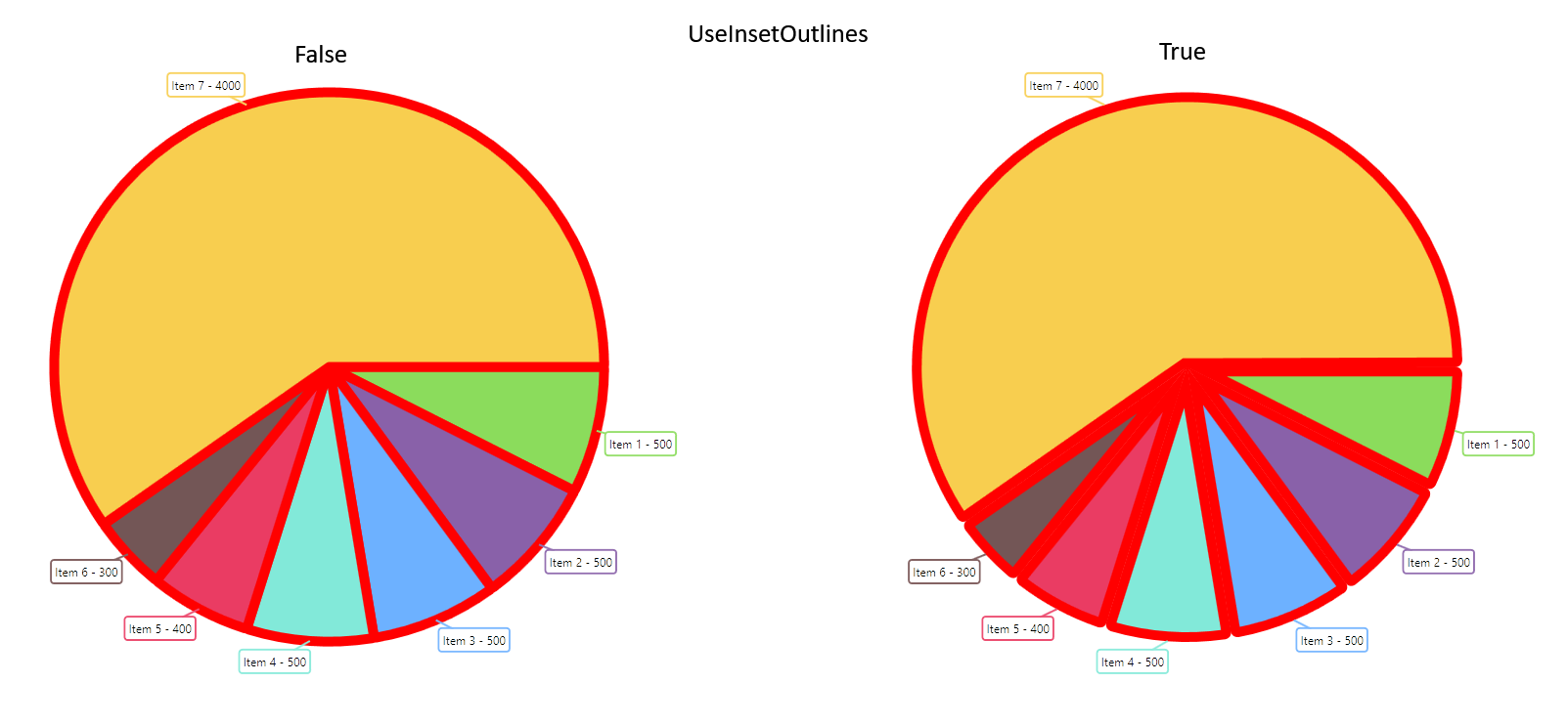
We have added a new property called UseInsetOutlines to control how outlines on the RadialPieSeries are rendered. Setting this value to true will inset the outlines within the slice shape, whereas a false (default) value will place the outlines half-in half-out along the edge of the slice shape.
Added new LabelsVisible property (Beta)
New properties added to the DataToolTipLayer, ItemToolTipLayer, and CategoryToolTipLayer to aid in styling: ToolTipBackground, ToolTipBorderBrush, and ToolTipBorderThickness
New properties added to the DataLegend to aid in styling: ContentBackground, ContentBorderBrush, and ContentBorderThickness. Note, you can still style the DataLegend using previously existing Background, BorderBrush, and BorderThickness properties, but these new properties will take precedence. Both of these related BorderBrush and BorderThickness default to transparent and 0 respectively, so to see these borders, you will need to set these properties.
Added a new property to ChartMouseEventArgs called WorldPosition that provides the world relative position of the mouse. This position will be a value between 0 and 1 for both the X and Y axis within the axis space.
Added HighlightingFadeOpacity to SeriesViewer and DomainChart. This allows you to configure the opacity applied to highlighted series.
Expose CalloutLabelUpdating event for domain charts.
Added new LabelsVisible property (Beta)
Add MaximumExtent and MaximumExtentPercentage properties to Axis Labels (Beta)
The DataAnnotationBandLayer is a new annotation layer that displays over the series.
The full documentation topics for the DataAnnotationBandLayer can be found at the following links:
The DataAnnotationLineLayer is a new annotation layer that displays over the series.
The full documentation topics for the DataAnnotationLineLayer can be found at the following links:
The DataAnnotationRectLayer is a new annotation layer that displays over the series.
The full documentation topics for the DataAnnotationRectLayer can be found at the following links:
The DataAnnotationSliceLayer is a new annotation layer that displays over the series.
The full documentation topics for the DataAnnotationSliceLayer can be found at the following links:
The DataAnnotationStripLayer is a new annotation layer that displays over the series.
The full documentation topics for the DataAnnotationStripLayer can be found at the following links:
The XamDataLegend and DataToolTipLayer elements now expose a LayoutMode property that you can use to layout the legend in either a table or vertical structure. More information on this can be found in the respective topics for this documentation linked below:
There is a new enumeration for the DefaultInteraction property on the chart named DragSelect. This will use the preview Rect of the chart to select points of a series.
The following series types now support overlaying text for additional annotation in the chart by using the new OverlayText property:
In addition to to the series types mentioned, the new data annotation layers listed above also support this feature.
You can configure how this overlay text appears in aspects such as angle, color, background, padding, margin, font, etc. by using the many OverlayText-prefixed properties. For example, OverlayTextBrush will configure the color.
The TrendlineLayer is a new series type that allows you to apply a single trend line per trend line layer to a particular series. This allows the usage of multiple trend lines on a single series since you can have multiple TrendlineLayer series types in the chart.
The XamDashboardTile now supports propagating the aggregations from its DataGrid view to the chart visualization such as sorting, grouping, filtering and selection.
This is currently supported by binding the ItemsSource of the XamDashboardTile to an instance of LocalDataSource.
Value layers added from the XamToolbar now appear on the Legend.
The zoom reset tool has been moved to the zoom drop-down.
The chart now exposes a GetOthersContext() method. This will return the contents of the others slice.
As of version 2024.2, the Ultimate UI for WPF toolset supports .NET 9. For more information on .NET 9 please refer to this article on Microsoft’s site.
With this release and per the Microsoft .NET lifecycle, we no longer support .NET 3.1, .NET 5, or .NET 7.
The XamDashboardTile component is a container control that analyzes and visualizes a bound ItemsSource collection or single point and returns an appropriate data visualization based on the schema and count of the data. This control utilizes a built-in XamToolbar component to allow you to make changes to the visualization at runtime, allowing you to see many different visualizations of your data with minimal code.
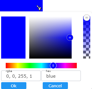
This new editor can be used as a standalone color picker and is now integrated into the XamToolbar component to update visualizations at runtime.
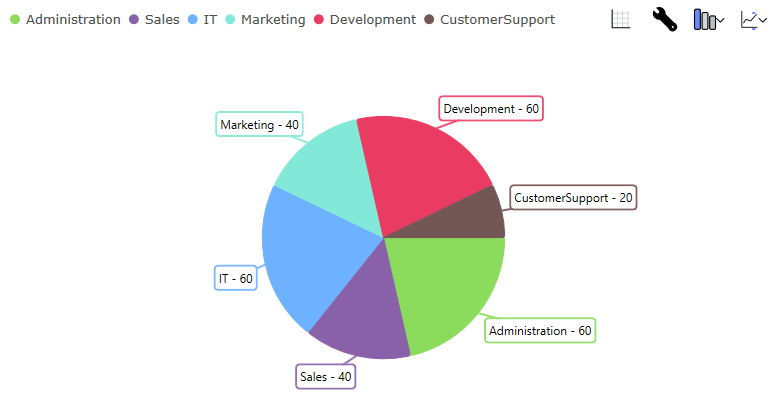
The XamDataPieChart is a new component that renders a pie chart. This component works similarly to the XamCategoryChart, in that it will automatically detect the properties on your underlying data model while allowing selection, highlighting, animation and legend support via the ItemLegend component.
The full documentation for the XamDataPieChart can be found using the link below:
New XamDataChart grouping feature added. The property GroupRowVisible toggles grouping with each series opting in can assign group text via the DataLegendGroup property. If the same value is applied to more than one series then they will appear grouped. Useful for large datasets that need to be categorized and organized for all users.
New series selection. This is adopted broadly across all category, financial and radial series for XamCategoryChart and XamDataChart. Series can be clicked and shown a different color, brightened or faded, and focus outlines. The colors can be modified via the SelectionBrush and FocusBrush` properties. Manage which items are effected through individual series or entire data item. Multiple series and markers are supported. Useful for illustrating various differences or similarities between values of a partcular dataitem. Also SelectedSeriesItemsChanged event and SelectedSeriesItems are available for additional help to build out robust business requirements surrouding other actions that can take place within an application such as a popup or other screen with data analysis based on the selection. In addition, you can read the selected items via the SelectedSeriesItems collection.
New axes for the Radial Pie Series in the XamDataChart, to enable creating pie charts in the allowing robust visualizations using all the added power of the data chart.
New label for the highlight needle. HighlightLabelText and HighlightLabelSnapsToNeedlePivot and many other styling related properties for the HighlightLabel were added.
New IsHighlighted option for ToolAction for outlining a border around specific tools of choice.
The plot area for polar and radial series is now expanded to fill the entire chart space and is no longer forced to be square, this allows for labels to expand into the bleed area.
As of the 23.2 April release, the XamFunnelChart has a highlighting overlay. It exposes this overlay through multiple highlighting properties, namely HighlightedItemsSource, HighlightValueDisplayMode, HighlightedValueMemberPath, and HighlightingOpacity.
When the HighlightValueDisplayMode is set to Overlay, this works in tandem with the HighlightedItemsSource and HighlightedValueMemberPath to provide a highlighted overlay the displays the difference between the values in the chart’s ItemsSource and the HighlightedItemsSource. You can control the opacity of the highlight overlay with the HighlightingOpacity property.
The XamRadialGauge, XamLinearGauge, and XamBulletGraph now expose HighlightValue and HighlightValueDisplayMode properties.
In the XamRadialGauge and XamLinearGauge, when provided a value and a HighlightValueDisplayMode of Overlay, this will make the main needle appear faded and an additional needle will appear.
In the XamBulletGraph, the performance bar will now reflect a difference between the value and the HighlightValue when the HighlightValueDisplayMode is set to Overlay. The highlighted value will show a filtered/subset measured percentage as a filled-in color while the remaining bar’s appearance will be faded to the assigned value.
The CategoryAngleAxis for the XamDataChart now exposes a LabelMode property that allows you to further configure the location of the labels. This allows you to toggle between the default mode by selecting the Center enum, or use the new mode, ClosestPoint, which will bring the labels closer to the circular plot area.
The XamRadialGauge now has the ability to change its scaling for its labels, subtitle and title. This is done by setting the OpticalScalingEnabled property to true. Then, you can set the OpticalScalingSize which manages the size at which labels have 100% optical scaling. Essentially, labels will have larger fonts when the gauge’s size is larger.
For example, labels will have a 200% larger font size when this property is set to 500 and the gauge size is 1000.
New title and subtitle properties for the XamRadialGauge are now available. TitleText and SubtitleText will show the corresponding title near the bottom the gauge. In addition, various title and subtitle font properties were added such as TitleFontSize, TitleFontFamily, TitleFontStyle, TitleFontWeight and TitleExtent. Finally, the new TitleDisplaysValue will allow the value to correspond with the needle’s position.
As of version 2023.2, the Ultimate UI for WPF toolset supports .NET 8. For more information on .NET 8 please refer to link: this article on Microsoft’s site.
The XamCategoryChart and XamDataChart now expose a way to highlight and animate in and out of a subset of data. The display of this highlight depends on the series type. For column and area series, the subset will be shown on top of the total set of data where the subset will be colored by the actual brush of the series, and the total set will have a reduced opacity. For line series, the subset will be shown as a dotted line.
This feature includes a new filter syntax that is OData-like that you can use with the XamCategoryChart.
The following documentation describes the various ways that you can apply the highlight filter to the chart controls.