
This topic provides a brief overview on how to style the series of the XamDataChart™ control and demonstrates, as an example, how to apply drop-shadow effect to the series.
The following topics are prerequisites to understanding this topic:
This topic contains the following sections:
The series XamDataChart can be styled in many aspects, the main of which are applying different fill and outline brushes to the series. This is managed by the Brush and Outline properties of the series. Some other aspects of the series’ look-and-fill, such as the thickness of the outline and the opacity of the series, are configurable, too through the Thickness and Opacity properties of the series.
Because the Series class used for the XamDataChart XamDataChart.Series collection is inherited from the Control class, it, too, exposes an Effect property. The property applies a visual effect to the series visual. The following table maps supported visual effects to the Effect property settings that configure them.
Each of the effects can be configured by changing the settings of the effect’s properties. The blur effect can be configured in terms of radius of the blur and the curve used to calculate the blur. The drop-shadow effect can be customized by changing the shadow color, its opacity, direction, offset and blur.
There are two alternative ways to apply drop-shadow effect to the series:
Through the Effect property of the Series class
Through the IsDropShadowEnabled property of the series
Effect property of the Series classSet the Effect property of the Series class to a DropShadowEffect instance. The drop-shadow effect is applied out-of-the-box and further customization is possible through customizing the DropShadowEffect instance.
IsDropShadowEnabled property of the seriesSet the IsDropShadowEnabled property of the series to "true" . Customization of the effect in terms of changing its blur radius, color, direction, depth, and opacity is supported through the respective shadow-related properties of the Series (See Property settings and the example for details.).
The default drop-shadow effect differs depending on the series type.
The following table lists the configurable aspects of the drop-shadow effect (when applied through the IsDropShadowEnabled property of the series) to their respective property settings. Note that for these settings to be effective, the Effect property of the series must not be set.
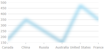
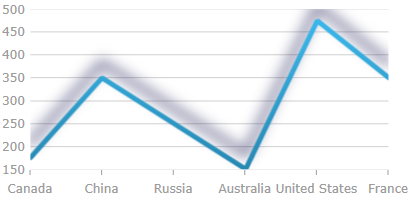
This example demonstrates applying drop-shadow through the IsDropShadowEnabled property of the series. The screenshot below demonstrates how a line series in a XamDataChart control looks as a result of the following shadow-related settings:
Following is the code snippet for setting the shadow related properties of a chart’s line series:
In XAML:
…
<ig:LineSeries IsDropShadowEnabled="True"
               ShadowBlur="20"
               ShadowColor="DarkBlue"
               ShadowDepth="15"
               ShadowDirection="90"
               ShadowOpacity="0.8"
               Thickness="5"
               …
>
…
In Visual Basic:
…
Dim lineSeries = New LineSeries()
lineSeries.IsDropShadowEnabled = True
lineSeries.ShadowBlur = 20
lineSeries.ShadowColor = new SolidColorBrush("DarkBlue")
lineSeries.ShadowDepth = 15
lineSeries.ShadowDirection = 90
lineSeries.ShadowOpacity = 0.8
lineSeries.Thickness = 5
…
In C#:
…
LineSeries lineSeries = New LineSeries();
lineSeries.IsDropShadowEnabled = True;
lineSeries.ShadowBlur = 20;
lineSeries.ShadowColor = new SolidColorBrush("DarkBlue");
lineSeries.ShadowDepth = 15;
lineSeries.ShadowDirection = 90;
lineSeries.ShadowOpacity = 0.8;
lineSeries.Thickness = 5;
…
The following material (available outside the Infragistics family of content) provides additional information related to this topic.