
This topic gives a brief overview of the new controls and features introduced in the Ultimate UI for WPF 2017 Volume 2 Release. The main features are listed below and the following sections explain them in details.
New Control - xamShapeChart (RTM)
New Control - xamScatterChart (CTP)
New Scatter Series - xamDataChart
New TimeXAxis - xamDataChart
New Theme - Royal Light Theme
The SimpleTextBlock which is found in the editor templates found in cell templates now uses GlyphRun instead of FormattedText. This leads to significant performance improvements when rendering the cell’s text. For more details, please see Performance Optimizations Overview (xamDataPresenter) topic
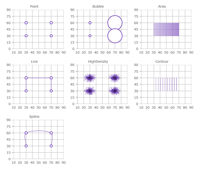
The XamShapeChart is a lightweight, highly performant chart. This chart can be easily configured to display scatter X/Y points or data items with at least 2 numeric data columns. The chart can also plot data from shape files as either Polygon or Polyline visualizations. Also, you can plot any custom shape by using an list of lists of Point objects with X/Y properties.
The XamShapeChart control is using a smart data adapter in order to analyze bound data and select an appropriate visualization to render. For example, if the ChartType property is set to Auto and the data set contains three numeric data columns named X, Y, and Radius then a bubble chart will be plotted. Or if the 3d numeric column is Value instead of Radius then the chart will choose to draw a colored surface using a triangulation of X and Y coordinates with a numeric value assigned to each pixel of the surface. However, it is possible to specify which chart type the XamShapeChart will use by setting the ChartType property to one of the following values: Area,Bubble,Contour,HighDensity,Point,Line, Spline, Polygon, or Polyline. For more details, please see Getting Started with XamShapeChart topic

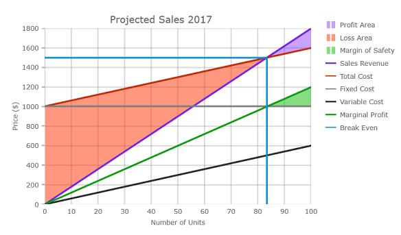
In addition, the Shape Chart can render break-even data as long as at least one data item has FixedCost, VariableCost, SalesRevenue, and SalesUnits data columns. The following screenshot displays the shape chart control bound to break-even data. For more details, please see Binding Break-Even Data in XamShapeChart topic
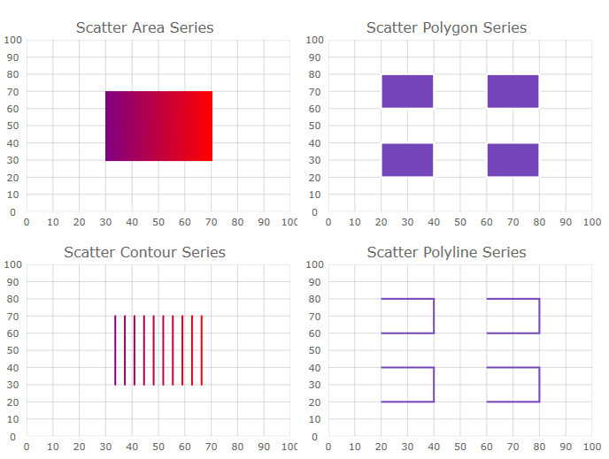
The xamScatterChart is also lightweight, high performance chart with an extremely simple and intuitive API. The main difference from the XamShapeChart control, is that it does not support complex visualizations such as Polygon and Polyline but rather just simple visualizations (Area,Bubble,Contour,HighDensity,Point,Line, and Spline) that you can use to display X/Y data (either as a collection or a collection of collections) and the chart will take care of everything else.
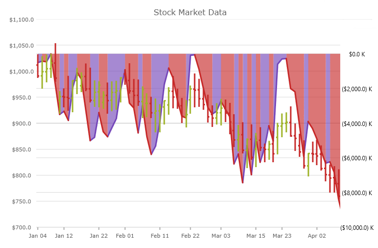
There are 4 new types of scatter series added to the XamDataChart control. The following image show preview of these series, followed by a table with their description with links to topics that explain them in details.
A new axis, TimeXAxis, is added to the XamDataChart this release. By default, this axis will automatically apply label formats which dynamically change as the user zooms into data. In addition, axis breaks may be configured to omit dates within a range. For example, weekends can be skipped, or any range of dates considered insignificant can be skipped. The axis can also be configured to override the default label-formatting scheme for custom configuration of labels at varying visible date ranges. For more details, please see Using Time X-Axis topic
The Royal Light theme is a consistent and simplified new theme enriched with more visual states, featuring improved UX and light colors.
Featured Colors:

xamDataGrid
xamSpreadsheet

xamRibbon
Related topics:
Themes
MS Controls Implicit Themes