Version

Creating OHLC Visualizations

In this tutorial, you will learn how to a OHLC chart visualization using a sample spreadsheet.

Access the links below for the OHLC chart view walkthroughs:


Key Concepts

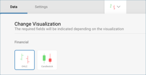
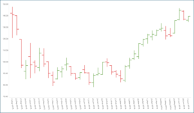
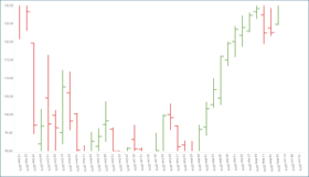
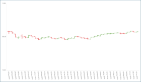
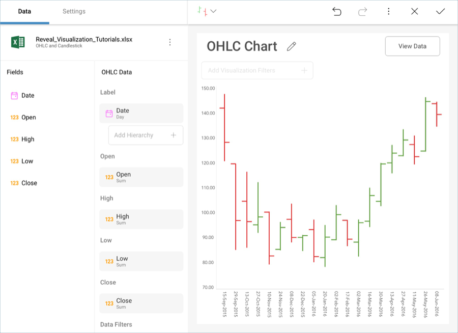
Like Candlestick Charts, OHLC charts are meant to show the opening, high, low and closing prices for any financial data. They are particularly useful for financial scenarios and stock movement analysis. This chart displays numerical values in vertical axes, with the two horizontal lines in each vertical axis representing the "Open" and "Close" values.

OHLC charts, therefore, require:

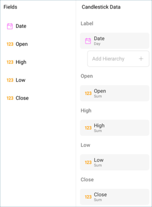
  • One field to be dropped into the "Label" placeholder of the data editor, generally related to dates.

  • Four different fields in the "Open", "High", "Low", and "Close" categories of the data editor.

OHLCChartVisualizationSettings_All

There are also different options to add further information to your chart:

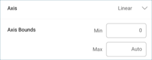
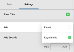
  • Axis Configuration: the axis configuration lets you configure the minimum and maximum values for your charts. The minimum value is set to 0 by default and the maximum calculated automatically depending on your values.

  • Logarithmic Axis Configuration: if you check the "Logarithmic" checkbox, the scale for your values will be calculated with a non-linear scale which takes magnitude into account instead of the usual linear scale.


Sample Data Source

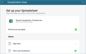
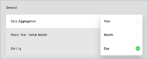
For this tutorial, you will use the "OHLC and Candlestick" sheet in the Reveal Tutorials Spreadsheet.

Note
NOTE

Excel files as local files are not supported in this release. In order to follow these tutorials, make sure you upload the file to one of the supported cloud services or add it as a Web Resource.


Creating a OHLC Chart

1. Create a Dashboard

Tutorials-Create-New-Dashboard

In the dashboard viewer, select the + button in the top right-hand corner of the "My Dashboards" screen. Then, select "Dashboard" from the dropdown.

2. Configure your Data Source

Tutorials-Select-Data-Source

In the New Visualization window, select the + button in the bottom right corner and select your data source.

3. Select the Tutorials Spreadsheet

Tutorials-Select-OHLC-Candlestick-Charts-Spreadsheet

Once the data source is configured, select the Reveal Tutorials Spreadsheet. Then, choose the "OHLC and Candlestick" sheet.

4. Open the Visualizations Menu

Tutorials-Select-Change-Visualization

Select the grid icon in the top bar of the Visualizations Editor.

5. Select your Visualization

Tutorials-Charts-Select-OHLC-Chart

By default, the visualization type will be set to "Grid". Select the OHLC.

6. Organize your Data

Tutorials-TextView-Organizing-Data

Drag and drop the "Date" field into "Label" and the "Open", "High", "Low" and "Close" fields in their corresponding placeholder.

7. Change the Date Aggregation

Tutorials-CandlestickChart-Changing-Aggregation

Select the Date field in the Label placeholder of the data editor, and change the Date Aggregation to Day. Then, select Update Field.


Changing your Axis Configuration

Like gauge bounds, chart axis configuration allows you to set the lowest and highest values in your chart. You can use this feature to include or exclude specific data.

In order to access the axis configuration menu:

1. Access the Settings Menu

Tutorials-Navigate-Settings

Go to the Settings section of the Visualization Editor.

2. Navigate to the Axis Bounds section

Tutorial-Access-Axis-Configuration

The settings you will change will be the Axis Bounds.

Depending on whether you want to set the minimum or maximum value (or both), you will need to access one of the following options:

Changing the Minimum Bound

The default value is set to "0". In order to set a different bound, enter the value you want the chart to start with.

Changing the Maximum Bound

For Maximum bounds, the default will be set to "Automatic" so that Reveal uses your original data. In order to set a different one, enter the value you want for the chart’s top limit.


Setting your Axis Configuration as Logarithmic

1. Access the Settings Menu

Tutorials-Navigate-Settings

Go to the Settings section of the Visualization Editor.

2. Change the Axis to Logarithmic

Tutorial-Access-OHLC-Axis-Configuration

Open the Axis dropdown and select Logarithmic.