Version

Configuring the Background (XamLinearGauge)

Purpose

This topic explains, with code examples, how to configure a background for the linear gauge. This includes setting the background’s size, position, color, and border.

Required background

The following topics are prerequisites to understanding this topic:

Topic Purpose

This topic provides conceptual information about the XamLinearGauge™ control including its main features, minimum requirements, and user functionality.

This topic explains how to add the XamLinearGauge control to a WPF application.

Configuring the Background

Background configuration summary

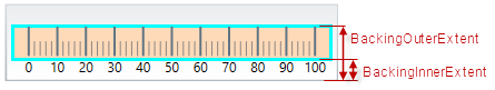
The background of the XamLinearGauge control is configurable in terms of spread and position and look-and-feel (fill and border). The spread and position are configurable in the dimension across the scale (through the BackingInnerExtent and BackingOuterExtent properties); along the scale, the background always spreads from one edge of the control to the other. The fill color and the border are managed by a set of properties available in the style template.

The following picture demonstrates a background color of a variety of light blue and a yellow green border with a thickness of 3 pixels. The background extent is made smaller by providing values for its BackingInnerExtent and BackingOuterExtent properties.

XamLinearGauge Overview 12.png

Background configuration summary chart

The following table explains briefly the configurable aspects of XamLinearGauge control’s background and maps them to properties that configure them.

Configurable aspects Property Default value

Spread and position (across the scale)

0

Spread and position (across the scale)

1.0

Fill color

Defined in the default theme

Border color

Defined in the default theme

Border thickness

2.0

Property settings

The following table maps the desired behavior to its respective property settings.

In order to configure: Details Use this property: And set it to:

Bottom / left edge position

The position of lower edge of the background (at horizontal orientation) or the left edge (at vertical orientation) relative to the bottom edge of the Graph area at horizontal orientation or to its left edge – at vertical orientation.

The desired value as a relative part of the height/width of the Graph area (depending on the orientation) presented as a fraction of 1 (e.g. 0.2)

Top / right edge position

The position of top edge of the background at horizontal orientation or the right edge at vertical orientation relative to the lower edge of the Graph area at horizontal orientation or to its left edge – at vertical orientation.

The desired value as a relative part of the height/width of the Graph area (depending on the orientation) presented as a fraction of 1 (e.g. 0.2 )

Fill color

Fill color of the background

The desired color

Border thickness

Border thickness of the background

The desired value in pixels

Border color

Border color of the background

The desired color

Example

The screenshot below demonstrates how the XamLinearGauge looks as a result of the following settings:

Property Value

“#FFDAB9”

“#00FFFF”

“3”

“0.2”

“0.7”

xamLinearGauge Configuring the Background 1 17 1.png

Following is the code that implements this example.

In XAML:

<ig:XamLinearGauge x:Name="linearGauge"
                 BackingBrush="#FFDAB9"
                 BackingOutline="#00FFFF"
                 BackingStrokeThickness="3"
                 BackingInnerExtent="0.2"
                 BackingOuterExtent="0.7"/>

In C#:

linearGauge.BackingBrush = new SolidColorBrush(Color.FromRgb(255, 153, 153));
linearGauge.BackingOutline = new SolidColorBrush(Color.FromRgb(51, 255, 255));
linearGauge.BackingStrokeThickness = 3;
linearGauge.BackingInnerExtent = .2;
linearGauge.BackingOuterExtent = .7;

In Visual Basic:

linearGauge.BackingBrush = New SolidColorBrush(Color.FromRgb(255, 102, 102))
linearGauge.BackingOutline = New SolidColorBrush(Color.FromRgb(0, 255, 255))
linearGauge.BackingStrokeThickness = "3"
linearGauge.BackingInnerExtent = ".2"
linearGauge.BackingOuterExtent = ".7"

Related Content

The following topics provide additional information related to this topic.

Topic Purpose

This topic explains, with code examples, how to configure the title and subtitle of the XamLinearGauge control. This includes the title area width the start position of the text and the title/subtitle text itself.

This topic explains, with examples, how to configure the scale of the XamLinearGauge control. This includes positioning the scale inside the control and configuring the scale tick marks and labels.

This topic explains, with code examples, how to configure the needle of the XamLinearGauge control. This includes the needle’s value, width, and formatting.

This topic explains, with code examples, how to configure ranges in the XamLinearGauge control. This includes the number of ranges and their positions, lengths, widths, and formatting.