
This topic explains, with examples, how to customize the scale of the XamLinearGauge™ control. This includes positioning the scale inside the control and configuring the scale tick marks and labels. (For the default settings, see the XamLinearGauge Overview topic.)
The following topics are prerequisites to understanding this topic:
This topic contains the following sections:
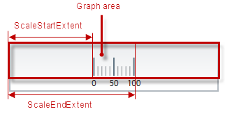
The scale of the XamLinearGauge control is a logical entity formed by the tick marks and the (numbering) labels. The size and position of the tick marks is configured relative to the Graph area and the position of the numbering labels – relative to the inner edge of the control (the bottom edge at horizontal orientation).
The tick marks of the XamLinearGauge control identify equal intervals of measure along the graph. Two types of tick marks are supported – major and minor. Both can be positioned along the scale by adjusting the values of the respective extent-related properties which are measured against the Graph area. The tick marks’ exact count, position, look, and frequency of occurrence can be customized by property settings.
As far as the labels are concerned, various aspects of them can be configured such as position, text, format, etc..
The following table explains briefly the configurable aspects of XamLinearGauge control’s scale and maps them to properties that configure them.
The scale’s size and position within the XamLinearGauge control in the along-the scale-dimension is determined relative the Graph area. This is done through a pair of properties ( ScaleStartExtent and ScaleEndExtent).
The positioning of the scale in the other (across-the-scale) dimension of the Graph area is not configurable by itself; instead, all elements comprising the scale are configured individually.
Note
The following table maps the desired behavior to its respective property settings. For an illustration of the configurable aspects, see the Example.
The screenshot below demonstrates how the XamLinearGauge would look as a result of the following settings:
Following is the code that implements this example.
In XAML:
<ig:XamLinearGauge x:Name="linearGauge"
                 ScaleStartExtent="0.2"
                 ScaleEndExtent="0.9" />
In C#:
linearGauge.ScaleStartExtent = .2;
linearGauge.ScaleEndExtent = .9;
In Visual Basic:
linearGauge.ScaleStartExtent = ".2"
.ScaleEndExtent = ".9"
[[_Configuring_the_Scale’s]]
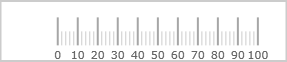
The values of the scale are defined by specifying its value range, that is, its minimum and maximum values. This is done with the MinimumValue and MaximumValue properties.
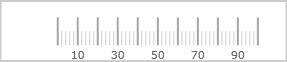
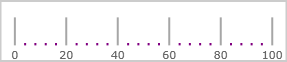
Setting the minimum and maximum values implicitly defines all values within the scale; all values are meant as evenly distributed between the minimum and maximum values. However, only those values are displayed for which there is a numbering label, placed on the scale. (The scale’s values can be displayed only through the numbering labels. The labels display the respective values based on the label’s position on the scale, i.e. the labels’ values are configured through the positioning of the labels along the scale and not set explicitly.) There is no requirement to have labels at the positions of the minimum and maximum values which means that the minimum and maximum values may not be indicated visually on the scale and the scale can look something like this:
Having the scales’ range defined also enables the positioning of the other value-based visual elements on the scale, namely the comparative ranges and the needle. Note that because these elements are value-based, when the scale’s range changes (i.e. when either its minimum or maximum value (or both) changes), these visual elements are re-positioned spatially together with the scale’s values keeping their position on the scale.
The following table maps the desired behavior to its respective property settings. For an illustration of the configurable aspects, see the Example.
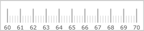
The screenshot below demonstrates how the XamLinearGauge would look as a result of the following settings:
Following is the code that implements this example.
In XAML:
<ig:XamLinearGauge x:Name="linearGauge"
                     MinimumValue="60"
                     MaximumValue="70" />
In C#:
linearGauge.MaximumValue = 70;
linearGauge.MinimumValue = 60;
In Visual Basic:
linearGauge.MinimumValue = "60"
.MaximumValue = "70"The major tick marks of the XamLinearGauge control can be customized in terms of position and interval at which they occur. The height, thickness, and color of the line segments that forms the major tick marks are configurable as well.
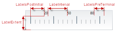
The major tick marks are defined in terms of starting and ending points (the positions of the first and the last tick marks relative to the edges of the Graph area and the interval (the distance from each other) at which they occur. (This is done through the TicksPostInitial, TicksPreTerminal, and Interval properties.) This way, defining the starting and ending points of the major tick marks essentially defines the position and length of the scale.
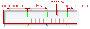
In the across-the-scale dimension, the length and position of the line segments that form the major tick marks is configured relative to the edges of the Graph area. (This is done through the TickStartExtent and TickEndExtent properties.)
The following table maps the desired behavior to its respective property settings. For an illustration of the configurable aspects, see the Example.
The screenshot below demonstrates how the XamLinearGauge looks as a result of the following settings:
Following is the code that implements this example.
In XAML:
<ig:XamLinearGauge x:Name="linearGauge"
                     Interval="30"
                     TickBrush="Lime"
                     TickEndExtent="0.9"
                     TicksPostInitial="30"
                     TicksPreTerminal="10"
                     TickStartExtent="0.5"
                     TickStrokeThickness="3" />
In C#:
linearGauge.Interval = 30;
linearGauge.TickBrush = new SolidColorBrush(Color.FromRgb(128, 255, 0));
linearGauge.TickEndExtent = .9;
linearGauge.TicksPostInitial = 30;
linearGauge.TicksPreTerminal = 10;
linearGauge.TickStartExtent = .5;
linearGauge.TickStrokeThickness = 3;
In Visual Basic:
linearGauge.Interval = "30"
linearGauge.TickBrush = New SolidColorBrush(Color.FromRgb(51, 255, 51))
linearGauge.TickEndExtent = ".9"
linearGauge.TicksPostInitial = "30"
linearGauge.TicksPreTerminal = "10"
linearGauge.TickStartExtent = ".5"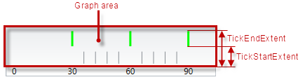
linearGauge.TickStrokeThickness = "3"The minor tick marks of the XamLinearGauge control can be explicitly disabled or customized in terms of number (between two major tick marks), positioning, size, and color.
The minor tick marks are defined as a count (the number of minor tick marks between two adjacent major tick marks). (This is done through the MinorTickCount property; setting this property to 0 disables (hides) the minor tick marks.) When the count is set, the specified number of minor tick marks is placed evenly between every two adjacent major tick marks, from the first one, to the last.
In the across-the-scale dimension, the minor tick marks length and position is configured relative to the edges of the Graph area.
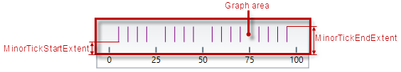
The following table maps the desired behavior to its respective property settings. For an illustration of the configurable aspects, see the Example.
The screenshot below demonstrates how the XamLinearGauge looks as a result of the following settings:
Following is the code that implements this example.
In XAML:
<ig:XamLinearGauge x:Name="linearGauge"
                     MinorTickBrush="Purple"
                     MinorTickCount="4"
                     MinorTickEndExtent="0.1"
                     MinorTickStartExtent="0.05"
                     MinorTickStrokeThickness="2"
                     Interval="20" />
In C#:
linearGauge.MinorTickBrush = new SolidColorBrush(Color.FromRgb(153, 0 , 153));
linearGauge.MinorTickCount = 4;
linearGauge.MinorTickEndExtent = .1;
linearGauge.MinorTickStartExtent = .05;
linearGauge.MinorTickStrokeThickness = 2;
linearGauge.Interval = 20;
In Visual Basic:
linearGauge.MinorTickBrush = New SolidColorBrush(Color.FromRgb(102, 0, 102))
linearGauge.MinorTickCount = "4"
linearGauge.MinorTickEndExtent = ".1"
linearGauge.MinorTickStartExtent = ".05"
linearGauge.MinorTickStrokeThickness = "2"
linearGauge.Interval = "20"By default, the labels indicating the scale’s measures are enabled. The labels are defined in terms of the following factors:
Starting and ending points – the positions of the first and the last label relative to the edges of the scale
Breadth of the label row – relative to the height/width of the control, depending on the orientation (vertical/horizontal). The breadth can be controlled only indirectly by the font settings in the applied style template.
The interval (the distance from each other) at which they occur. (This is done through the LabelsPostInitial, LabelsPreTerminal and LabelInterval properties.)
The position of the label row in the across-the-scale dimension – the default is at the bottom / on the left of the control (for horizontal or vertical orientation, respectively); the entire row can be shifted vertically at horizontal scale orientation or horizontally at vertical scale orientation. (This is done through the LabelExtent property.)
The value that each label displays is defined by the value represented by its position on the scale (This requires configuring the scale’s value range.) A string format can be applied to the labels so that their look is additionally customized. By default, a numeric label is displayed for each of the major tick marks and the labels are positioned beneath / on the left of the scale depending on the scale’s orientation (horizontal/vertical, respectively).
If you customize the labels and the major tick marks, you will more likely need to make sure they align to each other; to achieve alignment, set the same value for the tick marks interval ( Interval property) and the label interval (LabelInterval property). (By default, they are aligned because the LabelInterval property is not set and uses the value set for Interval.)
The labels of XamLinearGauge can be additionally formatted and aligned on handling the corresponding events.
The following table maps the desired behavior to its respective event.
The following table maps the desired behavior to its respective property settings. For an illustration of the configurable aspects, see Example – horizontal orientation.
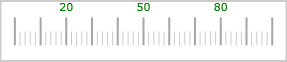
The screenshot below demonstrates how the XamLinearGauge looks as a result of the following settings with the default horizontal scale orientation:
Following is the code that implements this example.
In XAML:
<ig:XamLinearGauge x:Name="linearGauge"
                 LabelExtent="0.8"
                 LabelInterval="30"
                 LabelsPostInitial="20"
                 LabelsPreTerminal="20"
                 FontBrush="Green"  />
In C#:
linearGauge.LabelExtent = .8;
linearGauge.LabelInterval = 30;
linearGauge.LabelsPostInitial = 20;
linearGauge.LabelsPreTerminal = 20;
linearGauge.FontBrush = new SolidColorBrush(Color.FromRgb(0, 153, 0));
In Visual Basic:
linearGauge.LabelExtent = ".8"
linearGauge.LabelInterval = "30"
linearGauge.LabelsPostInitial = "20"
linearGauge.LabelsPreTerminal = "20"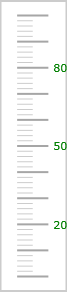
linearGauge.FontBrush = New SolidColorBrush(Color.FromRgb(0, 255, 0))The screenshot below demonstrates how the XamLinearGauge looks as a result of the following property settings (same as in Example – horizontal orientation) and vertical orientation:
Following is the code that implements this example.
In XAML:
<ig:XamLinearGauge x:Name="linearGauge"
                 Orientation="Vertical"
                 LabelExtent="0.8"
                 LabelInterval="30"
                 LabelsPostInitial="20"
                 LabelsPreTerminal="20"
                 FontBrush="Green" />
In C#:
linearGauge.Orientation = LinearScaleOrientation.Vertical;
linearGauge.LabelExtent = .8;
linearGauge.LabelInterval = 30;
linearGauge.LabelsPostInitial = 20;
linearGauge.LabelsPreTerminal = 20;
linearGauge.FontBrush = new SolidColorBrush(Color.FromRgb(0, 153, 0));
In Visual Basic:
linearGauge.Orientation = LinearScaleOrientation.Vertical;
linearGauge.LabelExtent = ".8"
linearGauge.LabelInterval = "30"
linearGauge.LabelsPostInitial = "20"
linearGauge.LabelsPreTerminal = "20"
linearGauge.FontBrush = New SolidColorBrush(Color.FromRgb(0, 255, 0))The following topics provide additional information related to this topic.
The following material (available outside the Infragistics family of content) provides additional information related to this topic.