
This topic explains the features supported by the control from developer perspective.
This topic contains the following sections:
The xamPropertyGrid control provides the user with a friendly properties editing experience of a single object or multiple objects. The user has the ability to edit plain properties or complex list type properties.
Properties are edited using different editors depending of the property type. The user has the ability to browse quickly in large property lists using features like filtering, sorting or grouping.
The control provides a large number of customizations like changing the default property type editors, showing and hiding of filtering and description area, customizing the properties lists by including/excluding attached or read-only properties and many more.
The following screenshot shows the xamPropertyGrid while showing/editing a lot of object’s properties grouped by categories:
The following table summarizes the main features of the xamPropertyGrid control. Additional details are available after the summary table.
The control supports binding to a single or multiple objects. Binding to multiple objects allows the user to change a property value simultaneously on multiple objects.
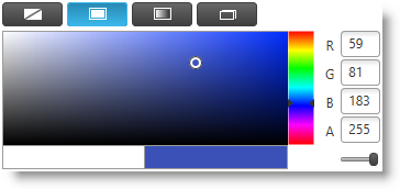
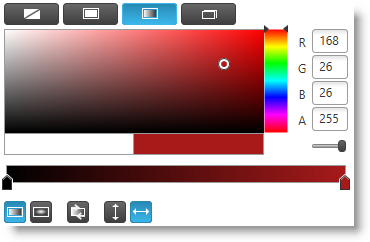
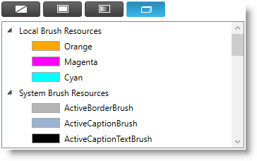
In addition to built-ins editors for basic property types the xamPropertyGrid ships with a Visual Studio-like editor for manipulating properties of type Brush. It provides an UI for editing solid color brushes, gradient color brushes and a list of predefined brush resources.
Solid color editor:
Gradient color editor:
Predefined brush resources:
Each property type has its own default editor (for example enumerations are edited by using a ComboBox) however you can create custom editors for specific property types, property names and/or property categories.
The control supports visualization of dependency objects' dependency properties which depends on the value of the PreventEditingOfBoundProperties property and of whether the dependency property has a local value or a binding expression.
The following table maps the dependency property displaying behavior of the controls depending on the configuration:
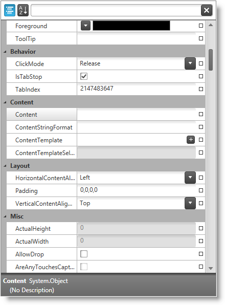
The description area at the bottom of the control contains the following information about the currently selected property:
Property type
Property description
The description area can be shown or hidden.
The control allows the user to drill down into more complex properties (like collections or lists) using a special expand/collapse glyph on the left of the property.
The control allows the user to enter a filter value in the text box located in the filtering area at the top of the control. This filter is used as "contains" filter for displaying the property list, and the pipe symbol (i.e., "|") can be used to specify multiple filter criteria which are combined using an "Or" operator. In addition you can programmatically add custom filters (based on the "ICondition" interface) which are combined using an "and" operator with the value specified by the user.
The control supports grouping of properties based on their categories - categories are assigned via the CategoryAttribute. The categories are expandable/collapsible. The properties in each category are sorted alphabetically.
The control uses property generators to discover the properties to display for the currently selected object(s). The control ships with 2 built-in property generators - one uses reflection and the other uses TypeDescriptor to discover properties. You can also create your own custom property generators.
The control allows the user to reset a property to its default value using a glyph located at the right side of the property value.
The sorting feature allows the user to sort all properties ascending regardless of their category. This forms an alphabetically sorted list containing all properties and no category groups are shown.
The following topics provide additional information related to this topic.