
Chart provides the feature of smart tickmarks. Enabling smart tickmarks will cause Chart to automatically determine the best possible Range and Interval for an axis, based on the data and the available space.
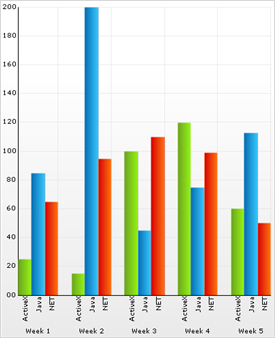
Here is a typical column chart with Axis.Y.TickmarkStyle set to Percentage, and the Axis.Y.RangeType set to Automatic:
There are two problems with the presentation of this chart:
The Minimum and Maximum of the y-axis are equal to the data Minimum and Maximum values. This results in Row 2, Column 0 being hidden, because its value is 10.96. The range of data is also unintuitive; 10.96 to 302.46 is not a range of numbers that makes sense to human eyes.
The intervals are generated at every 10% of the axis, resulting in a data interval of 29.15. Again, this number is unintuitive and does not make much sense to viewers.
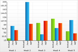
These problems can be easily resolved by setting the Axis.X.TickmarkStyle to Smart. Doing so enables Chart’s "Smart Labels" algorithm, which provides the following features:
Smart Range: the axis minimum and maximum will be set to the best possible "round numbers" around the actual range of data.
Smart Intervals: tickmarks will appear separated by "round numbers." Also, Chart will prevent axis labels from overlapping by considering the available space along the axis before determining the tickmark interval.
The following chart was generated using smart tickmarks:
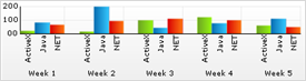
These two charts illustrate how smart tickmarks prevent axis labels from overlapping: