<Grid.Resources>
   <!— Add DataTemplate -->
</Grid.Resources>

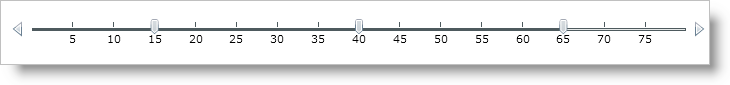
By default the tick marks are displayed as ticks on the slider; however you can override this default setting and display the value of the tick mark instead.
There are no standard left, right, top bottom tick marks. Everything depends on the data template
This topic assumes that you already have a xamSlider™ control on your page, for more information, see the Getting Started with xamSlider topic.
You will display the value of the tick mark, similar to labels.
Add a grid resource.
In XAML:
<Grid.Resources> <!— Add DataTemplate --> </Grid.Resources>
Add a data template. This data template will bind to the value of the tick mark and display that value.
In XAML:
<DataTemplate x:Key="HorizontalTick">
   <Border >
      <TextBlock Text="{Binding}" Margin="0,60,0,0"/>
   </Border>
</DataTemplate>
Within the SliderTickMarks, set the HorizontalTickMarksTemplate property to the data template you created.
In XAML:
<ig:XamNumericRangeSlider Grid.Row="1" MinValue="0"   MaxValue="80" Height="100" Margin="10">
   <ig:XamSliderNumericThumb Value="15" InteractionMode="Push"/>
   <ig:XamSliderNumericThumb Value="40" />
   <ig:XamSliderNumericThumb Value="65" InteractionMode="Lock"/>
   <ig:XamNumericRangeSlider.TickMarks>
      <ig:SliderTickMarks TickMarksFrequency="5" UseFrequency="True"/>
      <ig:SliderTickMarks TickMarksFrequency="5" UseFrequency="True" HorizontalTickMarksTemplate="{StaticResource HorizontalTick}"/>
   </ig:XamNumericRangeSlider.TickMarks>
</ig:XamNumericRangeSlider>
Save and run your application.