WPF Pie Chart
Create simple or exploded pie charts. Customize the threshold for inclusion in the Other category, and display text labels and images that can be within or outside of the pie in a manner that avoids overlap. Users can click or drill down to view underlying data, explode out a section of the pie, and find information via tooltips.
Use the new Ultimate UI for WPF Pie Chart Configurator to quickly configure the control and bind data directly from XAML—no code required!
WPF 샘플 다운로드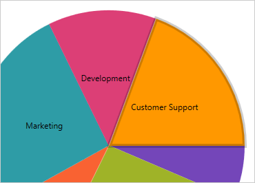
Slice Selection
Users can select pie chart slices out of the box with no extra code needed. Just drop the pie chart on your page and users can immediately select single or multiple slices.
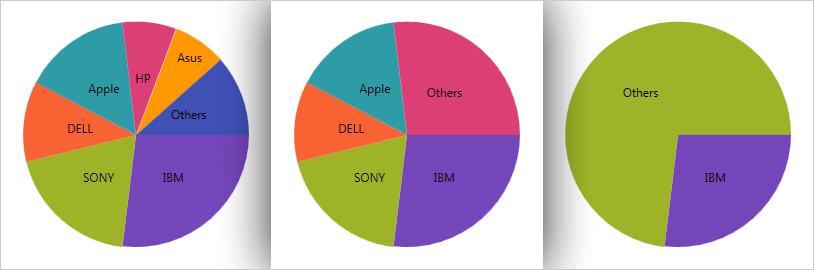
Others Category
Group the smaller data values into one slice using the Others category in the Pie Chart control. Use the drop-down in the Threshold Category to select a threshold value and see how the smaller slices are grouped into one slice labeled "Others."
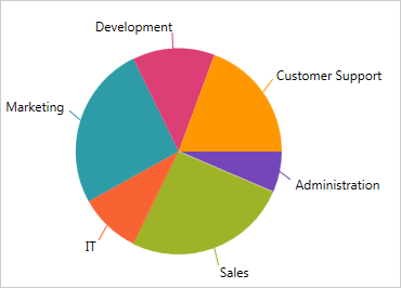
Pie Chart
Specify the number of symbols the reader will search for, set the minimum pixels size of a symbol, and set orientation for scanning barcodes.

Pie Chart Configurator
The control configurators shave off hours of development time by removing the complexity of learning the Pie Chart API. Visually configure your entire pie chart in a WYSIWYG point-and-click experience. Allow your designers to style controls interactively and visually to get a pixel-perfect render of their design intent.
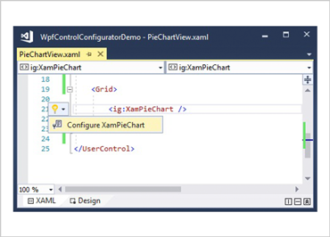
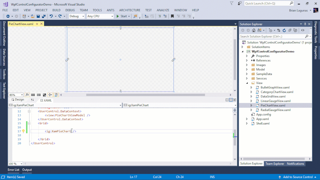
Launch the Pie Chart Configurator with a Single Click
Select your control on the XAML editor and use the suggested actions lightbulb to launch the Pie Chart Configurator.
Visually Configure Your Pie Chart
Use the Ribbon Gallery items to visually customize almost every aspect of your pie chart – from the initial pie chart layout, to the Interactivity, Layout, Brushes, and Legend configuration. All without needing to know anything about the API of the pie chart!
Customize Pie Slice Effect
Visually configure pie chart features like Slice Selection, Slice Explosion, and Exploded Radius from the Configurators Ribbon Gallery.
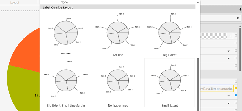
Change Layout in One Click
Visually customize the Label Mode, Leader Line visualization, and more with the Layout tool.
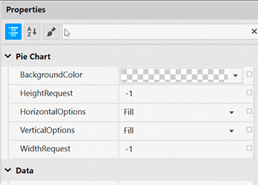
Property Editing with Ease
Conveniently find properties grouped by related features in the Property Editor. Features are also enabled or disabled by feature compatibility. This lets you customize any detail of the control, and it helps you learn by example, as you can see in real time how your changes affect the control.
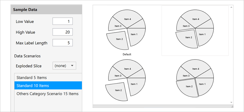
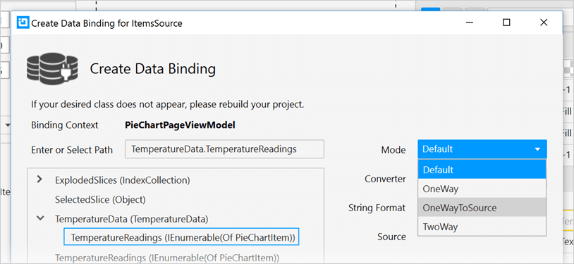
Data Binding is a Breeze
You can quickly add dynamic data to inflate Low Value, High Value, and Label Length and pick a standard pie slice size. Use the Binding Editor to easily set a binding for a control, including binding mode or your custom converter. We’ve even provided a handy formatter so you don’t need to think about how to display your values.
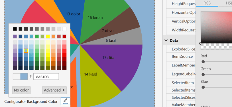
Ensure Correct Color Views
Conveniently change the background of the Pie Chart Configurator to your app background so you know what the pie chart will look like at runtime. We’ve also included a dotted line around the actual control bounds so you know where the control begins and ends.
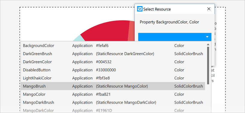
Easily Use Existing Style Resources
Bind to existing project or page level resources from the convenient Resource picker.